Getting started
Primer is also a design system for Terminal like implementations of GitHub. If you’re just starting out with creating those kind of experiences, here’s a list of principles and design foundations to get you started.
Optimize for what most people will need to do most of the time, but make it easy for people to adjust it to their needs. Often this means considering the default behavior of each command, and how it might need to be adjusted with flags.
Using this tool, it should be obvious that it’s GitHub and not anything else. Use details that are specific to GitHub, such as language or color. When designing output, reflect the GitHub.com interface as much as possible and appropriate.
Use language accurate to GitHub.com
Don't use language that GitHub.com doesn't use
Use sentence case
Don't use title case
Command line interfaces are not as visually intuitive as graphical interfaces. They have very few affordances (indicators of use), rely on memory, and are often unforgiving of mistakes. We do our best to design our commands to mitigate this.
Reducing cognitive load is necessary for making an accessible product .
We want to help people stay in the terminal wherever they might want to maintain focus and reduce context switching, but when it’s necessary to jump to GitHub.com make it obvious, fast, and easy. Certain actions are probably better to do in a visual interface.
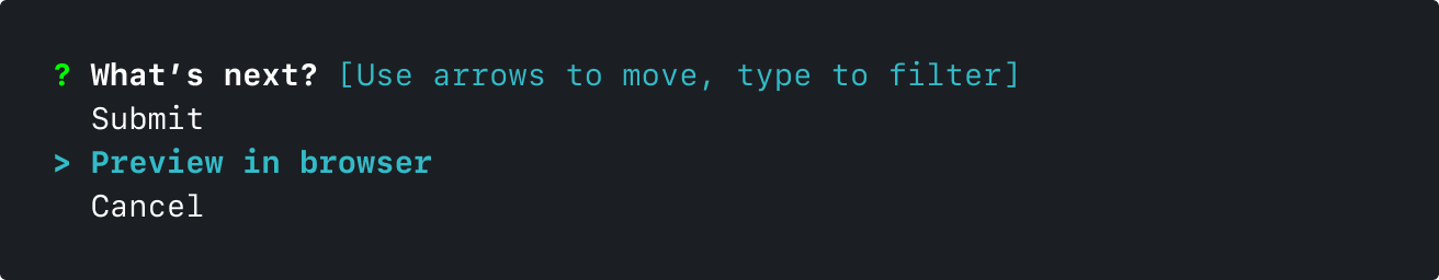
A preview in browser step helps users create issues and pull requests more smoothly.
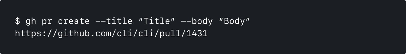
Many commands output the relevant URL at the end.
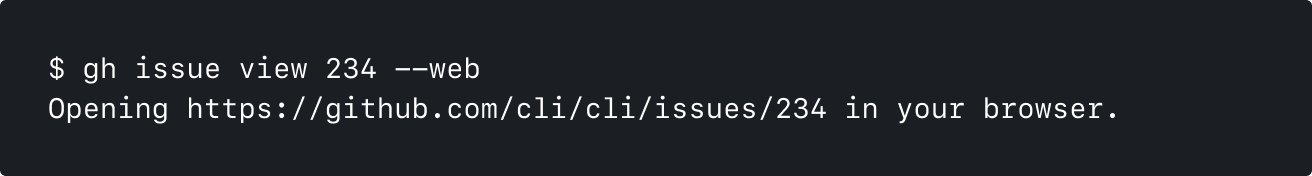
Web flags help users jump to the browser quickly
When designing for the command line, consider:
When designing for GitHub CLI, there are several ways you can go about prototyping your ideas.
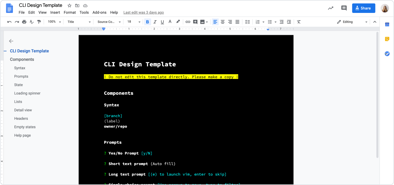
Best for simple quick illustrations of most ideas
Use this template, or format your document with these steps:
If you need to show a process unfolding over time, or need to show a prototype that feels more real to users, Figma or code prototypes are best.
Figma library (accessible to GitHub staff only)