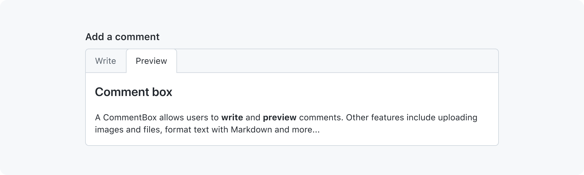
Comment box
Comment box allows users to write and preview comments.
On this page
On this page
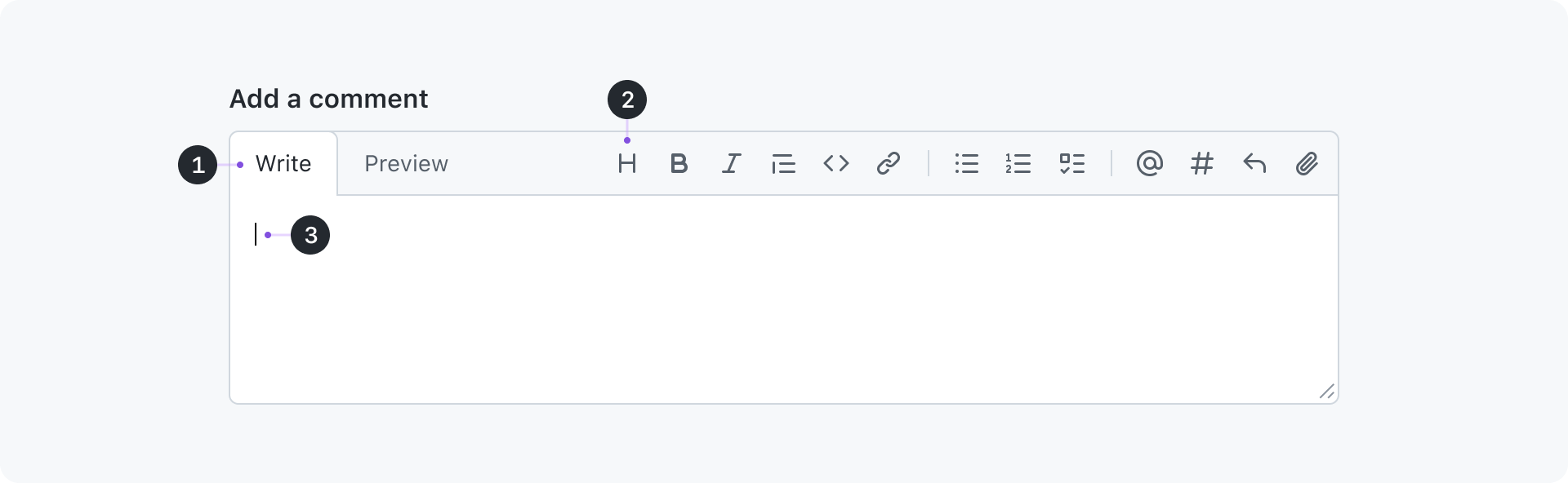
Anatomy
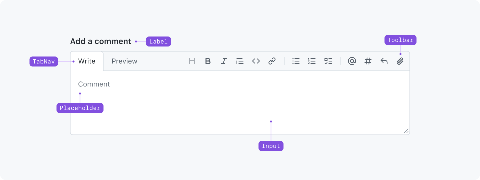
Content
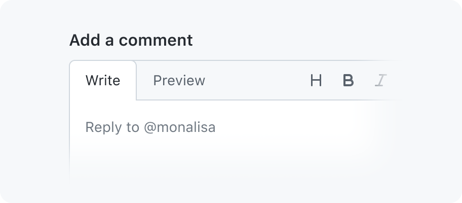
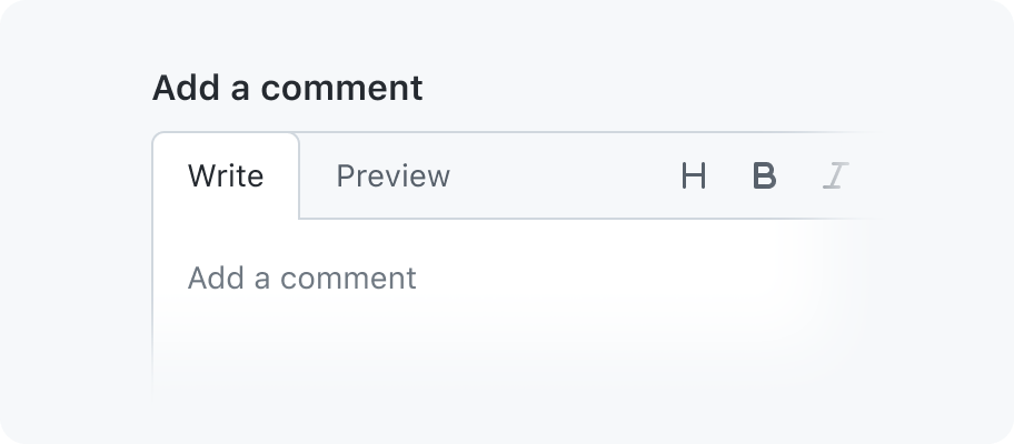
Heading (required)
A heading is shown above the comment box to establish the context and inform users about the purpose of the textarea that follows. The default heading is "Add a comment".
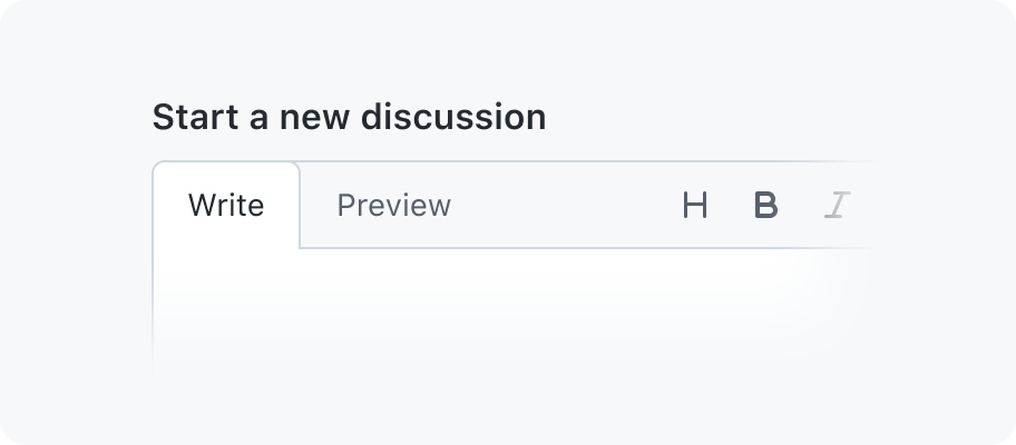
Use a different heading depending on the context.
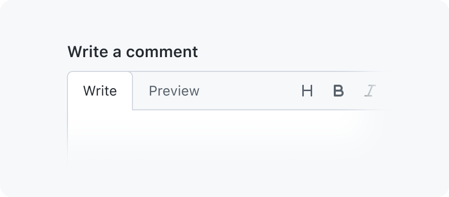
Don't use the term "Write". This may create confusion when navigating between the comment box's heading and the "Write/Preview" tab nav.
It's recommended to always show a heading to give users a permanent description of the comment box. In case the design doesn't have room for a heading, the sr-only class may be added to visually hide the heading.
When the heading needs to be visually hidden, use the placholder text instead.
Don't visually hide the heading and remove the placholder text.
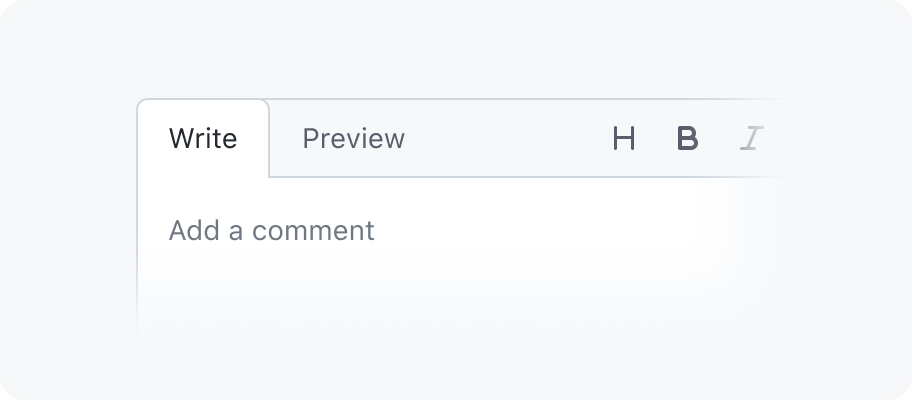
Placeholder text (optional)
The placeholder text is meant to give users addtional hints. Keep in mind that it will disappear as soon as users start typing. By default a comment box has no placeholder text, but can help suggest features specific to an implementation, such as slash commands. Having a placeholder text can also help with improving usablity and making sure users know where to start typing. For example by adding a placeholder text like "Add your comment here...".
Use a different placeholder text depending on the context.
Don't repeat the heading also as placeholder text.
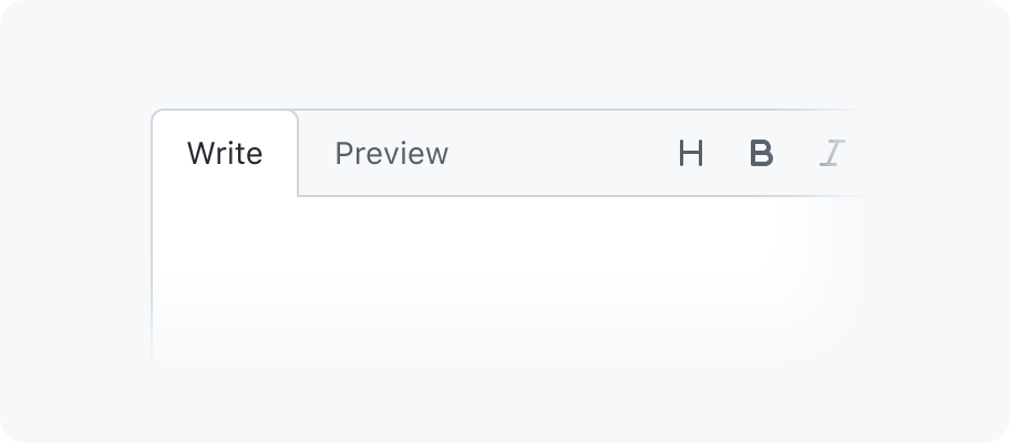
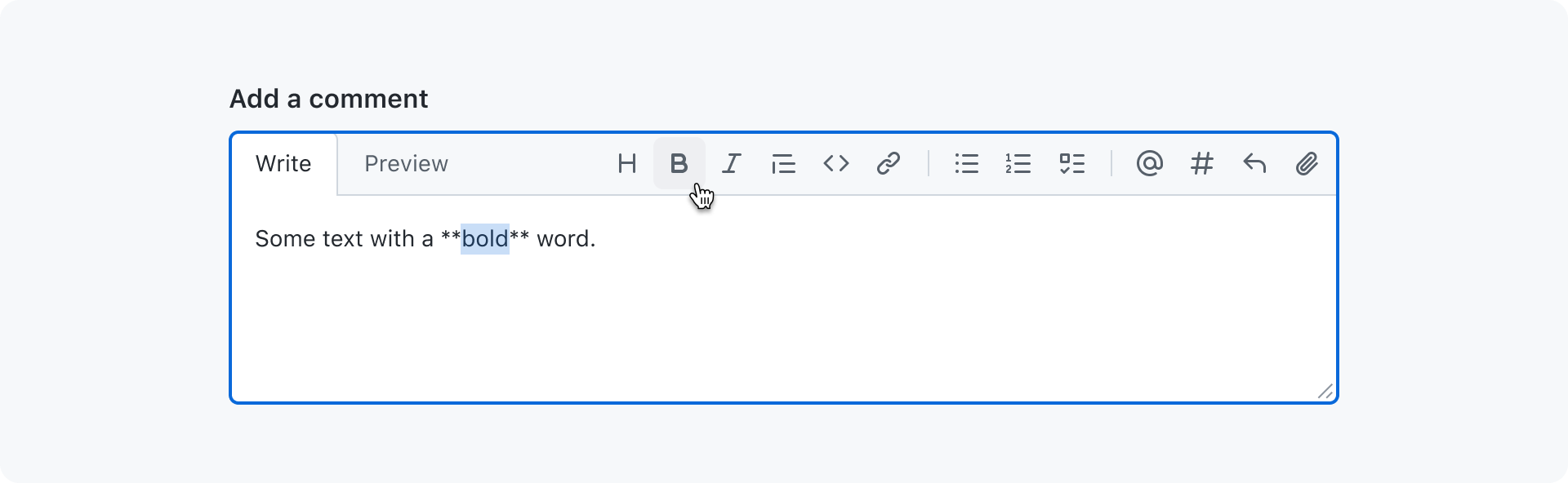
Tab nav
A tab nav is used to toggle between write and preview mode. In write mode the entered text is rendered as typed (plain text).
When switching to preview mode the toolbar disappears and the text is rendered as HTML. Markdown formatting, autolinking and other features are supported as well.
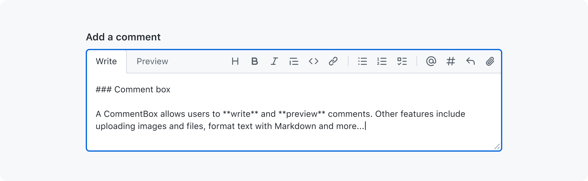
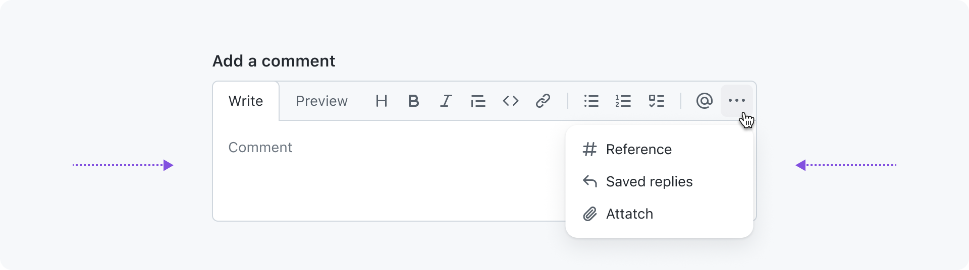
Toolbar
The toolbar provides the comment box with shortcuts to...
- format Markdown
- @-mention users or reference issues and pull requests
- insert saved replies
- attach images and files
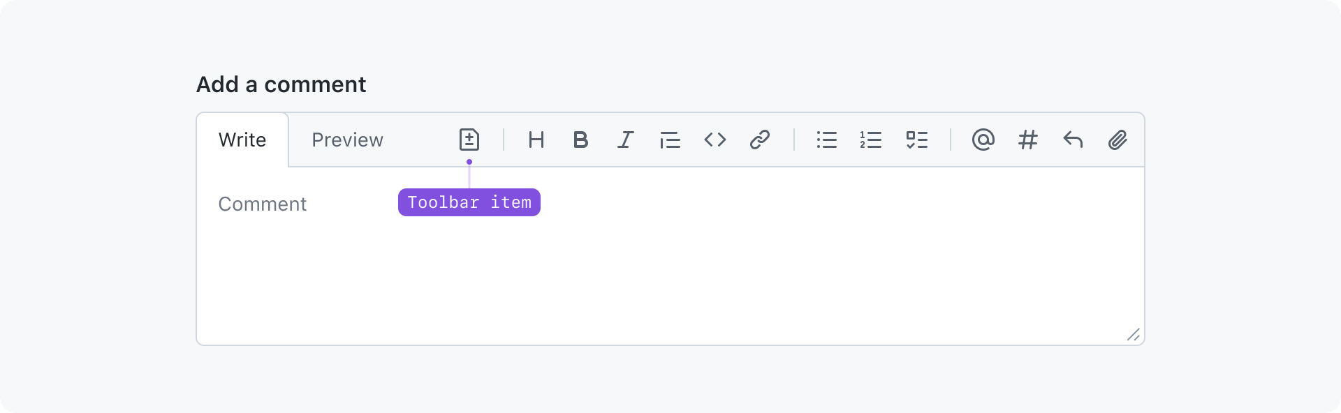
Additional toolbar items can be added based on context. They appear at the beginning of the toolbar separated with a divider.
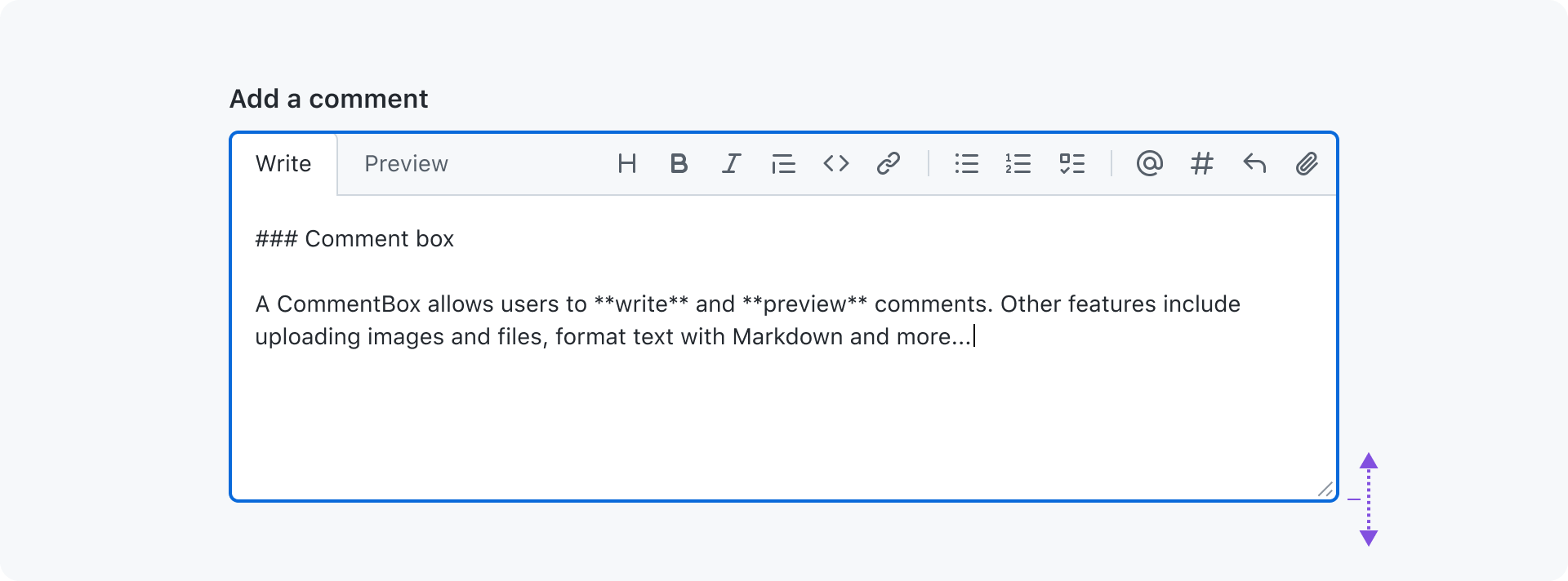
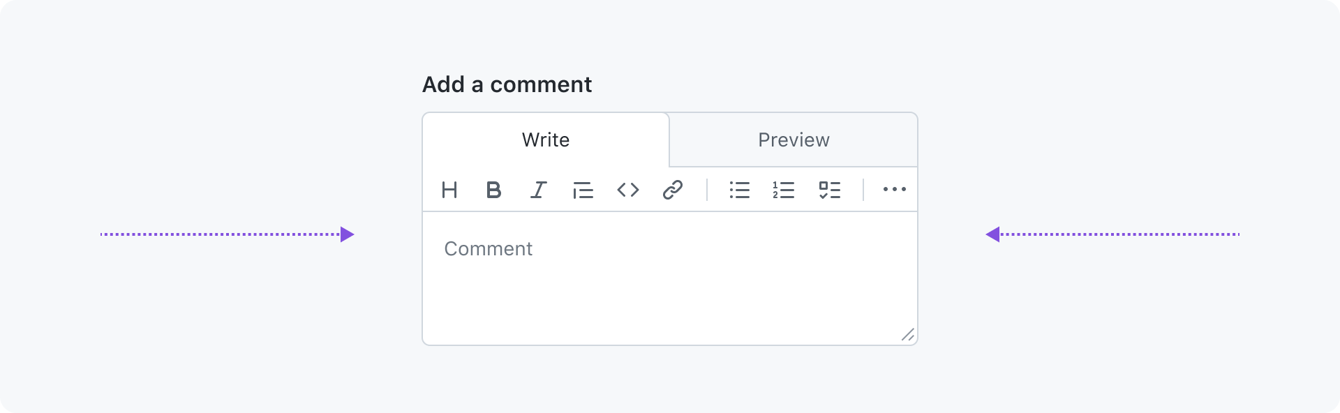
Textarea
A textarea is used to write the comment. While typing it will automatically resize to fit the content until a certain max height is reached. The textarea can also be manually resized by dragging the handle in the bottom right corner.
The default and minimum height is 100px. For cases where users typically add a lot of content, like issues or pull request descriptions, the textarea can be configured to have an increased initial height:
| Option | value |
|---|---|
small (default) | 100px |
medium | 300px |
large | 500px |
Messages
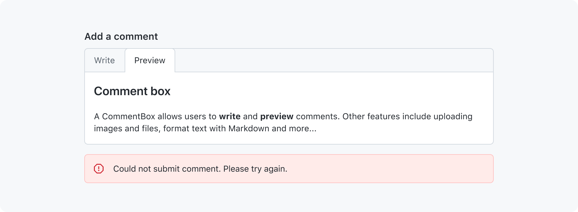
A flash alert is used to inform users about an event related to the comment box. Events include but are not limited to error or warning messages, uploading state or successful actions. The flash alert is shown undertneath the comment box.
Responsive behavior
The comment box's toolbar uses an action bar under the hood that is responsive by default. Toolbar items that don't fit in the available space are moved to an overflow menu.
When the available space becomes narrow, the tab nav takes up full width and the toolbar moves to its own row underneath.
Example usage
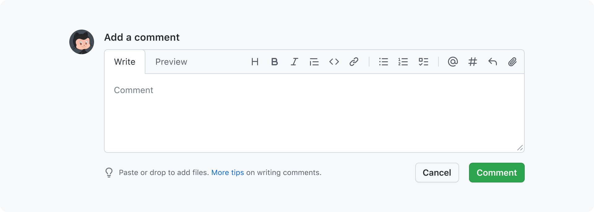
A typical use of the comment box is at the bottom of a timeline or inline when replying to existing comments. Most often there is a cancel and a submit button at the bottom right of the comment box. Pro tips can also be shown to eductate users and help feature discovery.
Accessibility
Keyboard navigation
| Key | description |
|---|---|
Tab | Moves focus between the different parts of the comment box. The order is as follows: 1. tab nav 2. toolbar 3. textarea. |
Note that tab nav and toolbar (action bar) have their own keyboard navigation.