Text input
Text input is used to set a value that is a single line of text.
On this page
On this page

Usage
Use a text input to allow users to input short free-form text. It may also be used as a number input when type="number" is passed to the component.
States
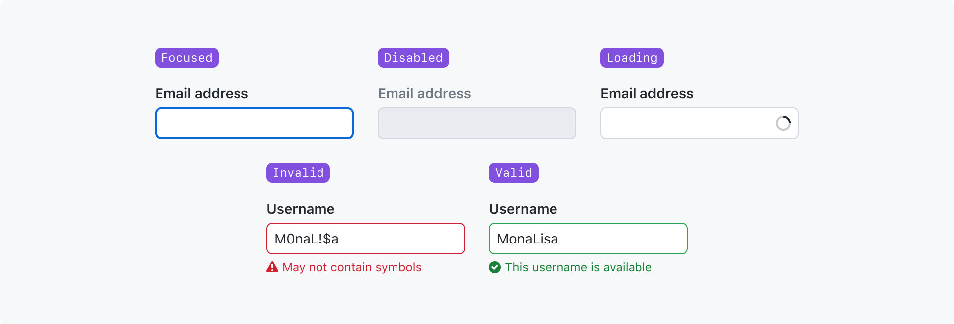
Focused: The input has been navigated to and is ready to accept input.
Disabled: The input cannot accept input or become focused.
Loading: Some process has been initiated by the input but has not finished.
Invalid: The value failed validation.
Valid: The value passed validation.
For more information about the "valid" and "invalid" states, see the validation section of the form design pattern guidelines.
Best practices
- Only use placeholder text to show an example of the expected input. Never use placeholder text for critical information.
- Use the width of the text input to give users a hint about how long the value is expected to be
- If your field accepts free-form text or an option from a predetermined list, consider using an autocomplete input
Anatomy

Label (required): The input's title. It should be as concise as possible and convey the purpose of the input. The label may be visually hidden in rare cases, but a label must be defined for assistive technologies such as a screen reader.
Required indicator: Indicates that a value is required. Must be shown for any required field, even if all fields in the form are required.
Input (required): Accepts user free-form text input
Leading visual: An icon or short piece of text to reinforce the purpose of the input. Appears before the input's value.
Trailing visual: The same as a leading visual, but appears after the input's value.
Trailing action: An action that affects the input. Most commonly used for a button that clears the input.
Caption: Provides additional context about the field to help users fill in the correct data or explain how the data will be used. Caption text should be as short as possible. Caption text may be displayed at the same time as a validation message, or it may be hidden if it only provides redundant information.
Validation message: A single validation message may be displayed to provide helpful information for a user to complete their task. It is most commonly used to explain why a value is invalid so they can correct it and submit the form.
Options
Sizes
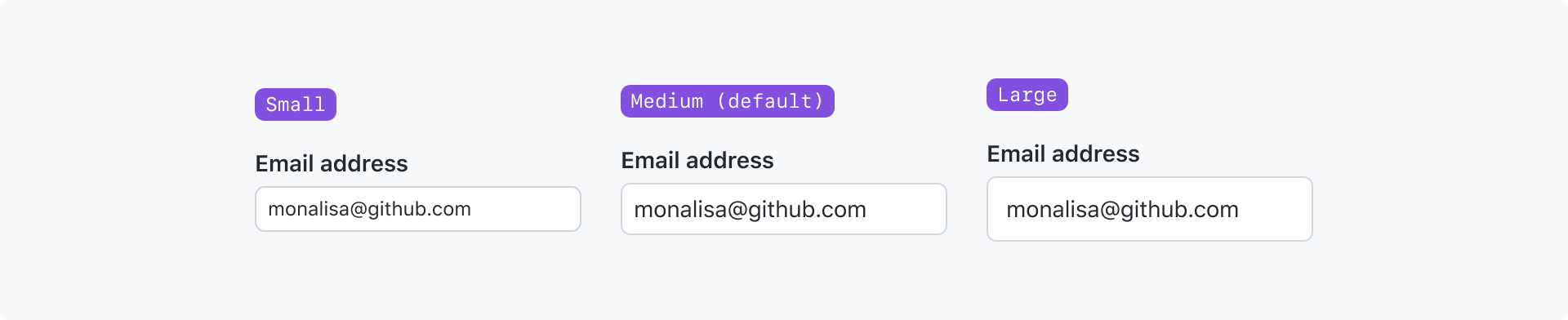
A text input can be made smaller or larger depending on the context it's being used in.
You can make an input smaller if it is being used in a tight space with other small elements. You can make an input larger if it's in an open space or feels out of proportion with adjacent large elements.
Width
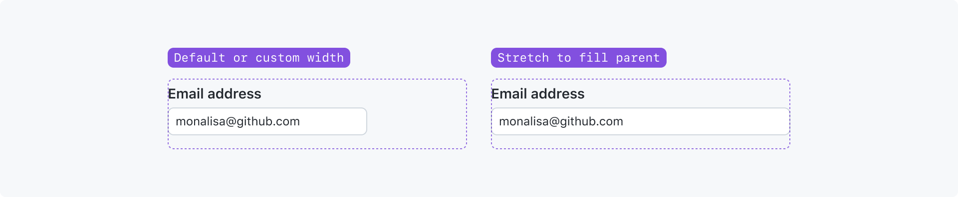
By default, a text input will be given a default width by the browser.
However, you can render a text input to fill the width of its parent element, or set the width to whatever makes sense for your use-case. When setting a custom width, consider the length of the expected value.
Monospace

The value of the text input may be rendered in a monospace font. Use this variant for inputs related to code. For example, setting a personal access token in a configuration.
With a trailing action

A trailing action may be used to render a single action that affects the input. A trailing action is most commonly used for a button that clears the input.
Ideally the trailing action button is an icon without a text label. It is also possible to render the button with a text label, but it should be avoided whenever possible.
Avoid using a trailing action with a trailing visual.
With leading and trailing visuals
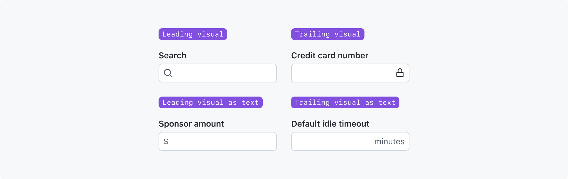
Leading and trailing visuals are typically shown as an icon to reinforce the purpose of the input.
Icons are preferred, but you may also use a short piece of text in the leading or trailing visual slots when appropriate. For example, text may be used to show a unit such as "minutes", "$", or "%"
Avoid overwhelming the text input by using both a leading and trailing visual. If you're trying to provide more context about the input, consider using text in the input caption.
Effects of loading state
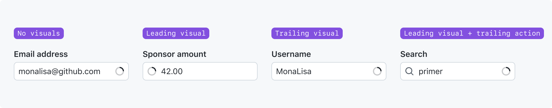
When a text input is processing some action like performing a search, a loading indicator is shown. To avoid a layout shift, either the leading or trailing visual will be replaced with the loading indicator. The text input component has internal logic to decide which visual to replace, but it can be overridden and explicitly set to show at the start or end of the input.
With tokens
Accessibility
- Text inputs must be labeled. The label may be visually hidden, but visible labels are preferred.
- Placeholder text is never an acceptable substitute for a label because:
- The placeholder text disappears as soon as the input has a value
- Placeholder text colors are typically too light to meet the minimum color contrast ratio required for accessibility
- Screen readers do not read placeholder text as a label
- Text inputs whose value is used to filter a list of results should be paired with an announcement for the effect of the filter. For more information, see the conveying status (filter results) section of the loading state pattern guidelines.