Foundations
Design concepts and constraints that can help create a better mobile experiences for GitHub.
In general, our apps conform to an 8-point grid layout. However, we defer many component sizes, spacings, and layouts to the platform (iOS + Android) in order to let them deal with cross-device responsiveness, tablet transformations, and OS accessibility settings. When designing custom components, make sure elements are spaced and aligned to an 8-point grid (half-steps of 4pts are included).
Because we support dark mode and high contrast color variants, working with colors on mobile requires a few special workflows and considerations. Our core color system is maintained in the Mobile Design Toolkit Figma file. This is the source of truth. Changes here will propogate out to the Figma Team Library, the Mobile Design Toolkit plugin, and eventually into the iOS and Android apps as Xcassets and XML files.
Adding and updating colors does take time and attention to detail. This should not deter us from iterating, adding new colors, or adjust color values when we find they are not working in production. The following notes and videos are meant to capture the existing processes.
We use the Primer Primitives color values as our starting point for working with color in mobile. We always want to be inheriting upstream changes to different values.
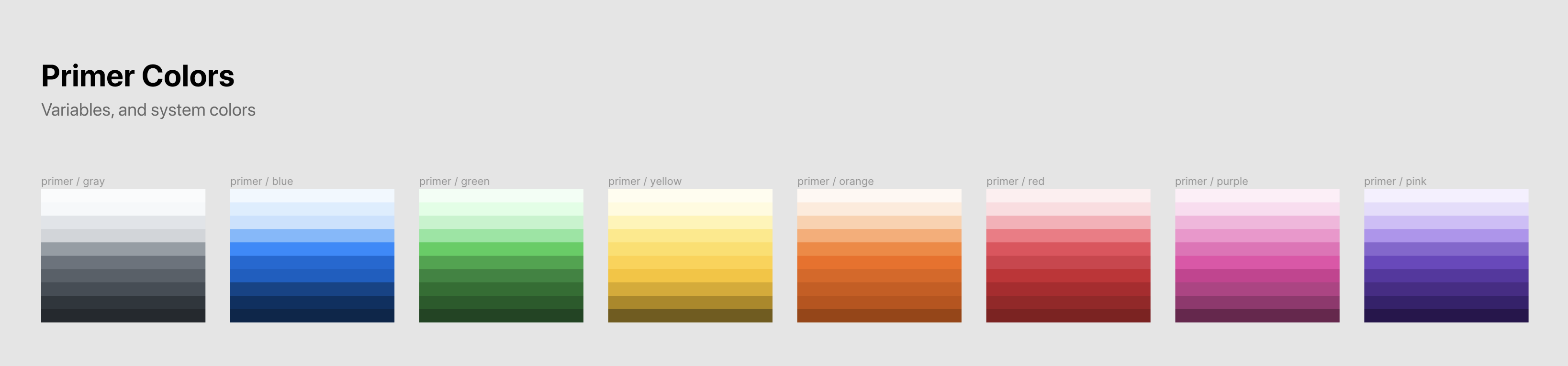
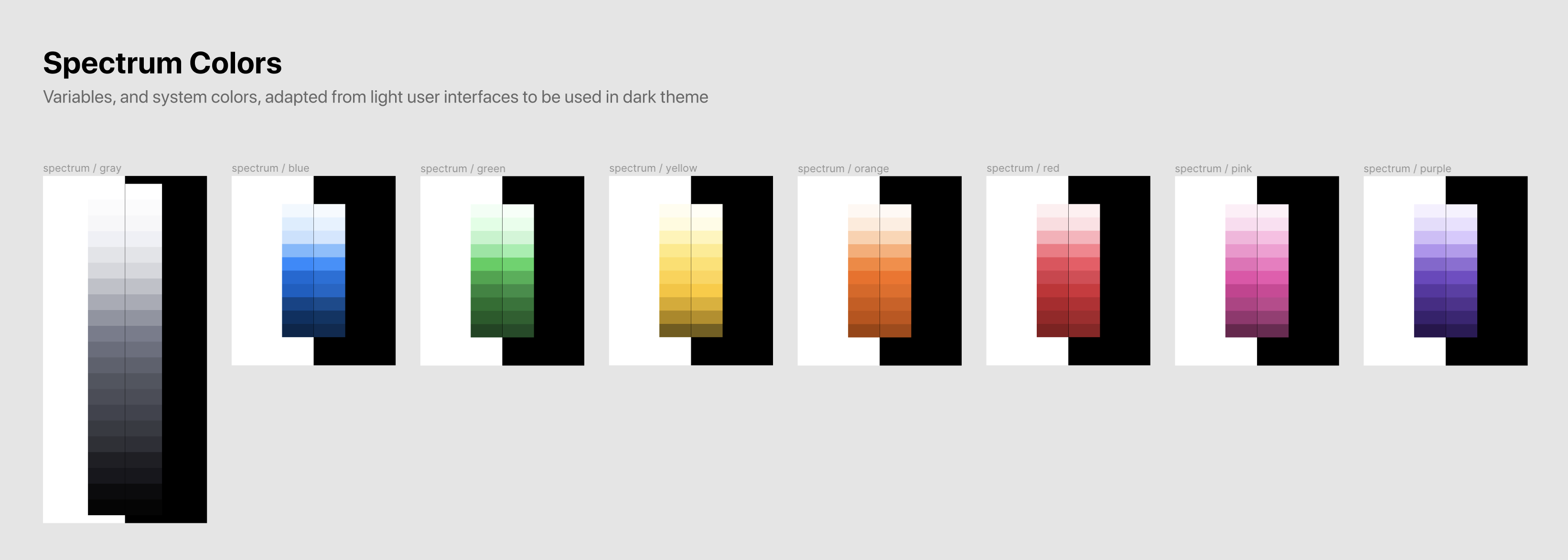
Because the mobile apps support dark mode, we want to make minor adjustments to the Primer colors so that they remain clear in a dark environment. Generally, we do this by increasing brightness (improve contrast) and decreasing saturation (reducing vibration). By doing this, we end up with a light/dark pairing for each color in the Primer system.
When we begin implementing colors into the codebase, we immediately bump into two problems:
gray-500 are not descriptive, and will lead to confusion about when to use which valuegray100 in dark mode, gray900 in light mode).To combat this, we abstract our Spectrum values into Functional colors. Functional colors describe their purpose in the application. For example, iconTertiary or textPrimary. These values are more readable to humans, and provide inherent context about when they should be used.
Additionally, functional colors abstract dark mode and high contrast mode. For example, a functional color textSecondary might wrap the following sets of rules:
gray800gray850gray200gray150Using code generation, we can dynamically extract XML files for Android, and Xcassets for iOS that contain these color abstractions.
Note: Our functional color system is a work in progress! We currently cover text, icons, backgrounds, badges, and borders. But we should expect to expand and refine this system over time as we encounter new use cases and opportunities for clear abstraction.
Our mobile apps use GitHub's icon system, Octicons. Octicons come in two sizes, 16px and 24px.
Star the Octicons repo to follow along with the Octicons project. Open issues and pull requests to get support or ask for new icon additions to the system.
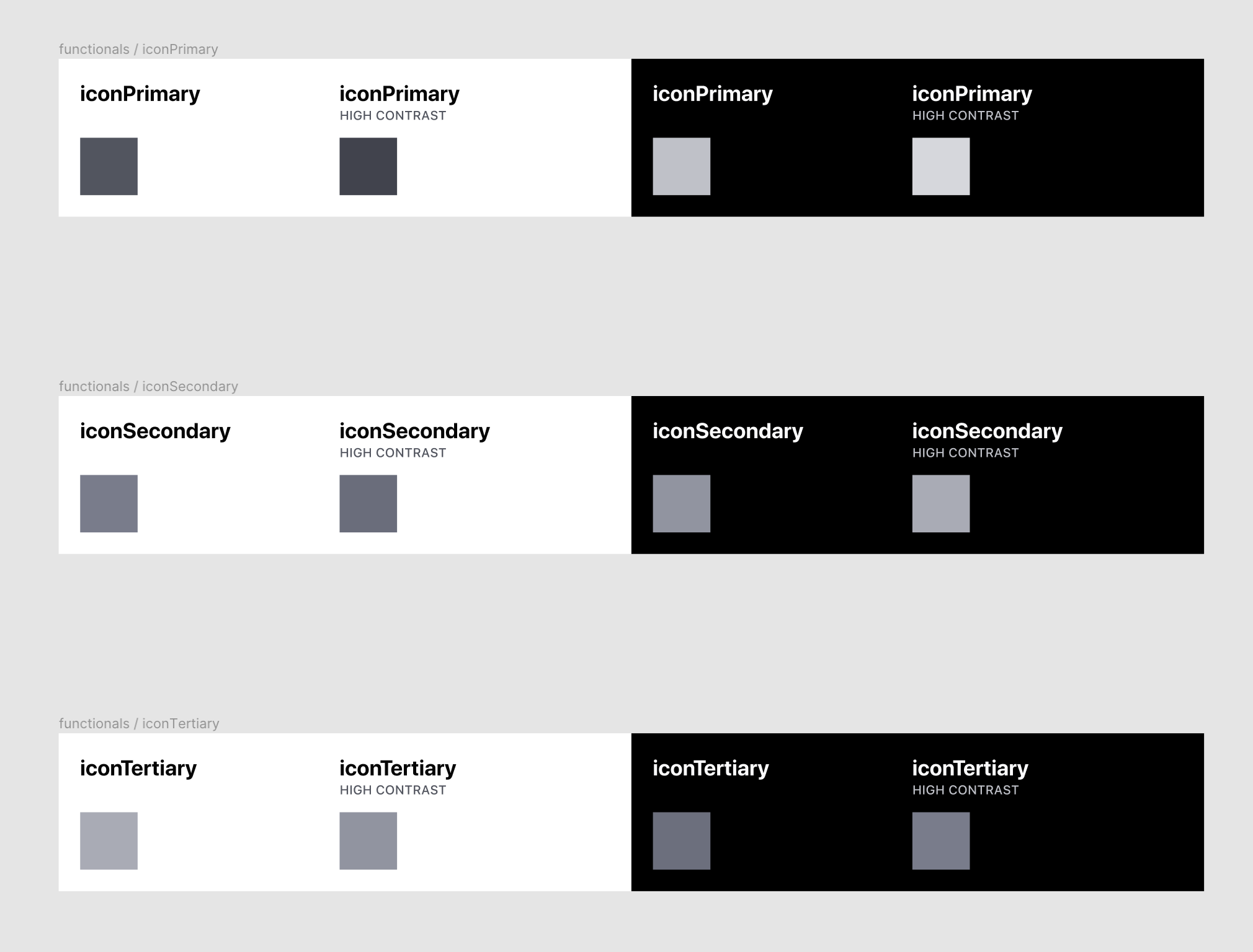
In the Mobile Design Toolkit we have two functional icon colors: iconPrimary and iconSecondary. Each of these colors implements a different brightness of gray, adding visual prominence to more important or actionable icons. But when should you use either of these colors? And when should an icon be gray versus our blue link color?
In general, an icon should be blue if it is:
We strive to use as few link tinted elements in a content view in order to draw attention to only the most important actionable interface elements. Adding too many blue buttons and icons dilutes the power of the color as a way to draw attention.
| Example | Notes |
|---|---|
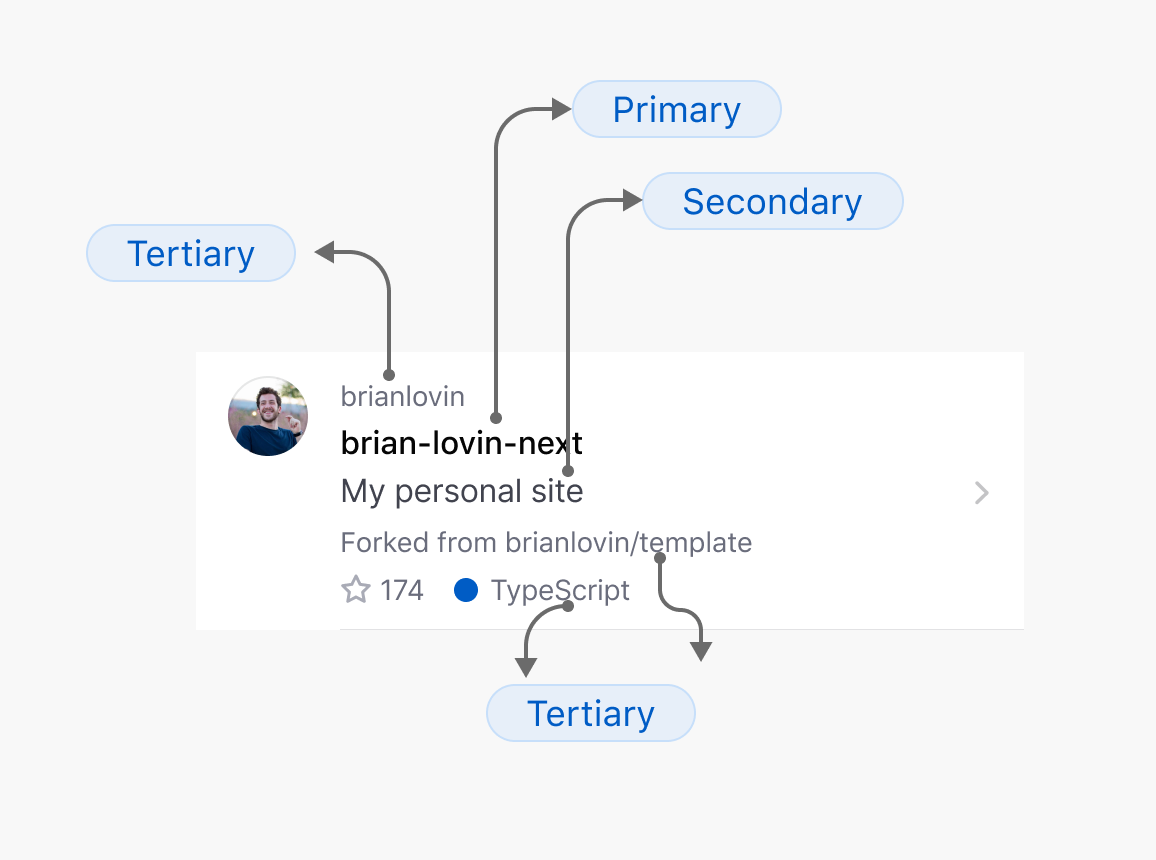
 | On the repo profile, we follow our rules that nav bar iconography is link blue, because it's part of the app's chrome. The icons in the Star and Watch buttons are also blue to match the button labels and draw attention to the highly-desirable actions that we want users to take on this screen. |
 | In the triage sheet, the primary purpose of this sheet is to manage assignees for a given issue. Because the purpose of this view is to manage (or more likely, to add) assignees, we make the ( + ) icons blue. |
Generally, an icon could be filling one of four roles:
Generally, important actionable elements and primary supporting graphics should use iconPrimary, while unimportant actionable elements and decorative accessories use iconSecondary.
Let's look at some examples:
| Example | Notes |
|---|---|
 | The header metatdata icons are unimportant decorative accessories, and not actionable, so we tint them secondary. The Pinned section icon is not actionable, but is an important accessory to distinguish this content section, so it is tinted primary. |
 | The accessory icons are not actionable, and not important decorations, so they are tinted secondary. |
 | The branch icon in the code browsing section header is an unactionable accessory tinted secondary. |
 | The commit icon is an important accessory, despite not being actionable, so it is tinted primary. |
 | The search typeahead icons are important supporting accessories to quickly distinguish the typeahead options, so they are tinted primary. |
 | The remove buttons when editing favorites are actionable, but not the primary action on this view, so they are tinted secondary. |
It's possible for icons to be other colors besides gray and blue! For example, we use yellow star icons to indicate that you, the viewer, have starred a repository. We also use green eye icons to indicate that you are watching a repository. You might also find pink hearts when working with sponsors. And of course, we use green, red, and purple as issue and pull request icon tints to represent states (open, closed, merged).
| Example | Notes |
|---|---|
 | In this example, the Star button gets a gray label and yellow icon to communicate the state of the viewer's relationship to this repository. The gray label de-emphasizes the button, because un-starring is a generally undesirable action. |
| The state of the PR where this commit was created is tinted purple to indicate the PR was merged, therefore this commit was merged, too. |
While we can define our own custom type styles at any time, we prefer to lean on system defaults. System defaults allow us to inherit an enormous amount of functionality for free: dynamic type sizes, bi-directionality, dark mode, voiceover, internationalization, and more.
Our Android app takes advantage of the Material Theming spec that allows us to use Inter as our default typeface, providing a more clear reading experience for interface text.
There are currently six functional colors used in the mobile toolkit:
textPrimarytextSeconarytextTertiarytextPlaceholderlinkIt is up to each designer's judgment, and through our critique process, to decide on the correct text values used for a screen. In general, for the primary → tertiary values, these should map closely to the visual hierarchy or importance hierarchy of content on a screen.
The link color will render a blue color, affording an actionable element on the screen (like button, or a link).