Links
Links help us navigate a website. Learn how to style links appropriately to keep them usable by all.
Overview
Links are user interface elements that navigate you to a new place or new content. Contrast this with buttons, which are designed to activate a feature.
Why?
Links can do things like help with page context, reference similar items of interest, and allow for endless connected information surfing through sites like Wikipedia. Links play a key part in your experience on the web, but without proper consideration they can be frustrating to use, skipped over, or completely unnoticed.
For screen reader assistive technology, links and buttons are expected to function differently from each other. If a link is activated and does not do what was expected, that can be disorienting and frustrating.
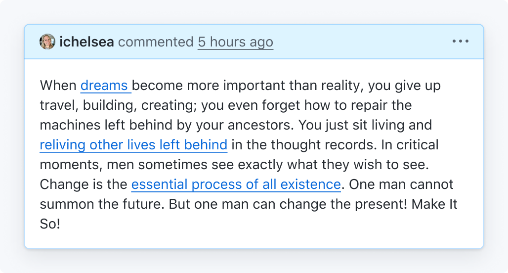
A common way a screen reader might navigate the page is by going through a list of all the links on the page. Without context, "read more" or "click here" links are not helpful.
People who have low or colorblind vision may have trouble identifying links that just use color to distinguish them from plain text, this is why keeping the underline styling on links within body text is important for identification.
How to test links
Functionality and purpose
A link's function is to navigate to a different page or new content. If instead a feature on the page is activated, use a <button>. Learn when to use a link or button.
A link's purpose must be obvious from the link text alone. If you can't get an idea of where a link will take you based on the link text without reading the surrounding text, the link text should be updated. Learn how to write good link text.
This is important because screen readers allow users to browse through a list of links, where the link text is the only clue of where a link will take you.
Visual distinction & contrast
Like normal text, a link must have a 4.5:1 contrast against the background color that it is placed on. Use a contrast checker to validate that your link meets this required contrast.
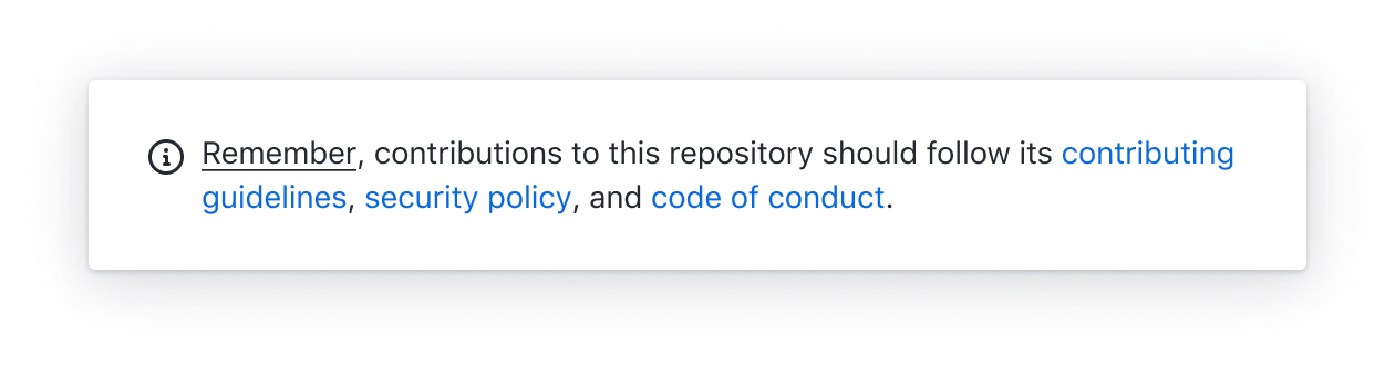
If a link is surrounded by text, it must be underlined or pass a 3:1 contrast against the surrounding text as well. Alternatively an icon, a background shape or an outline can demarcate a link.
Some examples of this are:
- links within body text
- a headline and subline which both are individual links
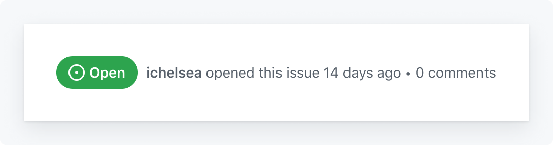
- issue numbers or usernames within a commit line
Guidelines
For designers
- Visually demarcate your links by using:
- the
accent.fgcolor in combination withfg.defaultfor the surrounding text on any of thecanvas.[...]colors - an underline for the link text
- an icon before or after the link text
- using a background shape behind the link
- using a link color that has a
3:1contrast against the surrounding text color AND a4.5:1against the background color
- the
- Make sure a link's purpose can be understood from the link text alone, without needing the surrounding context.
- Links should look like links, not buttons, except in rare circumstances, like calls to action.
Be descriptive with your links so that they can stand alone and be understood.
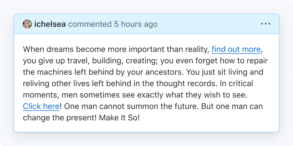
Don't use generic terms like 'click here' that can't be understood out of context.
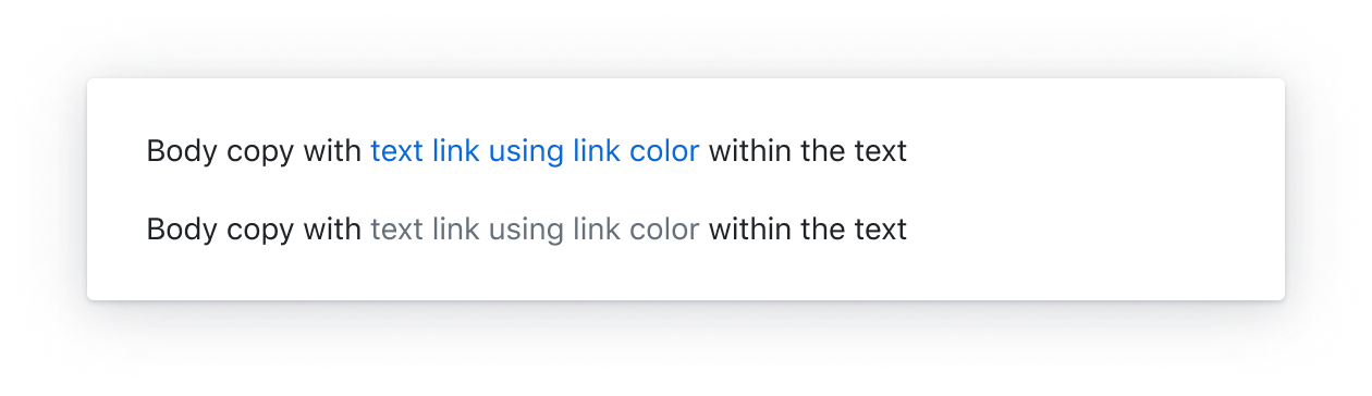
Underline links in paragraphs and sentences
Don't use underlines for non-link highlights or forget to demarcate links
Use a link color that has a 3:1 contrast against the text color
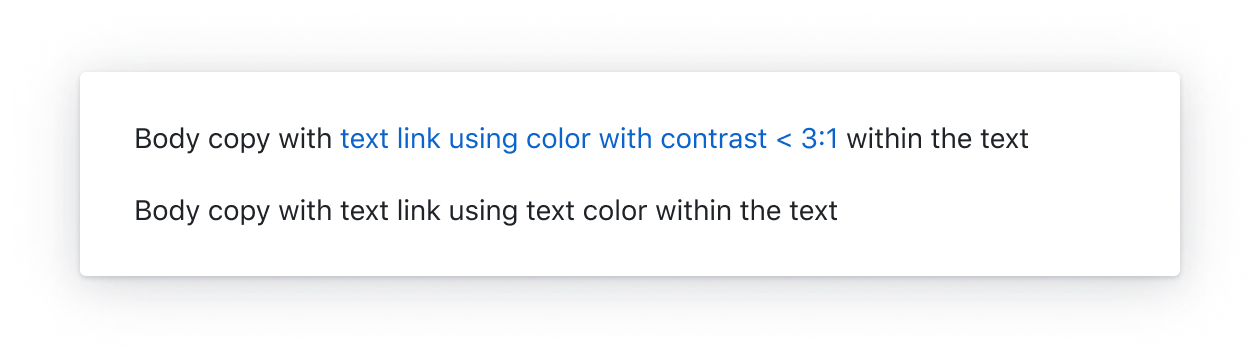
Don't use a color that has less than a 3:1 contrast against the text color for links
Use an icon or a background shape to demarcate a link
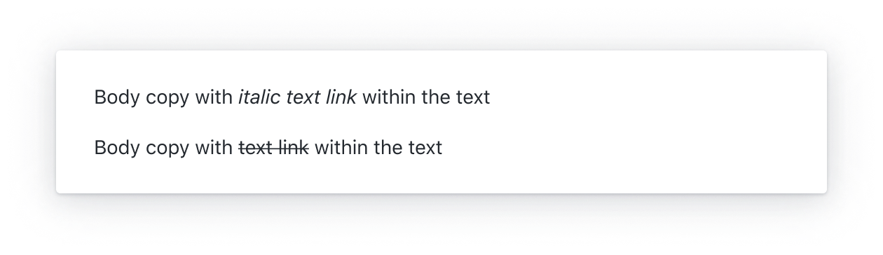
Don't use text styles like italic or bold to demarcate links
For engineers
- Use the Primer Link component
- Don't override the link styling provided in the components
- Make sure links receive our global focus indicator styling when navigating the page with a keyboard (reference: Focus management)
- Don't use the
titleattribute- Content within a
titleis inaccessible for many users, such as touch-only and keyboard-only users. If additional content needs to be associated with a link consider using a Tooltip or alternatives to a tooltip.
- Content within a
- Avoid adding side effects to link click events. Links should navigate, not affect the page.
- Don't force links to open in a new tab/window by setting the
targetproperty. - Links should always open in a new window when clicking while holding Command/Control.
Common mistakes
- Only adding an underline to a link when it has focus or is hovered over
- Underlining every link on the page. For example, a navigation list is a list of links but navigational links don't have to be underlined because the intent is understood and an underline is not needed to identify the interactive nature of the control.
Writing link text
Link text should be descriptive enough to convey the destination without relying on the surrounding text. Screen reader users often tab through links on a page to quickly find content without needing to listen to the full page. When link text is too generic like "Read more", the destination of the link is not conveyed.
It may be acceptable in some scenarios to provide a more descriptive link text for screen reader users by setting the aria-label. However, this technique will result in divergence between the label and the text and is not an ideal, future-proof solution.
Whenever possible, prefer a single descriptive link text that is available for both sighted users and screen reader users.
If you must resort to the ARIA technique to provide a descriptive link text, follow these principles:
- The visible text is included in full as part of the accessible name to avoid a violation of SC 2.5.3: Label in Name.
- The sentence that the link is a part of is well-formed and grammatical when read with both the visible text and the accessible name.
Accessible name fully includes the visible link text, "Learn more" and is well-formed with either label.
<a href="..." aria-label="Learn more about GitHub pricing plans">
  Learn more
</a>Accessible name results in poorly-formed sentence, "Learn more about keyboard shortcuts allow you to access common commands more quickly".
<a href="..." aria-label="Learn more about keyboard shortcuts">Keyboard shortcuts</a> allow you to access common commands more quickly.
As demonstrated in the examples, this technique adds more complexity to the code and can introduce more problems than it solves so only use this technique if absolutely necessary.
Additional resources
- Color to Distinguish Links from Text (requires a subscription to access the content)
- Accessibility Insights plugin: With the Accessibility Insights plugin installed, open the plugin, visit the Assessment option and select 7. Links
- WebAIM: Links and Hypertext - Introduction to Links and Hypertext
- erblint-github: Avoid generic link text