Progress bar
Progress bar visualizes one or more parts of a whole.
On this page
On this page

Usage
A progress bar is a simple chart that can be used to show how complete something is, or visualize parts that make up a whole.
Best practices

When using multiple segments, use colors that are easy to tell apart and include a legend that identifies what each segment represents.

Default to pairing the progress bar with text that explicitly shows the value(s) of the filled segment(s). Text values are not explicitly required, but should only be omitted when the progress is intentionally vague.
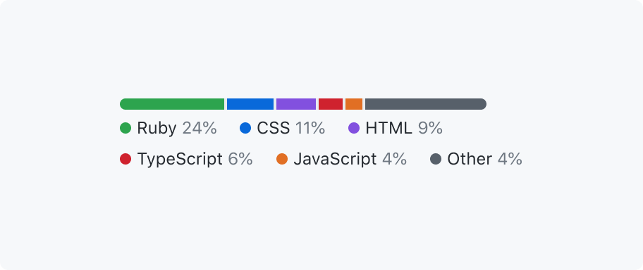
Limit the number of segments.
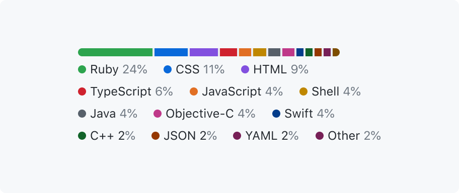
Don't overload a progress bar with too many segments.
When using multiple segments, avoid overwhelming users by with too many segments. This is especially important for narrow progress bars. Consider a different kind of chart for these cases.
Options
With multiple segments
A progress bar may use segments to represent multiple parts of a whole.

Color
The color of the filled part(s) of the progress bar may be customized. Default to using success.emphasis for a progress bar that only shows a single segment.

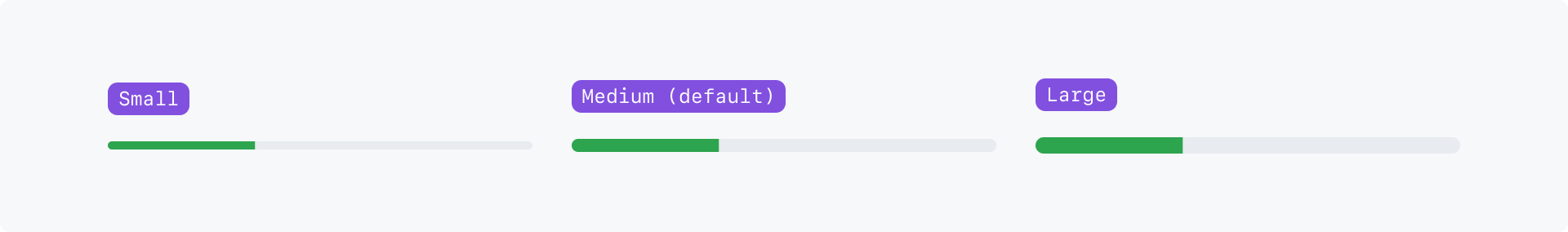
Size
The size may be adjusted to adapt the progress bar to different contexts.
Size options:
- Small
- Medium (default)
- Large
Width
By default, a progress bar will fill it's parent. However, a progress bar can be any width.

Accessibility
When rendering multiple segments, the segment colors should have a 3:1 contrast ratio with colors of adjacent segments.
Progress bars can only be interpreted by sighted users. Include a text description to support assistive technologies like screen readers.
For example, "tasks: 8 of 10 complete" for a single segment, or "tasks: 80 done, 14 in progress, 6 open" for multiple segments.

If the progress bar value is already shown as text adjacent to the progress bar, don't use a redundant label for the progress bar.