Color considerations
Color is an important aspect of creating accessible, inclusive experiences.
Overview
This guidance covers considerations that can't automatically be integrated into Primer. It supplements accessibility guidance given in the Color portion of our Foundations documentation.
Design tokens
The majority of color contrast considerations should be handled by Primer color design tokens. Ensure that solutions for the following considerations integrate design tokens as a method of creating accessible experiences.
Determining contrast
WebAIM's Contrast Checker tool is the recommended way to calculate color contrast ratios.
Level AA support
GitHub is required to honor WCAG AA-level compliance. This means that WCAG Success Criterion levels A and AA are both observed.
An example level A Success Criterion is SC 1.4.1 Use of Color. An example level AA Success Criterion is SC 1.4.3 Contrast (Minimum).
Compliance
The following guidance is based on one or more normative Web Content Accessibility Guidelines (WCAG) success criterion. This means that the guidance is based on objective requirements with implications that affect MAS-C compliance efforts, as well as international laws regarding accessibility.
An example of the difference between non-normative and normative considerations would be the difference between the overall choice of color used, and then the actual value of the color.
Non-normative choices
A design could use a dark shade of purple as the background color as a non-normative aesthetic choice. Reasons for going with dark purple could be:
- The team prefers how it looks over dark blue, dark green, dark gray, etc.,
- The dark purple is a subtle reference to a brighter purple that is a core part of main palette,
- The dark purple is part of a new branding update,
- Etc.
Normative requirements
The normative requirement for going with dark purple would be comparing the final computed color value used for the dark purple background color against the color value used for text.
The APCA
The Advanced Accessible Perceptual Contrast Algorithm (APCA) is a proposal and is not normative. In terms of WCAG, and therefore, MAS-C compliance, this means that color contrast is valid only if it meets WCAG 2.2 criteria.
A color value that is APCA-compliant might not be WCAG-compliant until APCA is integrated into WCAG 3.0. WCAG 3.0 is still a work in progress and currently does not have an anticipated release date.
Don't rely on color alone
Show state with more than color
Color vision deficiency is different for different people. To make sure everyone can understand and use your UI you should show state with more than a change in color.
Unless color is only used as a visual "flourish", the information that the color conveys must be present either in the text (e.g. in the case of buttons, the actual wording of the button label), or through some additional visual cue (such as an icon).
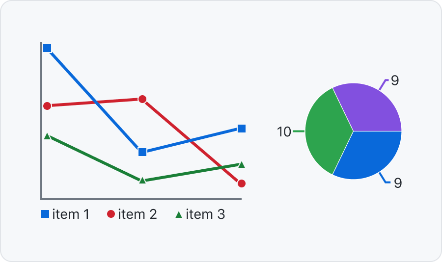
Connect labels to graphs with lines or patterns
For charts and graphs you can position the labels on top or close to each section. You can also use patterns to distinguish different parts.
Visual themes
GitHub offers two parent themes:
- Day (light), and
- Night (dark).
Each parent theme has a default appearance, and then a suite of sub-themes. Sub-themes include considerations for high and low contrast experiences, as well as certain vision conditions.
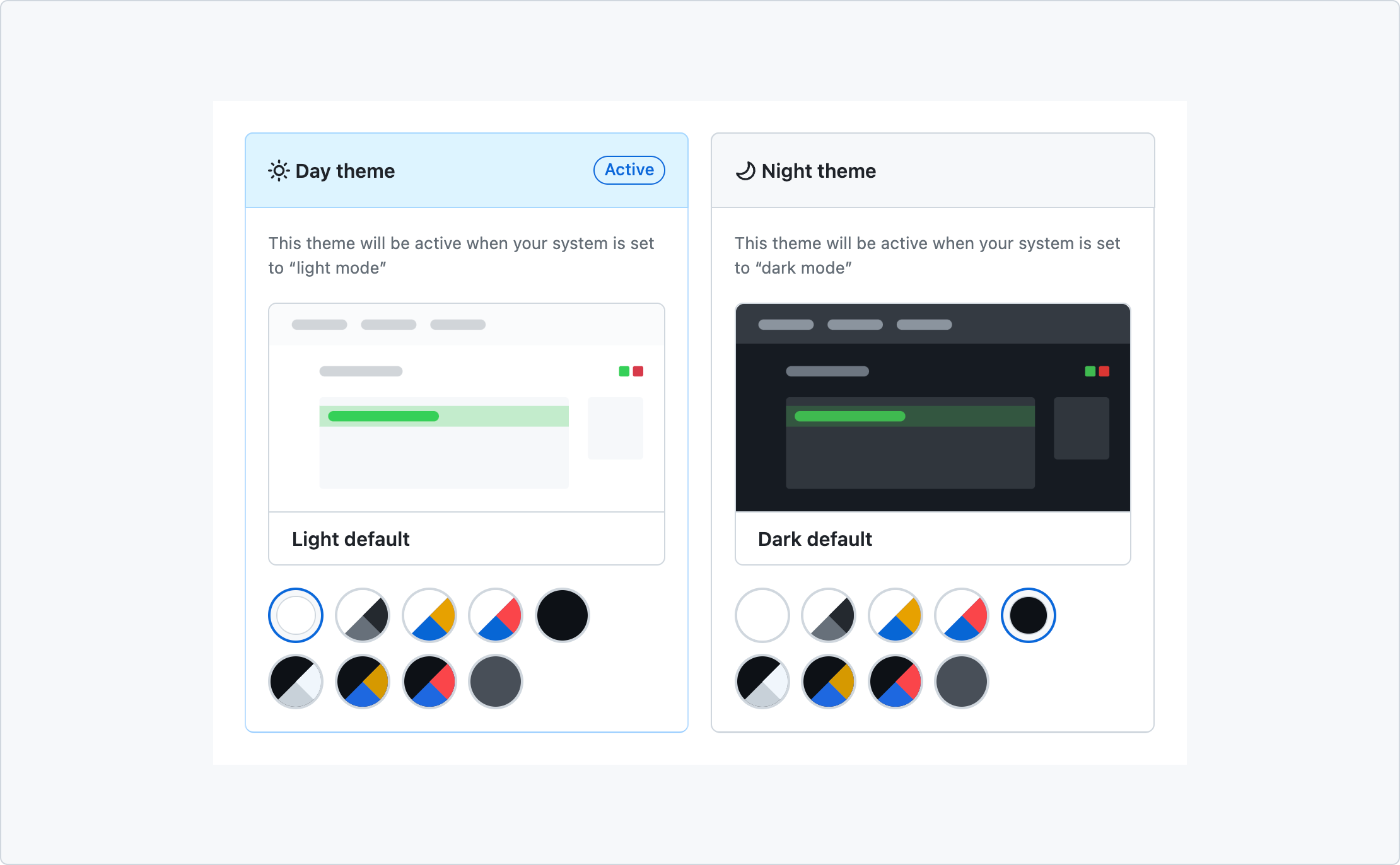
It is possible to set GitHub to use a dark sub-theme when a parent Day theme has been set, and vice-versa. This allows a user to have a fine-grained control over their experience.
Default theme
GitHub uses:
- The default Day (light) theme when a user visits the site in a logged out state and their operating system is set to light mode.
- The default Night (dark) theme when a user visits the site in a logged out state and their operating system is set to dark mode.
- Whatever theme the user has set in their account settings.
When not logged in, users are unable to adjust the theme in the Appearance settings.
Because of this, the default Day and Night theme must both satisfy WCAG criteria for color-related concerns. From a high-level, this means that all GitHub content displayed using the default Day and Night theme must:
- Pass color contrast requirements, and
- Have the mechanism for accessing and changing the theme be fully WCAG compliant.
This is the strongest guarantee we have that:
- Content can be perceived—and therefore understood and used—across a wide range of vision conditions, and that
- The mechanism to adjust GitHub's theme can be operated by the widest range of input modes.
This allows users to use GitHub in a logged-out state. If a user is logged in, it also enables them to address their own specific usability and access needs, as well as aesthetic desires.
Non-default themes
All Day and Night sub-themes do not need to meet WCAG color contrast requirements, provided all default Day and Night theme content is accessible. This guidance is derived from WCAG 2.2 Technique G174.
Certain themes are specifically designed to create a low contrast effect, notably the Dark Dimmed sub-theme. In this use case, a user selecting this theme is likely intentionally expressing a desire for an experience with less visual contrast.
Like other theme selections, this may be to satisfy:
- Aesthetic sensibilities,
- Access needs that are derived from visual conditions that make a higher contrast experience unusable, or
- A combination of both.
In the case of access needs, a higher contrast experience may actually be less accessible for the user.
The availability of the Dark Dimmed theme treatment allows users to customize their GitHub experience without having to resort to browser extensions or other user-hosted modifications. Of note is the portability of this theme, in that it will automatically be available across multiple sessions, browsers, and devices.
GitHub should strive to ensure all themes that don't specifically deal with an intentionally-lowered contrast experience are color contrast compliant. While this is not a normative requirement, it proactively helps an unknown number of users with unknown access needs.
High contrast themes, high contrast mode, and forced colors mode
GitHub offers two high contrast sub-themes:
- Light High Contrast, and
- Dark High Contrast.
In addition some, but not all operating systems offer forced color and high contrast mode experiences.
High contrast themes
These are provided by GitHub.
High contrast themes can be enabled with or without forced color and high contrast modes enabled. Some users may be unaware of, or unable to access these modes. Other users may not need them.
High contrast mode
This is not provided by GitHub.
A high contrast mode is a signal to the operating system to increase the visual distinction between different UI elements. On the web, it is a flag that can be targeted with a media query.
The presence of an enabled high contrast mode experience does not guarantee a high contrast web experience is generated—that is an experience the website has to intentionally provide.
GitHub currently does not auto-opt a user into its high contrast themes if a user has enabled high contrast mode on their device.
Forced colors mode
This is not provided by GitHub.
Forced color mode is another media query. Unlike high contrast mode, forced colors mode automatically adapts all operating system content. This includes all web content.
A forced color mode will update all GitHub content's visual presentation regardless of what theme a user has selected. It uses a suite of heuristics to determine content meaning and then assign a dynamic color keyword value to it.
Forced color mode content presentation should not be overridden to satisfy aesthetic desires. Instead, it should only be lightly adjusted to ensure maximum legibility and accuracy of applied color keywords.
Inputs and buttons
Different kinds of UI have their contrast compliance determined in different ways. This is because different parts of them are visually significant for understanding purpose.
The difference between inputs and buttons may be confusing. Understanding the difference between the two types of UI helps to understand why they are evaluated differently for color contrast purposes.
At a high-level:
- Buttons perform a predetermined action when pressed. Examples of this are submitting form input, triggering a dialog, or saving user-entered content.
- Inputs collect information for eventual submission. Examples of this are single and multiline text-entry areas, checkbox selections/radio choices, and comboboxes.
Inputs and buttons are combined to form data collection and transmission experiences such as a contact form or a Pull Request submission.
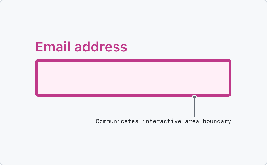
Inputs
Being able to perceive the boundaries of an input is vital. Meeting WCAG color contrast requirements helps to ensure the widest possible range of users can perform the data entry required to operate GitHub successfully.
Input considerations
Broadly-speaking, there are four overall considerations for input contrast:
- Text,
- Borders,
- Selected state, and
- Validation state.
Combined, meeting contrast requirements allow a user to understand:
- What the input is for,
- What area of the input a user can interact with,
- What information a user has entered into the input, and
- What state the input is in.
If a computed color value in any of the four considerations is not compliant, it may endanger one or more portions of user understanding and operation of the input.
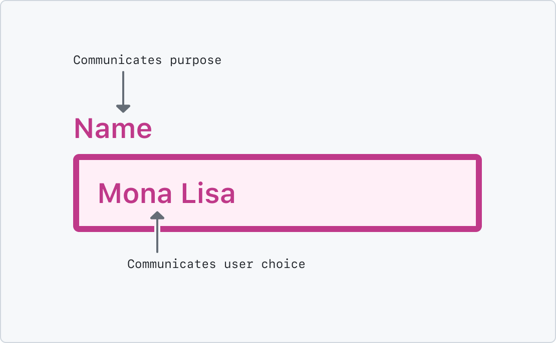
Input text contrast
Text portions of an input must meet a contrast ratio of 4.5:1 for "normal text", or 3:1 for "large text". This applies to both an input's visible label and its user-provided text content.
The majority of GitHub input text size is "normal text". Both "normal text" and "large text" are WCAG-specific terms. More information about this can be found on the Key Terms subsection of SC 1.4.3: Contrast (Minimum).
Input border contrast
Borders communicate the boundaries of an input, and are considered non-text contrast. This includes inputs that allow for freeform user input such as text, and also pre-specified inputs such as checkboxes.
Borders of an input must meet a contrast ratio of 3:1. This is calculated by the border's computed color value compared to the computed background color the input is placed on.
The contrast of the input's border color compared to the input's background color does not need to meet a contrast ratio. The color of the input's text against its background color still needs to be compliant, however.
Inputs without visible borders must use their background color instead. In this case, the required contrast ratio is 3:1, with the computed input background color and the color of the background of what the input is placed on.
Input selected state contrast
Selection state communicates if a user has chosen an input option, and is considered non-text contrast. Examples of this are a checkbox's check or a radio's dot.
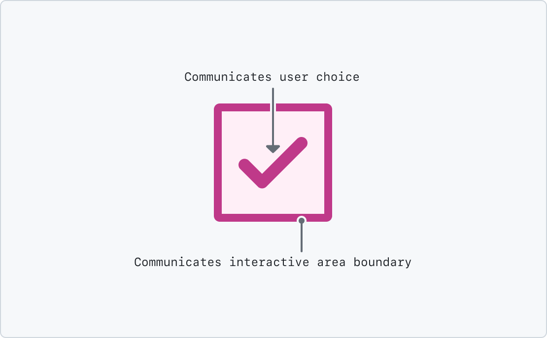
Selected state of an input such as a checkbox must meet a contrast ratio of 3:1. This is calculated by the border's computed color value compared to the computed background color the input is placed on.
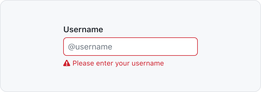
Input validation state contrast
Validation state communicates if the content a user has submitted meets the intake requirements or not. Examples of this are an inline error message with a text input, or a checkmark icon to indicate password criteria have been met.
Validation state must not rely on color as the sole way of determining if an input is valid. Accompanying text or icons can help accomplish this.
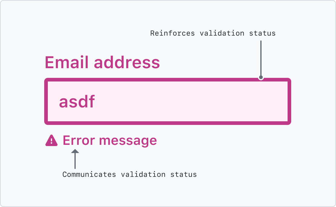
- If the validation message is only text, it must meet a contrast ratio of
4.5:1for "normal text", or3:1for "large text". - If the validation message is only an icon, it must meet a contrast ratio of
3:1. - If the validation message is both text and an icon, it must meet a contrast ratio of
4.5:1for "normal text", or3:1for "large text". In this context the icon is considered decorative. It is still encouraged to make the icon meet a3:1contrast ratio, however.
Contrast for validation state is calculated by the text or icon's computed color value compared to the computed background color the input is placed on.
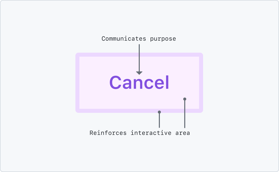
Buttons
Being able to perceive the name or icon of a button is vital. Meeting WCAG color contrast requirements helps to ensure the widest possible range of users can perform the actions required to operate GitHub successfully.
Button considerations
Broadly-speaking, there are four overall considerations for button contrast:
- Text,
- Icons,
- Borders, and
- Disabled state.
Combined, meeting contrast requirements allow a user to understand:
- What the button is for, and
- What area of the button a user can interact with.
Button text contrast
The visible text portion that communicates the button's purpose must meet a contrast ratio of 4.5:1 for "normal text", or 3:1 for "large text".
The majority of GitHub input text size is "normal text". Both "normal text" and "large text" are WCAG-specific terms. More information about this can be found on the Key Terms subsection of SC 1.4.3: Contrast (Minimum).
Button icon contrast
Icons can either be:
- Functional, or
- Decorative.
Functional icons
If the icon is the sole means of determining a button's purpose, it is considered functional. An example of this is an IconButton.
Functional icons must meet a contrast ratio of 3:1. This is calculated by the icon's computed color value compared to the computed background color the input is placed on.
Beyond the scope of normative WCAG guidance, a further consideration is if the icon's meaning has cultural considerations or represents abstract functionality a user may not be familiar with.
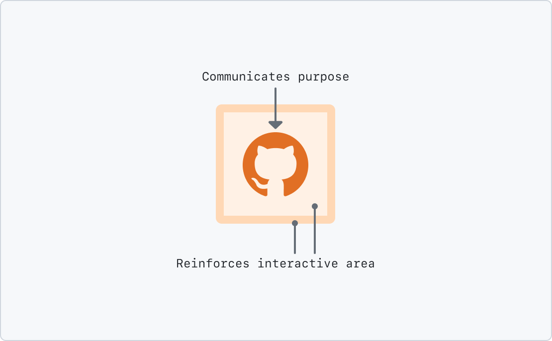
Decorative icons
Buttons with a text label that also have an accompanying icons can consider their icons as decorative. Decorative icons do not need to meet WCAG-compliant contrast ratios.
The reason for this is that the text label communicates the input's purpose, provided its computed color value is WCAG compliant. The icon in this circumstance reinforces the text label.
An example of this is a button with both a trash Octicon and a text label of "Delete".
Beyond the scope of normative WCAG guidance, a further consideration is if making a decorative icon color contrast compliant is useful for aiding in facilitating understanding, even if it is not required to be.
Button border contrast
The contrast of a button's border color compared to the input's background color does not need to meet a contrast ratio. Only the button's text or functional icon does.
Button disabled state contrast
Broadly-speaking, buttons should not be disabled until form validation criteria has been met. An example of behavior to avoid is disabling a submit button until a user has filled out all required fields.
If a button needs to be placed in a disabled state, it does not need to be color contrast compliant. Other WCAG criteria may affect this treatment, however.
Beyond the scope of normative WCAG guidance, a further consideration is there are other ways to visually communicate a disabled button, or to design the system in such a way that a button cannot circumstantially be placed in a disabled state.
While a button's disabled state is exempt from normative compliance, consider that the control may be invisible or unpredictably disappear from the perspective of a user experiencing low vision conditions.
Patterns that might be confusing
Following are examples of unique GitHub UI that are worth specifically documenting:
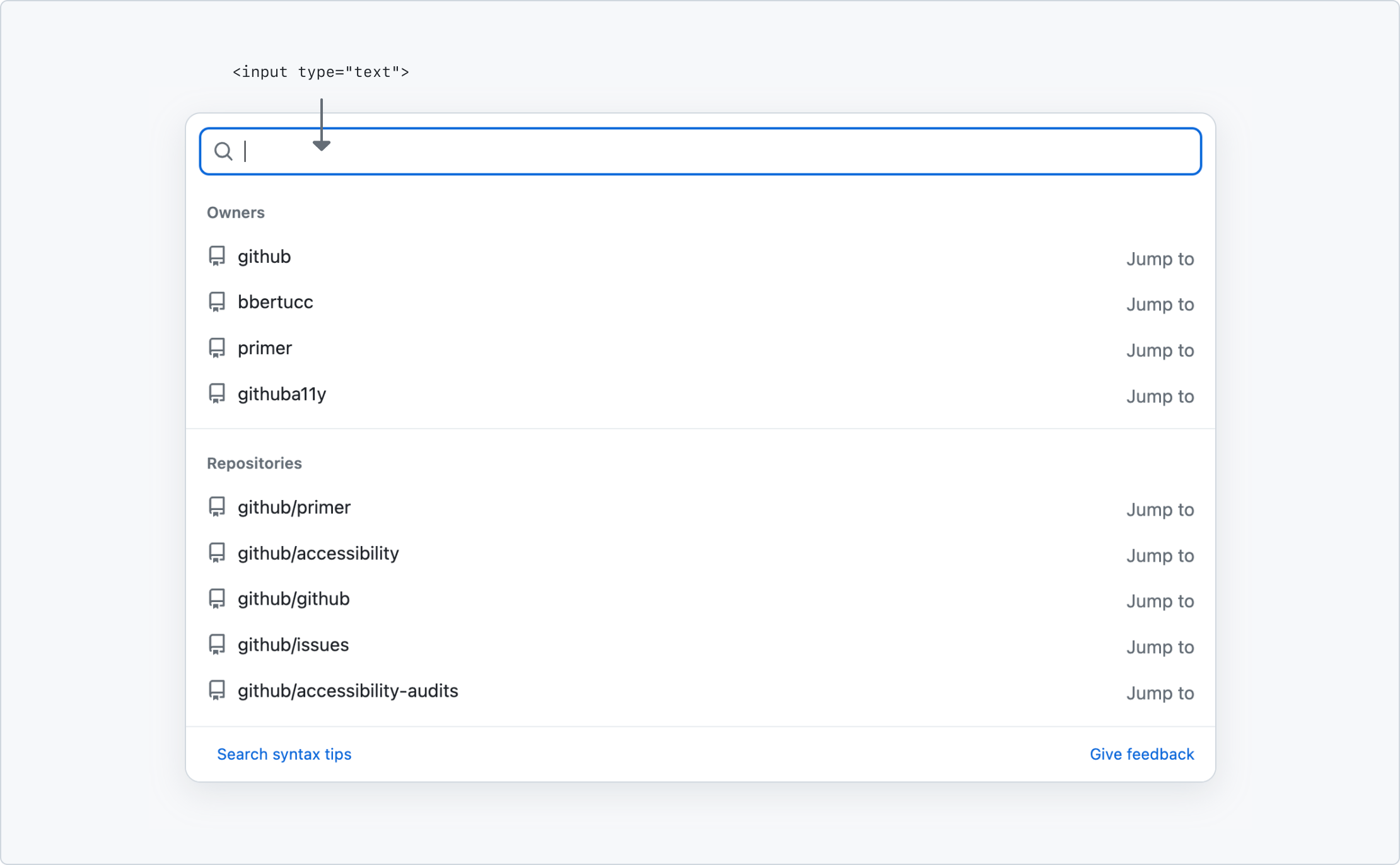
GitHub's search
GitHub's search visually looks like an input, but is coded as a button. Use of this approach is discouraged. The following documentation communicates how normative WCAG color contrast rules apply.
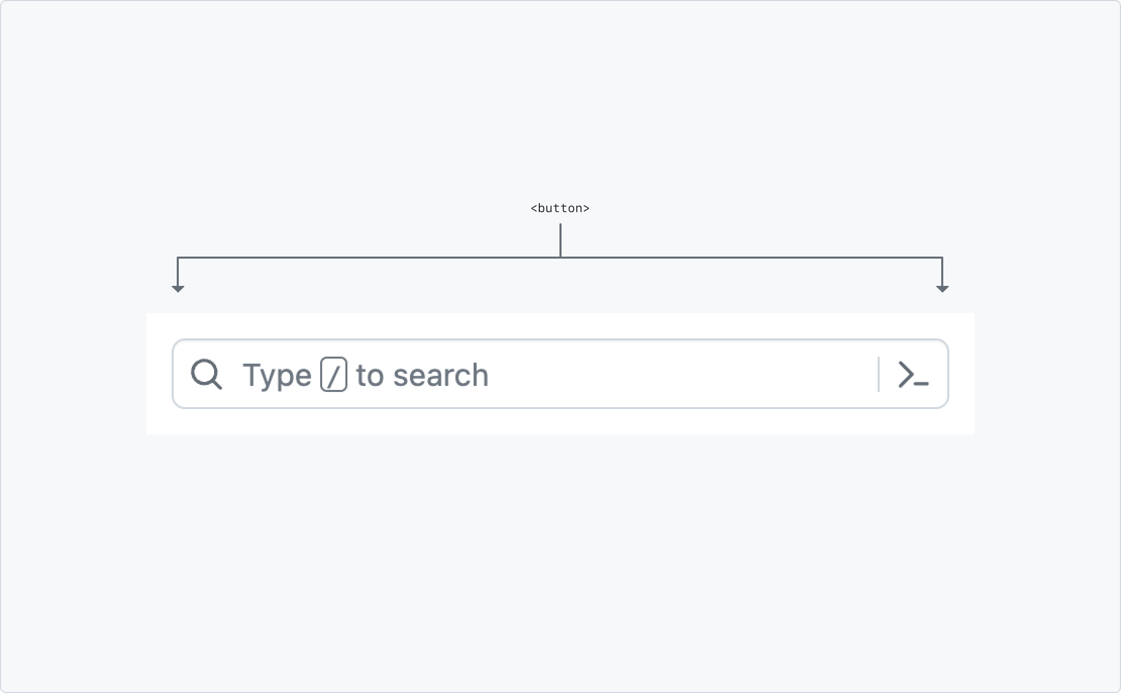
This is because it triggers the dialog that displays the full search interface—a user cannot directly enter text into a faux-input field. Because of this, it is treated like a button in terms of normative color contrast evaluation.
When the search dialog is displayed, the input that a user types in is treated as a text input for color contrast purposes.
Further reading
Resources, articles, and guidelines that informed this documentation:
Resources
- Assistive technology: Operating System and Browser Accessibility Display Modes
- WebAIM Contrast Checker
- Technique G174: Providing a control with a sufficient contrast ratio that allows users to switch to a presentation that uses sufficient contrast