Data visualization
Data visualizations are helpful tools for conveying complex data in an engaging and understandable way. They're commonly used in dashboards and insights pages.
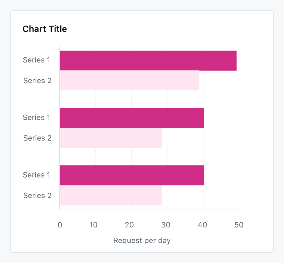
Chart anatomy

| Name | Description | Required |
|---|---|---|
| Header | Use to describe the contents of your chart. Keep the header title concise and descriptive. | Yes |
| Subheader | Use a sub header to provide additional context. If you choose not to show axis titles on your chart, you must give users context to the data on screen via a short description. ex. Showing new repositories by date | No |
| Legend | Only show a legend when showing more than 1 data set | Sometimes |
| Marks | Chart marks are how you represent data on a chart. Common types of marks include bar, line, and area. | Yes |
| Marker | A visual indicator (circle, square, triangle, etc.) that is placed on every intersection of a mark line and a vertical graph line | No (optional) |
| Axis Titles | Axis titles help users understand what is being measured in the displayed chart. If your chart doesn’t use titles, you must provide context to users via a description in the sub header. | Sometimes |
| Axis Labels | Axis labels show the units of measurement for the chart. | Yes |
| Graph Lines | Graph lines help users read the chart marks by connecting context to the axis labels. Some chart types only use horizontal lines and others only use vertical lines. | Yes |
| Axis | The axis borders define the bounds of the chart. | Yes |
| Point | A point is a visual cue that is highlighted on hover. | Yes (used for line charts only) |
| Plot line | A straight line on the x or y axis that show a specific value, e.g. the max or an important date | No |
| Crosshair | A crosshair is a visual cue shown in line charts to help users connect the point to the axis label. | Yes (used for line charts only) |
| Tooltip | Tooltips are shown on hover to display data at a given point on a chart. Note that a tooltip may show values for single category or all categories in a chart. | Yes |
| Toolbar Menu | The toolbar menu contains actions for additional chart interactions. For many chart types, users should be able to preview the data in a table and download the data in a CSV format. | Yes for most simple charts |
Charts we support
You may see a number of different types of charts across GitHub, including the prolific contributions graph. Today, we support the creation of a specific set of charts and data visualizations, including:
- Bar charts
- Line charts
- Area charts
- ProgressBars
We don't currently support the creation of new:
- Donut charts
- Sparklines
Axes
By default you should label all axes of a chart. The label should be concise but should be understandable on its own such that a screen reader user does not need to remember the title of the chart to make sense of the axis label.
Sometimes the axis label can be omitted if it is clear what is being displayed on the axis without further content, such as a date.
Axis labels must have a 4.5:1 contrast against the background.
Axes must meet a 3:1 contrast against the background. They should use the --borderColor-default design token.
Graph lines do not need to meet graphical color contrast.
Lines
Mark lines (line chart, stacked area chart) and plot lines must have a 2px width.
Mark lines must always use different stroke styles. The first line must always use a solid style, and the following must use other styles to easily differentiate them without the use of color.
If line markers are used, they must differ for every line, starting with a circle shape.
Legend
If only one item is shown on a chart, the title can be used to describe the shown item (e.g. Copilot usage) and the legend can be omitted.
Whenever more than one item is shown in a chart, a legend must be shown. One exception is when the elements are directly labeled. This could be by showing labels next to the area in a pie chart or below every bar in a bar chart.
Limits
Line charts
We recommend using no more than five lines. If you have more items in your data set, think about how this could be divided into subgroups with fewer items.
Stacked area charts
We recommend using no more than three lines if possible. Stacked area charts are limited to a maximum of 5 items, as more make the chart hard to read and comprehend. If you need to show more items, use a line chart.
Bar & Column Charts
When comparing different items, limit the chart to no more than ten bars or columns.
If you are visualizing amounts of the same data type (e.g., Copilot requests per month) over time, exceeding this limit may be acceptable.
Grouped bar / column charts: Keep the number of categories per group to four or fewer and try to limit the chart to no more than six groups.
Stacked bar / column charts: Keep the number of segments to 5 or fewer and limit the chart to no more than 10 bars.

Pie or donut charts
Because these charts are about comparing portions, it is best to use no more than five slices. Sometimes it is possible to combine the smaller slices into an "other" category.
Choosing chart colors
It is impossible to define a large set of colors that works across the entire color blindness spectrum and has a 3:1 contrast ratio between all colors.
This is why any chart needs to use more than only color to differentiate items.
Additionally, chart types that position areas next to each other like progress bars or pie charts must use spaces or dividing lines with a 3:1 contrast against the sourrounding elements to separate those areas.
All chart marks (lines, bars, charts, areas, slices) must meet a 3:1 contrast ratio against the background. If an outline is used, either the outline or the fill must meet a 3:1 contrast ratio.
While there aren’t specific rules on contrast between chart mark colors, it is recommended to use colors of different lightness to make them easier to differentiate.
Available mark colors
Available muted colors
Muted data colors must only be used in combination with an outline as they do not pass a 3:1 contrast ratios. Typical use cases are bar charts with an outline or stacked area charts.

Accessibility
Contrast requirements
| Elements | Required contrast |
|---|---|
| Marks to background (e.g. lines or bars) | 3:1 |
| Marks to graph lines | n/a |
| Graph lines / axes to background | n/a |
| Any text to background | 4.5:1 |
| Area fill below line in stacked area chart | n/a |
| Marks to other marks | n/a |