Degraded experiences
Ensuring that a page still renders and primary experiences are still available during downtime of optional service dependencies.
Using the "blast" analogy for availability incidents, graceful degradation is about reducing the effect of a blast, not about preventing the blast or reducing the blast radius. The "blast" still happens and affects all experiences it did before, but with a reduced effect.
Don't try to conceal or downplay that something is wrong. Communicate that there is a problem and guide users around that problem as much as possible.
Whether to render an error page instead
If there's an outage that doesn't affect the primary experiences of the page, it's best to render a degraded page to reduce disruptions. Don't attempt to render a page that won't be useful to the user.
GitHub's internal article about graceful degradation describes the difference between primary and secondary experiences:
Primary experiences are those experiences that are essential for the page to be useful to the user. In case of availability incidents, if any of these experiences can't be provided to users, then it makes sense to show an error page instead. For example, on the issue page, the issue title and description are primary experiences.
Secondary experiences are those experiences that are not essential for the page to be useful to the user. Instead, they enrich the page to make it more useful to some users for certain workflows. In case of availability incidents, if any of these experiences can't be provided to users, then it makes sense to show the page without them as the page is still likely useful to most users. For example, on the issue page, the unread notifications indicator is a secondary experience, as are the counters for the number of projects, issues, PR's, etc. in the repository navigation bar.
— The Hub - Graceful Degradation in the Monolith (only available to GitHub staff)
Global system notification
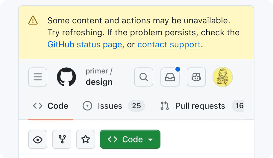
If there is a critical system error that will degrade the user experience, show a Banner at the top of the page above the global navigation. Having a global Banner helps set the expectation that some parts of the usual UI might be missing or broken. Default to using the "warning" variant of the Banner.
Explain what's wrong and, if possible, link to a page with more detailed information. For example, if there's a database outage, we could link to the GitHub status page.
In addition to a global Banner, we should inform users about availability issues in context. The following guidelines discuss how to handle outages in the context of the affected UI.
Degraded page content
Before making a decision about how to handle UI with unavailable content, check if it already has guidelines on handling errors or empty states.
Replacing UI with a message

We don't want users to think they've suffered data loss. If we know a user created something, don't show a generic "empty state". It's better to explain that it's unavailable, or remove the entire section from the page (including the section's heading). For example, I might think my repositories were deleted if I'm on an organization page (like https://github.com/primer/) and the repositories aren't listed there.
Ideally we can strike a balance and give the user just the right amount of context without overwhelming them with error messages. A page with too many error messages could communicate an unnecessarily reactionary and negative tone. As a general guideline, we suggest limiting pages to 5 or less outage messages.
Inline content and smaller elements
Smaller parts of the UI that cannot be accurately rendered but are too important to exclude entirely can often be replaced with a short error message.
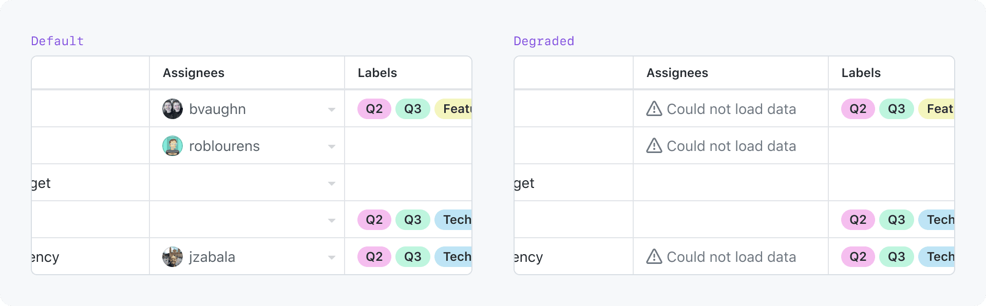
By default, replace the affected content with an error message. Show a warning icon before the message to help differentiate it from non-degraded content. The message may be colored with fg.warning to draw more attention to it.
Be mindful that rendering too many error messages on the page in fg.warning could be jarring and make the page feel broken instead of degraded.

Panels and larger areas
If the affected area is large enough, replace the affected UI with a blankstate component that explains why the expected UI isn't there.
Blankslate guidance for degraded content

- Leading visual: Use the alert icon. Default to using
fgColor-mutedas the fill color. UsingfgColor-attentioncould be too harsh and over-emphasize the error. Reference: Primer Primitives functional colors. - Primary text: You may optionally use the primary text for a title that succinctly describes the error.
- Secondary text: Use the secondary text to describe what's wrong and how (or if) the user can do anything to get around the issue.
- Secondary action: Use the secondary action for any action or link to places with more information.
We have yet to identify a case where a primary action would be appropriate. Theoretically, a primary action may be appropriate if it initiates an action that will resolve the problem.
For help with writing error copy for the Blankslate component, see the following parts of the empty state guidelines:
For more information about the Blankslate component, reference the Blankslate interface guidelines.
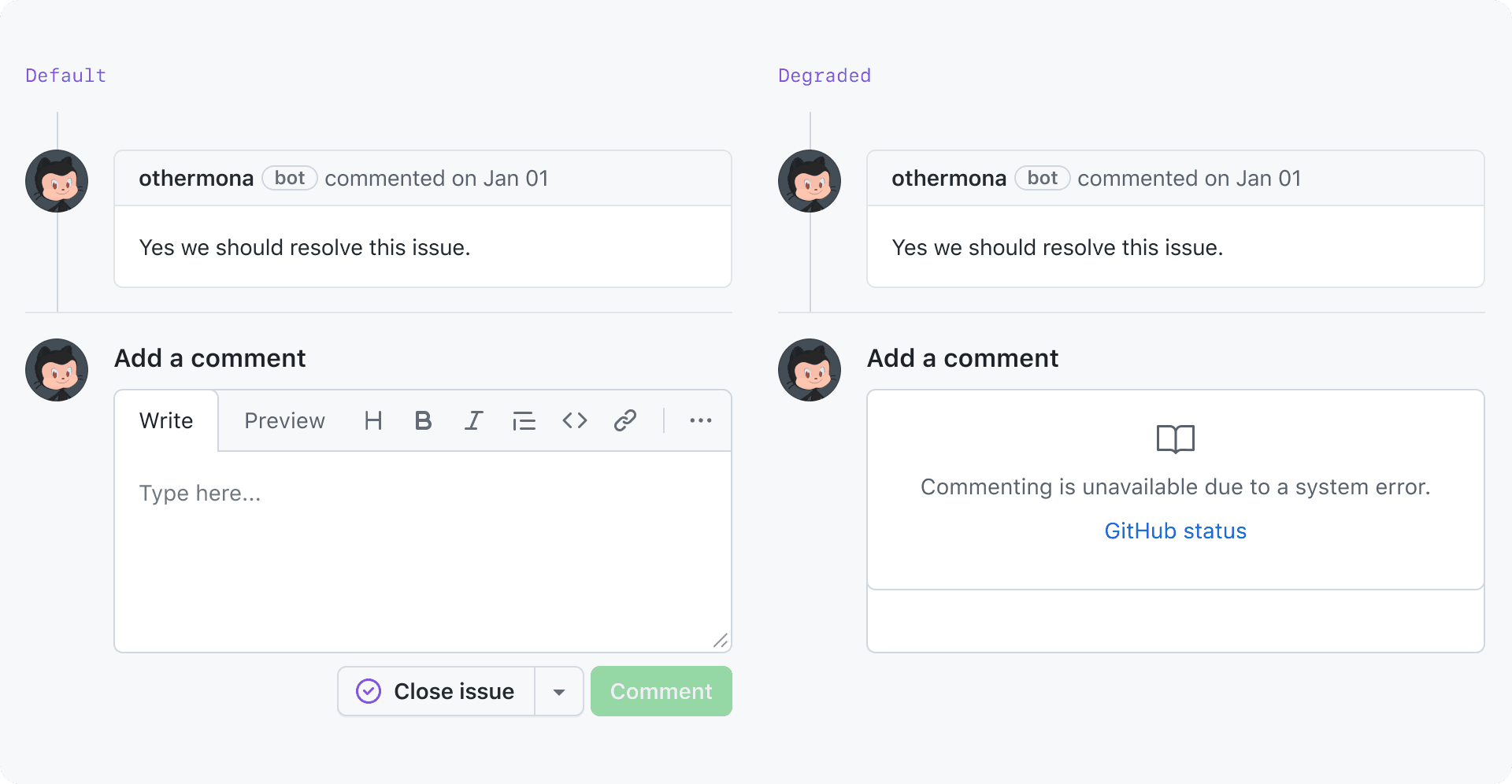
Dialogs (modal and non-modal)
If the content of a Dialog is not critical and cannot be rendered, prevent the Dialog from even being opened. For non-critical Dialogs that appear on hover, remove the hover interaction. For non-critical Dialogs that appear on click, remove the button that triggers the Dialog. For example, if a user's profile data cannot is unavailable, don't show a hovercard when their avatar is hovered.
If the Dialog is a core part of a workflow, replace the content of the Dialog with a message explaining why the expected UI isn't there. If you're using a Dialog component that supports error states (for example, SelectPanel), follow the component's guidelines for rendering error messages.

If you're not using a component that supports error states, replace the content of the Dialog with a blankstate component explaining why the expected UI isn't there.
If you're not using a component that supports error states, replace the content of the Dialog with a Blankslate component explaining why the expected UI isn't there.

Removing UI
Be mindful when choosing to remove affected UI without explanation, as this could cause confusion for users about whether that part of the UI is hidden due to an error, or if it's been permanently removed.
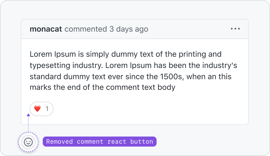
However, it is acceptable to remove UI that's not critical to core workflows and render the rest of the page without that UI. For example: choosing to hide unavailable activity indicators.
Examples of UI that we do not recommend removing:
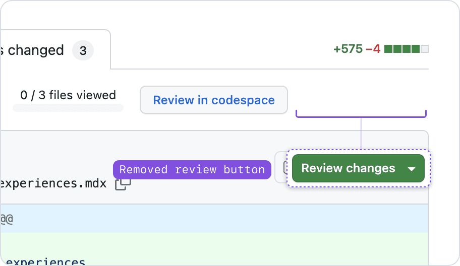
- The comment box on issues and pull requests
- The "Request changes" button in the pull request "Changes" tab
- Submit buttons on forms
Handling unavailable counts
When the data required to calculate a count is unavailable, default to hiding the number. If the count is shown inside of an interactive element, a tooltip may be displayed on focus and hover to explain the missing count.
Handling activity indicators
When the data is unavailable to determine whether to show an activity indicator (most commonly used for notification badges), default to hiding the indicator.

Degraded navigation
Some links can be static (for example, https://github.com/), but many links are made from dynamic data (for example: https://github.com/{org}/{repo}/issues/{issue-number}).
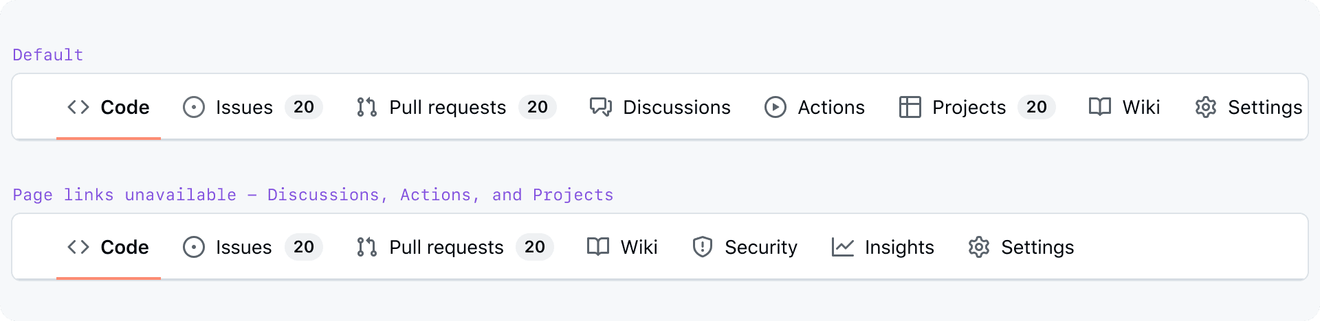
When a dynamic link in the navigation is not yet available, fall back to not rendering it.
If the page is in a state where we're not sure if a link is available, the navigation item should be put in a loading state. Refer to the pattern guidelines for loading for more information.
Global navigation header

Never suppress rendering of the global navigation header. Rendering a page without global navigation header could make a user feel stuck. Instead, suppress rendering of individual navigation items affected by a system error.
Most of the links in the global navigation header are static and will not need to be degraded anyway.
Global navigation side sheets
The left and right global navigation side sheets lazy-load some of their content when the nav is first opened. For example, repos and teams in the left global navigation side sheet.
If the user can see a loading state before a failure, inform them that there was a failure. If the user does not see a loading state before a failure, you may skip rendering the affected links. See the interface guidelines about loading patterns for more information about how to handle navigation loading states.
If we know specifically what groups couldn't be loaded, provide those details in the error message. Otherwise, show a generic error message.

Degraded side sheet group actions

If the data to render the "Show more" link or button at the bottom of a NavList group is unavailable, just don't render it.
If the data to render the search button in a NavList group is unavailable, just don't render it.
Page navigation
Common types of page navigation include UnderlineNav (for example, a repo page) and NavList as sidebar navigation (for example, settings pages).
UnderlineNav
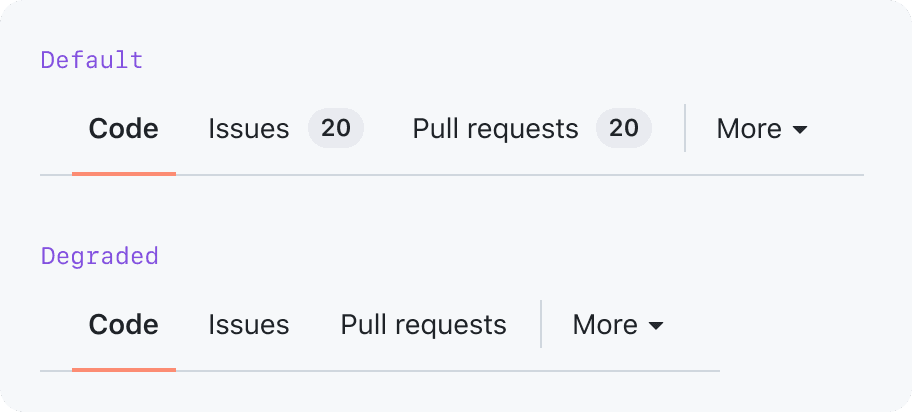
There may be cases where a page has to degrade its own navigation. If the data required to render a page navigation link is unavailable, don't render the navigation link.
If data required to render notification badges or counts is not available, don't render the badge. This was also mentioned above in the Handling unavailable counts section.
NavList
If a NavList is not inside a side-sheet that lazy-loads its link data, you can render inactive items immediately. This follows the same inactive item pattern as ActionList.

Degraded interactions
Handling non-functional buttons

Removing a non-functional button
Default to removing non-functional buttons from the UI. Don't remove buttons that are critical to a user's workflow—it may be disorienting.
Indicating a button is non-functional without disabling it
If a button is too critical to be omitted and responds to user input by showing more info about why it's non-functional, use an inactive Button.
Inactive button labels text still need to meet an accessible color contrast ratio.
For more information, see the the inactive Button guidelines
Handling ActionLists and menus with non-functional items
The ActionList and ActionMenu components provide an inactive state for their items. See their documentation pages for more information:
Handling degraded forms
Refer to the degraded form experience section of the form pattern guidelines.
Waiting for a timeout
There could be cases where we're waiting for data to load before determining that it's unavailable. In this case, refer to Primer's general loading state guidance. If the component has its own loading state guidelines, refer to those.
CLI
It's confusing and frustrating when a command silently fails. If a command fails, immediately return an error message or wait for a timeout to expire and then return an error message.
Accessibility
Never disable an interactive control that is non-functional due to availability issues.
A common (but inaccessible) pattern is to show a tooltip with more information when a user hovers an error message or a disabled button. However, tooltips may only be used on focusable elements.