Site navigation
The presentation system uses system fonts. The default font is Helvetica Neue. The default monospace font is Menlo in Keynote and Roboto Mono in Google Slides.
Font sizing
| Type | Keynote | Google Slides |
|---|---|---|
| H1 | 100 | 40 |
| H2 | 72 | 30 |
| H3 | 64 | 24 |
| H4 | 56 | 18 |
| Body | 48 | 16 |
Monospace fonts
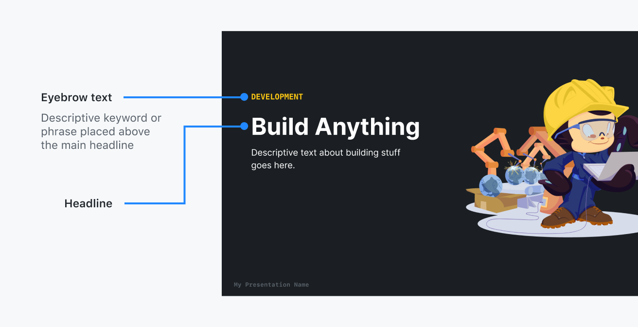
Monospace fonts are used for quote attributions, code, and eyebrow text.
Highlighting
Highlighting is great for indicating important points that you'd like your audience to remember from a statement or quote. In Primer Presentations, highlights are represented by altering the color of the text.
Usage guidelines:
- Avoid multiple highlights. Highlights should be used sparingly to only highlight key words or phrases on the slide. Too many highlights will confuse your audience about what the most important take away should be.
- Emphasis over decoration Remember that when you're highlighting text you're telling the audience, "This is important". Be sure to ask yourself if the highlight is necessary to add emphasis to your talking point.
Do

Highlight important points that your audience should pay attention to
Don’t

Don't use too many highlights
Recommended highlight color pairings
All highlight colors come from the Primer color system. We've supplied a list of recommended highlight colors below.
| Background | Highlight | Hex value |
|---|---|---|
| Black | yellow-400 | #ffdf5d |
| Black | blue-400 | #2188ff |
| Black | red-400 | #ea4a5a |
| White | blue-600 | #005cc5 |
| White | red-500 | #d73a49 |