Links and buttons
Guidance on when to use links versus buttons and how to make them accessible.
Basics
For links and buttons, the first step is to verify if the right element is being used:
- Links navigate to a destination.
- Buttons trigger an action.
Links
Links trigger a URL change. This can be navigating to a new resource or an id hash of an existing resource.
Links must utilize an anchor (a) element.
Utilizing an anchor element for links grants additional usability benefits, including:
- Opening resources in a new tab or window,
- Copying the destination URL,
- Bookmarking the destination URL, and
- Honoring Forced Color Mode.
JavaScript-powered logic and ARIA constructs are insufficient to meet all accessibility and usability needs for this kind of behavior.
✅ Common uses
- Navigating to another page/view.
- Navigating to another point on the page/view.
- Bypassing large sections of content repeated across multiple pages/views.
- Downloading a resource.
❌ Common antipatterns
- Triggering a dialog open or closed.
- Saving a resource.
- Deleting a resource.
- Submitting a comment.
Navigation in Single Page Applications
Most Single Page Apps (SPAs) do not handle navigation in an accessible way by default.
Be sure focus is managed following a link navigation event when using SPA architecture, to communicate to assistive technology that the destination has been successfully navigated to.
Avoid links that automatically open in new tabs/windows
Avoid using target="_blank" and other techniques for opening links in a new browser tab/window. This is a disruptive and often inaccessible experience.
Using an anchor element without the target attribute or JavaScript behavior modification empowers the user to make their own decision of how they want the link to behave.
Avoid ARIA constructs
Be sure to observe the first rule of ARIA.
ARIA constructs to replicate an anchor element are insufficient to meet all accessibility and usability needs for navigational behavior. Avoid using role="link", location.href, href="#", and other alternate techniques.
Buttons
Buttons should utilize a button element, if at all possible.
✅ Common uses
- Submitting a comment.
- Saving a resource.
- Deleting a resource.
- Renaming a Pull Request.
- Triggering a dialog open or closed.
- Triggering a component’s expanded or collapsed state.
❌ Common antipatterns
- Navigating to a destination.
- Downloading a resource.
- Visually highlighting/drawing attention to non-interactive content.
Code considerations: affordances provided by semantic buttons
ARIA constructs to replicate a button element are insufficient to meet all accessibility and usability needs for this kind of behavior. If an ARIA construct is used, the construct must support:
- Mapping to the appropriate proper high contrast/forced color keywords.
- Keydown exploration via the Space key.
- Keydown submission via the Enter key.
- Multiple submission via holding down the Enter key.
- Existing in the DOM focus order in the current page/view.
For accessibility, performance, maintenance, and usability concerns: utilize a button element.
Guidance on naming controls
An accessible name is what is announced by assistive technology, and is a core concept in crafting accessible experiences.
Links and buttons should utilize an accessible name that is unique, concise, and descriptive.
Unique accessible names
Some assistive technology can create lists of all interactive content on a page/view. Because of this, it is important that the accessible name is unique as well as descriptive.
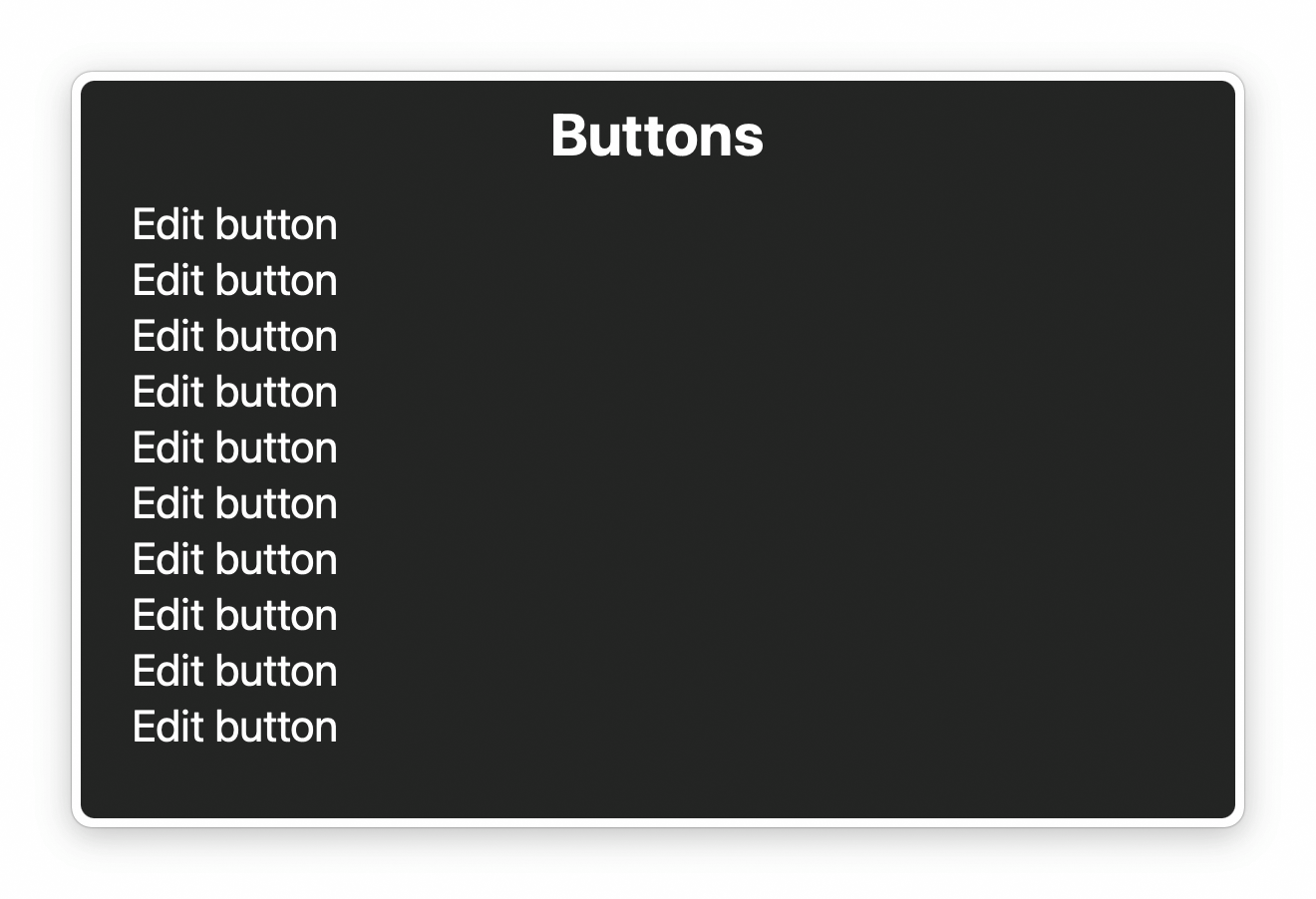
An example is a page/view with multiple edit buttons, each called “Edit”. Without language indicating what the button will edit, it is impossible to know which edit button will edit what without activating the control.
Avoid overly-descriptive names
Accessible names should not confuse or patronize users by over-describing. Provided the control is constructed in an accessible way, properties such as what kind of content it is and how it can be manipulated will be announced by assistive technology.
Overly-descriptive names includes considerations such as:
| Don't | Do | Reasoning |
|---|---|---|
Click to go to {destination} | {destination} | “{destination}” is sufficient, as the presence of the link will already be announced by using an anchor element. |
Link to {location} | {location} | “{location}” is sufficient, as the presence of the link will already be announced by using an anchor element. |
| Use the up and down arrows to select | N/A | This functionality can be inferred, provided the control is built in an accessible way. |
| Sorted ascending | N/A | This state will be announced by assistive technology, provided the control is built in an accessible way. |
| Comment tab | Comment | This component and its functionality can be inferred, provided the control is built in an accessible way. |
Further reading: Stop Giving Control Hints to Screen Readers.
Naming links
Links should hint about what the user can expect to find if they choose to activate it. Consider “Our product offerings” versus “Click here” or “Learn more”.
Naming buttons
Not all users may be able to perceive the visual design. Because of this, it is helpful to use a “verb noun” pattern. “Submit comment”, “Save draft”, and “Delete repository” are good examples of concise and descriptive accessible names.
Code considerations: how to provide an accessible name
Following is advice on accessible name generation and accessible names that contain partially visually-hidden content:
Accessible name generation
Create accessible names for links and buttons by (in order of preference):
- Visible text (a text string placed between the opening and closing anchor or
buttontags). - Hidden text styled with the
sr-onlyclass. - An
aria-labelledbydeclaration pointing at existing, visible text on the current page/view. - Via an
aria-labelattribute (content in anaria-labelis invisible to users who do not use screen readers).
Visually-hidden accessible names
A link or button’s accessible name may be hidden by use of the sr-only CSS class. This class hides the content it is declared on visually, but ensures that assistive technology will still announce it.
An accessible name can be fully or partially visually-hidden.
Example: a fully visually hidden accessible name
An example of a situation where you would want to fully visually hide the accessible name of a control would be an icon button:
<button type="button">
  <StarIcon size="{16}" />
  <span class="sr-only">Star repository</span>
</button>
For this example, the star icon visually communicates the button's functionality, while the string “Star repository” ensures that the button's purpose is announced by assistive technology.
Example: a partially visually hidden accessible name
Partially hiding the accessible name of a control is helpful in situations where multiple interactive controls start with the same prefix. This technique is used to balance a minimal design with accessibility needs.
For example, consider the experience of creating a new issue, where issue templates are present:
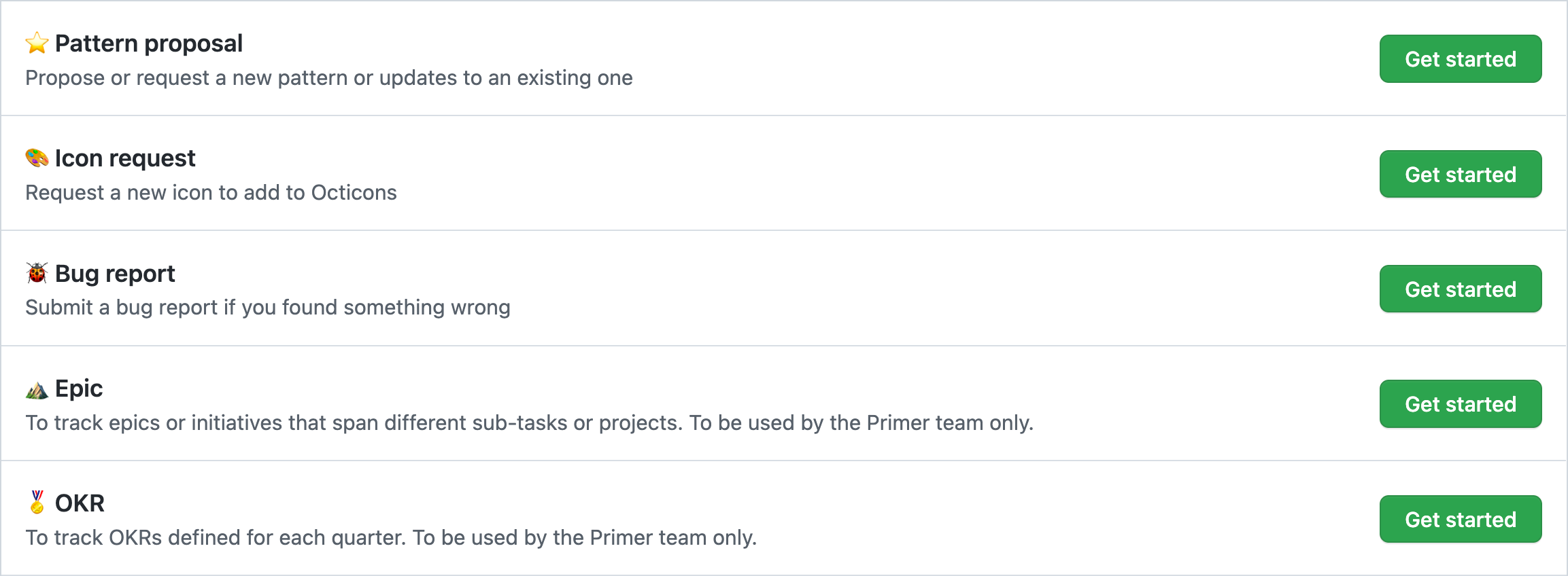
If a user cannot see the screen, the relationship between the “Get started” links and their associated issue template names is unclear. This may lead to a user:
- Choosing the wrong template,
- Not using a template, or
- Not submitting an issue altogether.
To address this issue, the “Get started” links can have the issue template's name appended to the end of the link's accessible name:
<a href="https://github.com/github/primer/issues/new/">
  Get started<span class="sr-only"> with a pattern proposal</span>
</a>

<a href="https://github.com/github/primer/issues/new/">
  Get started<span class="sr-only"> with a bug report</span>
</a>
Note the space placed immediately after the closing > of the first span tag. This is to ensure that assistive technology announces each word as intended, and does not accidentally combine them (ex: "getstarted").
Voice control
Visually displaying the full accessible name provides an obvious command to vocalize for voice control assistive technology.
If there is a situation where the accessible name and the visible name differ, the accessible name must start with the visible text in order to support voice control users.
Consider this construct:
<!-- ❌ Never do this -->
<a aria-label="Visit France" href="france.html">
  Learn more<span class="sr-only"> about France</span>
</a>
A voice control user may not be able to activate the link in this example because its accessible name is “visit France”. This overrides the anchor element’s string value of “Learn more about France”.
Further guidance
Visually displaying the full accessible name is net more beneficial to users for understanding the control’s purpose, regardless of if assistive technology is being used or not . This is especially relevant in situations where jargon or abstract iconography is used to try and communicate functionality.
Visuals
In addition to using the right underlying semantics, it is important that links and buttons look interactive.
Both links and buttons should:
- Have a base/resting state that meets WCAG Success Criterion 1.4.3: Contrast (Minimum) color contrast.
- Be able to be focused via the Tab key,
- Have a visually-apparent focus state that passes color contrast standards, and
- Have a hover state for devices that support pointer events (mouse, trackpad, trackball, etc.).
Links
Prefer underlining links. It is an accepted, universal signifier of interactive navigation behavior. It also makes managing color contrast requirements far easier.
If a link does not use an underline for its base/resting state, it will need an accompanying leading or trailing visual signifier to help communicate its interactive nature. This visual signifier should also meet WCAG Success Criterion 1.4.3.
Buttons
Prefer giving buttons padding with a background color that is distinct from the color of the background the button is placed on. The button’s text color should meet Success Criterion 1.4.3 against the button’s background color, if a button background color is present.
Leading and trailing visuals
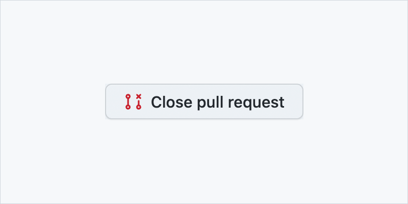
Leading and trailing visuals are icons added before or after a control’s visible text label:
Note that Primer components handle this for you automatically.
Selecting an appropriate leading or trailing visual
Make sure the visual is thematically appropriate if leading or trailing visuals are included to help communicate interactivity.
Iconography should help communicate intent. Existing interpretations of commonly-used iconography should not be subverted (i.e. using a gear icon to indicate copying code instead of editing settings).
Also be aware of an icon’s potential different interpretations across different cultures. Very few symbols are globally-recognized.
Code considerations: marking leading or trailing visuals as decorative
Leading or trailing visuals on a link or button are decorative, and should therefore not be announced by assistive technology. The accessible name of the link or button should be sufficient.
Following is advice for marking raster images and SVG as decorative. Decorative images do not contribute meaning to the user and are not announced by assistive technology:
Raster images
Make raster images decorative by applying alt="" (note the empty/nulled string) to the img element. This will remove the image’s presence for screen readers. Avoid using aria-hidden="true", or other techniques that have less cross-browser/assistive technology support.
Example:
<img
  alt=""
  src="/path/to/decorative/img.png" />
SVG
Mark SVG images as decorative by applying aria-hidden="true" and focusable="false" to the outermost svg element. Unlike raster images, SVG requires aria-hidden="true" because it is an image constructed via markup.
Example:
<svg
  aria-hidden="true"
  focusable="false"
  viewBox="0 0 120 120"
  xmlns="http://www.w3.org/2000/svg">
  <!-- Internal SVG code -->
</svg>
Link-buttons and call-to-action links
Sometimes content on GitHub is coded as a link, but is visually displayed as a button. Accessibility-wise, the specific visual styling of link-buttons and call-to-action (CTA) links are less important than the underlying semantic markup used, provided the two controls look interactive to the user.
Both link-buttons and CTA links must be coded using the anchor element. They should be able to be activated with Enter, but not Space (which should scroll the page instead).
If at all possible, ensure UI uses visual affordances that match the content’s underlying semantics. Examples of this are using underlines for links and a background color and padding for buttons.
Disabling links and buttons
Following is advice for disabling link and button controls:
Links
Links should never be disabled, or have their href declaration removed.
If a link needs to be disabled to satisfy the needs of the design, the user experience flow likely needs to be reconsidered. Note that both the ARIA specification and authoritative guidance on how to technically accomplish disabling a link strongly advises not to do it.
Buttons
Disabling buttons almost always requires consideration of where and how the control is being disabled. Because disabling buttons requires knowing the larger context of the overall experience, there is no one “correct approach.”
Hide controls if they will realistically not be able to be interacted with for the current user flow. Two examples are:
- A button to clear a search input. This control becomes useful as soon as the user starts typing a query, but is not needed if the search input has no content entered into it.
- Access permissions. Controls relating to administration are only shown when the necessary permissions are granted to a user. If the necessary permissions are granted mid-session, a user would still need to refresh the page/view to use them—displaying the controls in an initially disabled state is not helpful.
If a button must be disabled, the general rule is that a it should be disabled only if the user can take an obvious and immediate action to transition it back to an enabled state. Otherwise, the control should be enabled at all times and use validation feedback to communicate why it won't work in its current state.
If a button is disabled, ensure the UI proactively communicates to the user why it has been disabled. The most direct way to do this is to include explanatory text next to the disabled control.
The one exception is form submit buttons, which should never be disabled so as to support accessible error handling.
Prefer using aria-disabled="true" over the disabled attribute, so as to keep the button focusable and have its state announced. This prevents a scenario where a disabled button might seem to “disappear” to someone who cannot see the screen.