Accessibility fundamentals
Core concepts, standards, and considerations for designing accessible experiences.
This page introduces the core ideas behind accessible design: who you're designing for, the standards we follow, and the everyday considerations that make an experience usable by more people.
When you're ready to apply these ideas, Design guidance covers visual and interaction details like color, focus, and semantic markup, while Patterns and components shows how to build specific UI accessibly.
For official guidance, always refer to the official WCAG 2.2 documentation. You can find failure examples for each WCAG standard, and techniques for fixing them in How to Meet WCAG (Quick Reference).
It starts with you
Accessible experiences start with designers. Tacking on accessibility after a design is implemented costs businesses time and money, and it muddies the original design, leading to a poor user experience for people with and without disabilities.
When we consider accessibility from the beginning, we design for everyone from the start.
In many cases, designs created with accessibility in mind for a portion of the population end up benefiting everyone. Take the OXO brand's Good Grips line of products; although they were developed for people who have arthritis, most people found them easier to use than other product lines.
Who to consider when you design
While there are a multitude of disabilities to consider, the majority will fall into one of these categories:
Visual
Anything that deals with sight, or technology that helps someone to see. This includes people who have different types of sight like color blindness.
Cognitive
Concentration, memory, judgement, problem solving, logic skills.
Mobility
Anything that affects movement in a body.
Hearing
A spectrum of disabilities related to sound or audio.
Each disability category can be further divided into three sub-categories:
Permanent
Someone's disability does not go away. An example is someone who is Deaf.
Temporary
Someone's disability will go away in time. An example is someone who has an ear infection and is experiencing vertigo.
Situational
The environment someone is in plays a huge factor in how they interact with web content. For example: Someone who is at a loud sporting event and trying to listen to voicemail.
Consider how different people will experience your design. For an informative list on real-life disability situations, check An Alphabet of Accessibility Issues, published in The Pastry Box Project.
Microsoft has created a downloadable PDF that looks into the area of inclusive design from a people perspective, with several informative examples. Navigate to the ‘Inclusive 101’ toolkit on the main page of Microsoft’s Inclusive Design website.
Basic visual considerations
WCAG 2.2 includes more nuanced considerations than what is listed here, but these basic considerations will give you a strong foothold into accessible design.
Color
Contrast
Text and user interface components on a page must meet a specific minimum contrast ratio to pass WCAG 2.2 AA standards.
Why? People with low vision may have trouble reading or understanding important information. Depending on the contrast ratio, users may not see the item at all. Besides being perceived as disabled items, this makes users struggle with actions like making sure they select the correct option.
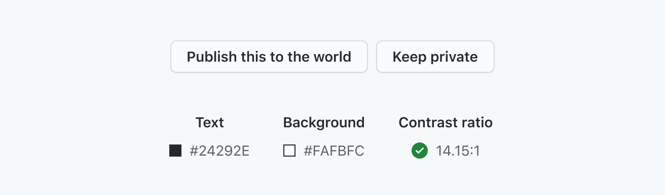
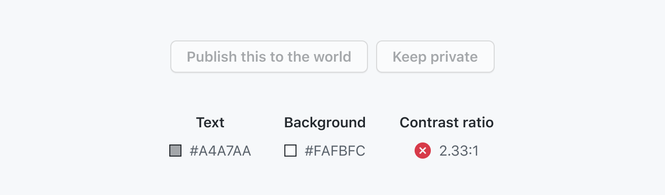
- Normal text (14pt): 4.5:1 minimum contrast
- Large text (14pt bold + , 18pt +): 3:1 minimum contrast
- Graphical objects and user interface components: 3:1 minimum contrast
Note: Disabled controls do not need to hit any specific contrast levels.
Official WCAG guidelines:
- 1.4.3 - Contrast (Minimum)(Level AA)
- 1.4.11 - Non-text Contrast (Level AA)
- 1.4.1 - Use of color (Level AA)
Use of color
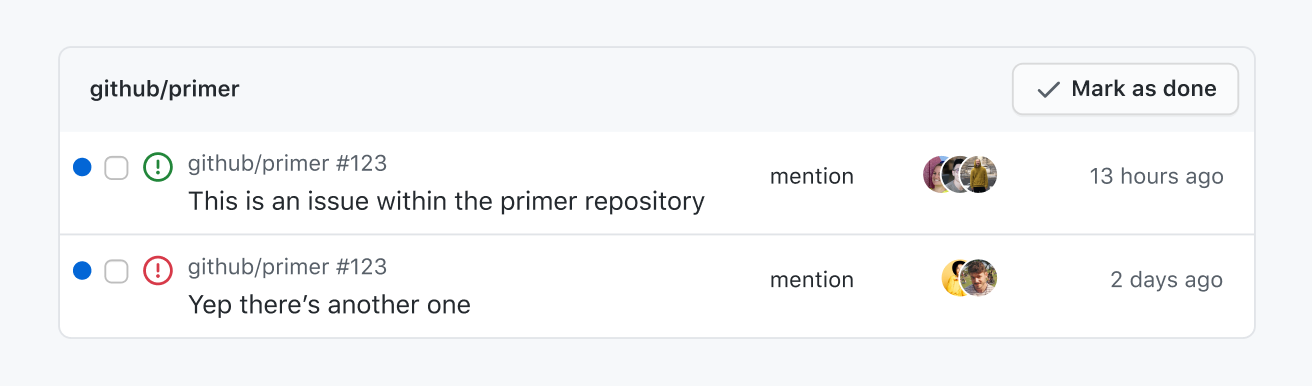
The main point in the guideline 1.4.1 Use of Color is to make sure that color isn't the sole identifier. If you have an important transition that is only a change in color, make sure that color change has a 3:1 contrast ratio.
A great way to test for this is to navigate that experience in greyscale mode.
Typography
Links
Assistive technology users will frequently browse a list of links for easy navigation. For this reason, make sure that the link text is meaningful and unique. There should be as few duplicated references as possible to prevent confusion.
For more detail on accessible links, read the W3C's Understanding 2.4.4 - Link Purpose.
<p>Find out more about <a href="#url">GitHub Enterprise pricing</a>.</p><p>To find out more about GitHub Enterprise pricing, <a href="#url">click here</a>.</p>Forms
- All form inputs should have a visible label
- Don't use placeholder text for titles, hints, or other important information.
Why? Visible labels determine the purpose for inputs, and screen readers can read this information without extra code. If placeholder text contains important information and that information disappears when one starts to type, those with cognitive disabilities will have difficulty completing the form.
Content on hover or focus
Hover cards and tool tips need to be approached with care. To meet the bare minimum for accessibility, tooltips need to be:
- Dismissible: Be able to dismiss tooltips without moving the pointer or keyboard focus (unless it's an input error or does not cover other content).
- Hoverable: Pointer can move over the hover content without the content disappearing.
- Persistent: The tooltip doesn't dismiss itself without user action.
For more information read 1.4.13 Content on Hover or Focus.
Text
People using the web should be able to increase font size to 200% without losing content or functionality.
If you'd like to go the extra mile and meet AAA guidelines, you can make sure that:
- The width of text doesn't exceed 80 characters or glyphs
- Text isn't justified (align text to the left and right)
Read Primer's typography guidelines for more detail about using type on GitHub.
Keyboard accessibility
All interactive elements need to be accessed and activated by a keyboard alone (2.1 Keyboard Accessible).
- Tabbing should be used to access standalone controls (buttons, links, widgets), and arrow keys should be used to navigate within a composite control (group of standalone controls, list of checkboxes).
- Some assistive technologies have keyboard combinations that override those of a web page, so don't rely on keyboard shortcuts as the only alternative to mouse actions.
- Focus must be visible for all interactive elements. Read more about focus management.
For deeper, implementation-level guidance on these topics, see:
- Color considerations
- Semantic HTML and ARIA
- Text resizing and spacing
- Images and alternative text
- Links and buttons
Resources
Understanding WCAG 2.2
- Knowbility.org: Search for 'WCAG 2.2' on Knowbility to get a more clear and succinct interpretation of WCAG 2.2's official guidance.
- The UK's Home Office designed easy-to-read posters on designing for accessibility, broken out into principles for various conditions. You can read about designing the posters on the team's accessibility blog.
- The a11yproject includes a wealth of resources on web accessibility.
Pattern libraries
- WAI-ARIA Authoring Practices Guide (APG) is an in-depth list of UI patterns and how to implement them, from W3C.
- Inclusive components
- a11ymatters patterns includes useful information for developers.
Screen readers
Top three screen readers for computers (data from WebAIM, February 2024):
- NVDA (Windows)
- JAWS (Windows)
- VoiceOver (Mac)
Top three screen readers for mobile devices (data from WebAIM, February 2024):
- VoiceOver (iOS)
- TalkBack for Android (Android)
- Commentary/Jieshuo (Android)
Keep in mind that just like there are different browser implementations, there are also different assistive technologies and their behaviors can vary.