Drag and Drop
Accessibility best practices, patterns, and implementation guidance for drag-and-drop interfaces.
Drag and Drop is a widely used pattern that allows users to interact with content by dragging an item from one location to another. While this pattern can enhance user experience and streamline interactions, there are limited industry-wise accessible solutions.
Defining drag and drop for this page
There are many aspects in the umbrella of "drag and drop" patterns. Some aspects include, but aren't limited to: single-dimension (a to-do list) versus multi-dimensional (nested/hierarchical structures like a tree view or a file system), single or bulk item move, and consecutive and non-consecutive selection in bulk item.
This document focuses on one-dimensional sorting for re-ordering items in a list.
Accessibility considerations for drag and drop
Multiple ways
To guarantee that drag and drop can be used by all users, it's critical to implement multiple ways of accomplishing said task. Suggested ways include keyboard-specific dragging, click-and-drag, and dialogs to complete moving item(s).
Keyboard specific
Keyboard-specific dragging
Likely the most common drag and drop movement, this approach is activated via an icon, typically a "grab" icon (6 dots arranged in 2 columns, 3 rows). This interaction can be operated using a keyboard or mouse and is compatible with screen-readers.
Unfortunately, this interaction neither works for mobile users nor voice control users, especially if the item to move is not in the visible area of a page. In addition, while effective for shorter lists, individuals who navigate content using a keyboard may find keyboard-specific dragging cumbersome when dealing with longer lists.
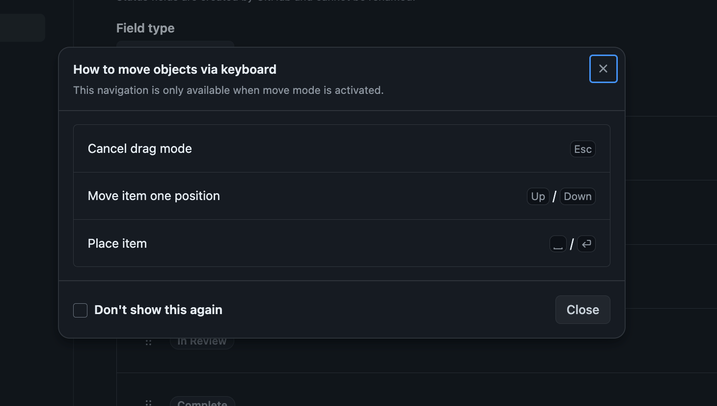
The following interactions are required for keyboard-specific dragging of a vertical list.
| Keyboard key | Interaction |
|---|---|
| Escape | Cancel action |
| Arrow Down | Move item down one time |
| Arrow Up | Move item up one time |
| Enter/Space | Place item |
If in a horizontal list, replace down and up arrows with left and right, respectively.
Screen reader specific
Use of role=application
When keyboard-specific dragging is activated, it is important to apply role='application' to the focused element (the grabber IconButton). role='application' tells the screen reader that the content within that element should be treated as a single-page application and allows the component to alter the standard keyboard navigation behavior. This means that keyboard functionality, like arrowDown and arrowUp (normally mapped to screen reader shortcuts) can be mapped to dnd functionality.
It's important to note that role=application must be used sparingly. We recommend scoping role=application to the smallest part of the webpage (the drag icon, in this case) and only apply it when a user has activated said icon.
ARIA Announcements
Aria-live announcements are important for users who use a screen reader to interact with drag and drop. These announcements should clearly and concisely convey the following information to the user:
- Activation of drag mode
- Positional updates of the item being dragged
- Cancellation of drag mode
- Successful movements
Positional updates may occur rapidly, sometimes even before the previous update has been announced, and potentially cause confusion and disruption for users. Because of this, it is important that we debounce (100ms) to prevent potential noise caused by rapidly moving draggable items. This short delay takes into consideration that users may opt for more gradual movements of items. In addition, one should apply aria-live="assertive" to positional update announcements.
aria-live="assertive" should be used sparingly and should only be applied to announcements which rapidly update.
Clarity and conciseness of announcement
Announcements should balance being clear and concise so users can operate drag and drop quickly.
For instance, consider the following two positional announcements:
- "object moved before X and after Y"
- "object moved between X and Y"
While readers may not perceive a difference between the two options, when repeated dozens of times in a row such as in a long list, the second option reduces cognitive load greatly for screen reader users. In this case, being concise is more clear.
Conversely, sometimes more words are needed for clarity. For instance, the announcement of "saved" feedback does not give confirmation to blind users of what action was completed compared to "Saved between X and Y".
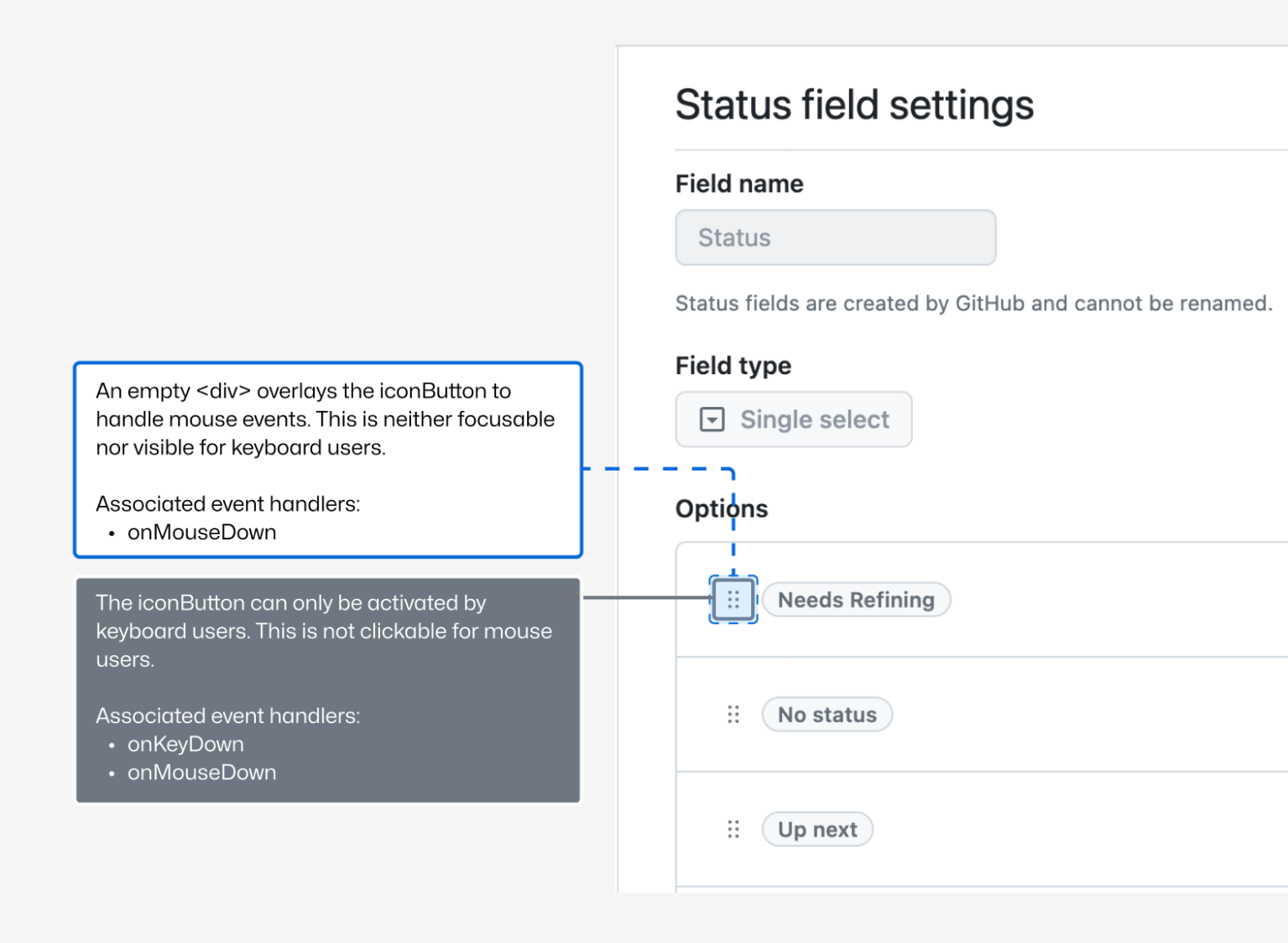
NVDA Enter/Space key nuance
Typically, pressing Enter or Space on a keyboard will trigger an onKeyDown event. This onKeyDown event is how we differentiate a mouse user from a keyboard user, which is a necessary distinction for determining when to exit drag mode.
However, when a user presses the Enter/Space key while NVDA (Non Visual Desktop Access) is running, something different happens. Instead of an onKeyDown event NVDA simulates an onMouseDown and onMouseUp event, making it impossible to differentiate a NVDA (keyboard) user from a non-NVDA mouse user.
To ensure that users using NVDA can remain in drag mode, we advise using two HTML elements to separate keyboard and mouse functionality:
- A Primer IconButton to handle the keyboard interactions.
- An invisible overlay to handle mouse interactions.
Reduced Motion
Sometimes, drag and drop operations will move the activeElement out of view. When this happens, drag and drop functionality should scroll the activeElement back into view using scrollIntoView. This situation can occur in two cases:
- A user operates drag and drop using an icon and presses
Escapeto return the item to its original position. - A user operates drag and drop using a dialog, and upon submission the item is shifted out of view.
When scrollIntoView is required, it is important to consider the impact on users who rely on reduced motion. In the case of drag and drop, we recommend applying behavior: instant when a user has reduced motion enabled.
Visual Feedback
An accessibility best practice is ensuring parity between screen reader experiences and sighted non-screen reader users. When designing a drag and drop pattern, be sure to include visual cues that help identify:
- What item is being moved,
- Where the item’s original position was, and
- Where an item has been moved to.
For a dialog experience, we recommend providing a visual preview of how the content will be reordered along with a live announcement. This helps users understand how their content will be moved and helps reduce cognitive load.
First time user experience
While not exclusive to accessibility best practices, it's important to acknowledge that many drag and drop patterns are neither keyboard nor screen reader accessible on the web. As a result, users with disabilities might not have had the opportunity to use drag and drop before, making the operations unfamiliar to them. To allow for a smooth onboarding, we recommend creating an accessible dialog that can educate users on how to navigate this specific drag and drop experience, particularly when drag and drop mode is activated. In addition, offering both a one time dismissal (close icon) and a "Don't show me this again" checkbox allows a user to learn at their own pace and comfort.