Truncation
While accessible truncation is difficult, it is not impossible.
What is truncation?
Truncation refers to shortening text when it reaches a length greater than the allotted width of an interface. The standard pattern is to shorten the string with ellipses (…). There are two types of truncation:
Implicit truncation
Implicit truncation is when a user places focus on an element to reveal its full text. Focus is done by hovering (via mouse) or focusing (via keyboard) on the element.
Explicit truncation
Explicit truncation requires an action to expand what is displayed. This is typically done through clicking, pressing Enter, or speaking "Click". A common example within GitHub is Primer's Progressive Disclosure pattern.
Questions when using truncation
While accessible truncation is difficult, it is not impossible. In the early stages of product development, consider these factors:
- Length: Are you shortening a string of text, a paragraph, or a long document?
- Volume: Is a single string the only truncated text, or one of many?
- Location: Is the truncation within a landmark or within a component?
- Interactivity: Is the string static or interactive?
- Implementation: What are the tradeoffs for trying to truncate text? Different methods have pros and cons, particularly in CSS.
The answers to these questions can help inform both designers and developers how to handle truncation use cases. The most important thing to consider is that the design of the truncation and intention of the content match.
For additional support in deciding, check out the Truncation Decision Tree on Figma (Internal only).
Length
If content is provided by the product team and not a third party source such as user generated content, it should be thoughtfully designed to avoid truncation. Before designing truncation content, ask yourself:
- Can I wrap the text instead of truncating? Wrapping allows all text to be seen and creates a more consistent experience across screen widths.
- Can I give the element in question more real estate to expose all text? Truncation on a small portion of text (a few characters or a word) adds friction to a UX that may be avoidable.
Splitting words, sentences, and even paragraphs can confuse users and slow down their workflow. Cutting off information can even generate "untrue information".
Specifically for long documents, a preview of content may be rendered with a Read More button for users. Make sure this preview stops in such a way so the preview sentence is complete and will make sense for screen reader users.
If the content is user generated, be sure to communicate any restrictions on character limits to the user beforehand to prevent surprise truncation.
Volume
For multiple strings with the same truncated text, the design should show what the truncation is prior to all options so that users have context.
For multiple truncated strings with unique text, offer a way for users to read the entire string. Common patterns include expand/collapse buttons and modals.
Location
Consistent placement of content across devices is a key to great design. If you don't truncate on one design viewport (i.e. mobile), don't do so on another (desktop). During development, test your design with a zoomed display and/or increased font size to see where content is artificially truncated by reflow blocking.
Interactivity
Static elements
The most accessible static element is one that is not truncated. It can be very tempting to place a tooltip on hover over a static truncation and call it complete; however, this is not available to keyboard-only and speech recognition users. In addition, depending on the type of tooltip, this approach can end up overriding the accessible name provided by the visible text.
Interactive Elements
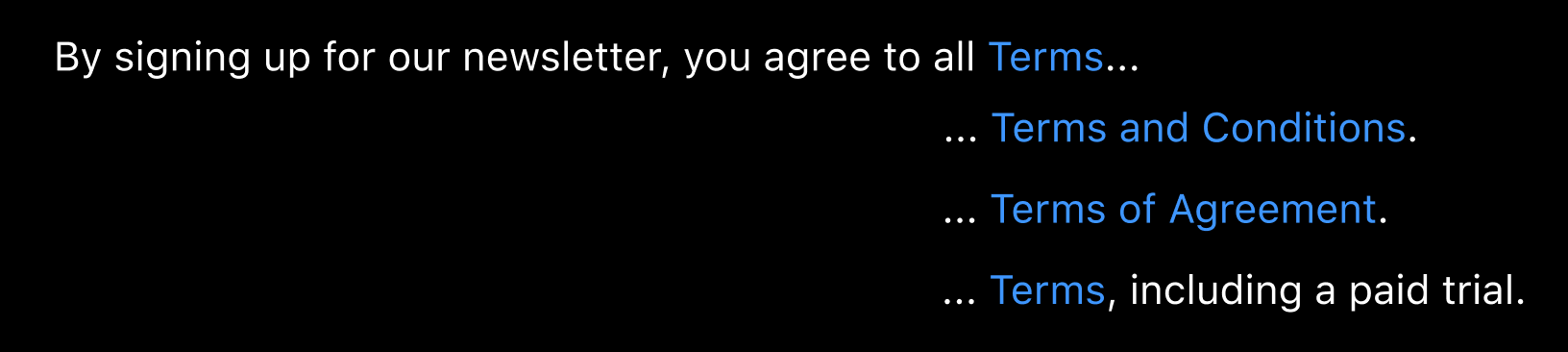
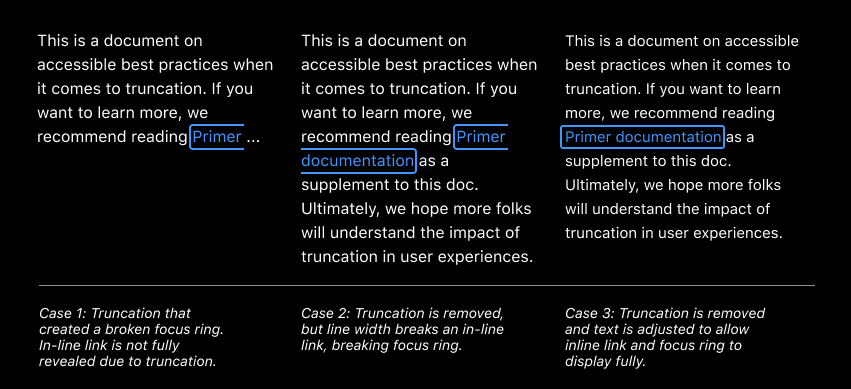
Do not truncate text if it contains focusable elements such as links, buttons, and mentions/tags. This includes the focusable element itself as well as truncation that hides focusable elements. Similar to nested interactive controls, truncated focusable elements may not be available to all users, blocking them from potentially completing tasks.
If you experience this challenge, some potential design alternatives are:
- Wrap text instead of truncate (so long as focus does not break)
- Use a tooltip that is keyboard and screen reader accessible to announce the entirety of text
- Offer a method such as a button or toggle to "expand all titles" and "hide titles"
Implementation
Why tooltips aren't the answer
Tooltips are rarely appropriate in truncation use cases. Their misuse can result in a myriad of accessibility issues, so do not rely on a tooltip to improve user experience. To learn more, check out Primer tooltip alternatives.
One use case where tooltips over truncation may be reasonable is user generated content that neither designers nor developers have control over. In that case, refer to the CSS Truncation section.
Focusable elements
Recall that truncation should not be used on text that contains focusable elements. Challenges with this approach include:
- Hidden elements will randomly appear on focus;
- Disappearing focus;
- No visual focus, especially on unsecure links;
- And broken focus (truncated interactive elements).
CSS Truncation
CSS provides mechanisms that allow you to visually hide or truncate content without needing to touch the underlying HTML; however, the implementation is controlled by the browser, so you cannot control where the truncation begins. There is a small amount of control using hyphenate-limit-chars, but support at this time is limited.
In addition, CSS truncation will not remove truncated text from the DOM, so it could look unreadable for a sighted user, but will still be readable for screen reader users. This creates a user experience that can vary between no assistive technology (AT) and AT, causing confusion and is generally considered a poor practice.
How to truncate via CSS
While one should not truncate large bodies of text using CSS, there are times where truncation using CSS works. Truncation can be achieved by applying Primer's Truncate component to the text element, so when a text reaches lengths larger than the existing container, it shortens with ellipses.
Primer's implementation allows for easy visual truncation of long text which might overflow outside its container. Since the text remains in the DOM, screen reader users will hear the entire string on focus.
Do's and Don'ts
Do
- Ensure that truncated text is accessible via mouse, keyboard, and screen reader.
- Take a mobile first design approach to account for truncation across devices.
- Consider if the truncation will provide security risks to your product.
- If you must truncate, consider wrapping the text, as opposed to truncating or relying on horizontal scroll.
Don't
- Rely on a tooltip for truncation, especially for static elements. Recall that keyboard-only users will not be able to access this info.
- Break up an interactive element with truncation. This creates confusion for both screen reader users (screen reader will read only what is visible) and non-screen reader users.