Action menu
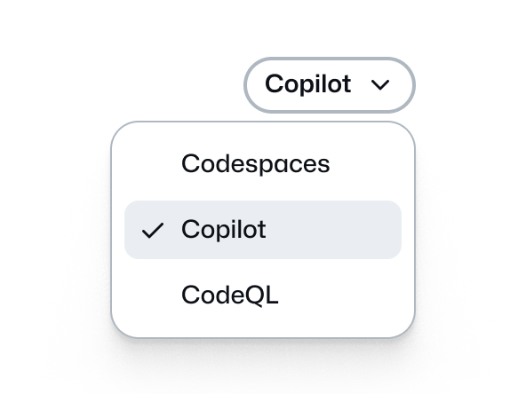
Use the action menu component to display a list of actions or selections that expand through a trigger button.
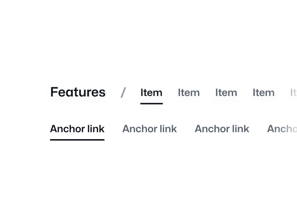
Anchor nav
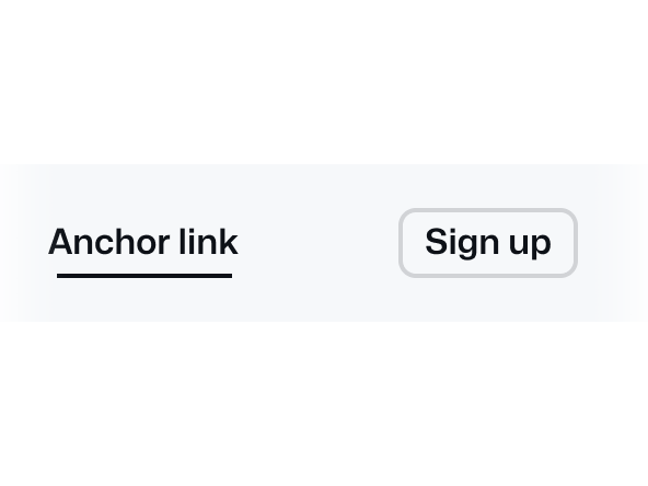
Use the anchor nav component for prompt navigation to different sections of a page.

Breadcrumbs
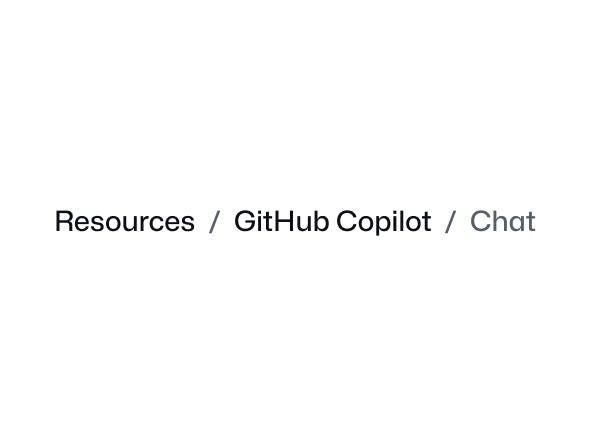
Breadcrumbs display the current page within the site's hierarchy, allowing users to easily navigate to a different level.
Breakout banner

Use a breakout banner to break up content on longer pages and highlight important information.
CTA banner
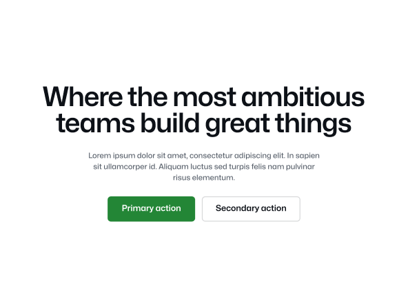
Use the CTA banner component to highlight and create urgency around user actions.
Card
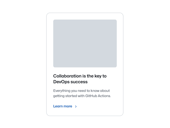
Use the card component to display information in a compact way and link to other internal pages.
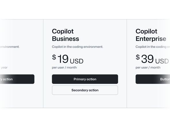
Comparison table
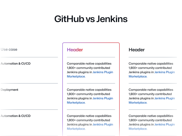
Use the comparison table component to compare two products or features in a table format.
Eyebrow banner

Use the eyebrow banner to highlight important information at the top of a page.
Footnotes
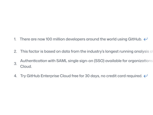
Use footnotes to display contextual information and cite sources in the page content.
IDE
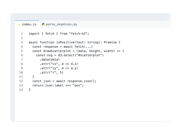
Use the IDE to showcase a simulated integrated developer environment, complete with a code editor and AI chat that's intended to enhance code representation in marketing contexts.

Minimal footer
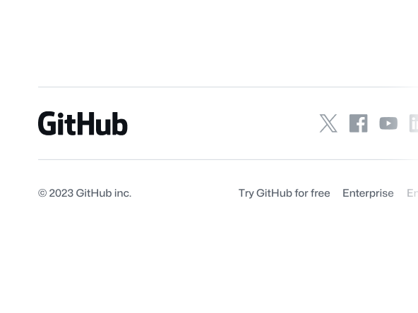
Use the minimal footer component to provide a global footer featuring legal links, GitHub logomarks and footnotes.
Pagination
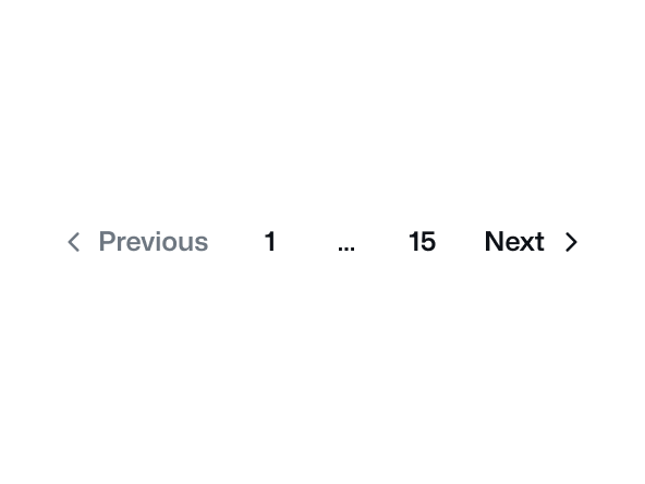
Use Pagination to display a sequence of links that allow navigation to discrete, related pages.

River accordion

Use the river accordion to create expandable content panels with associated visuals.

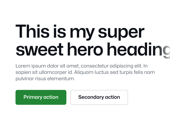
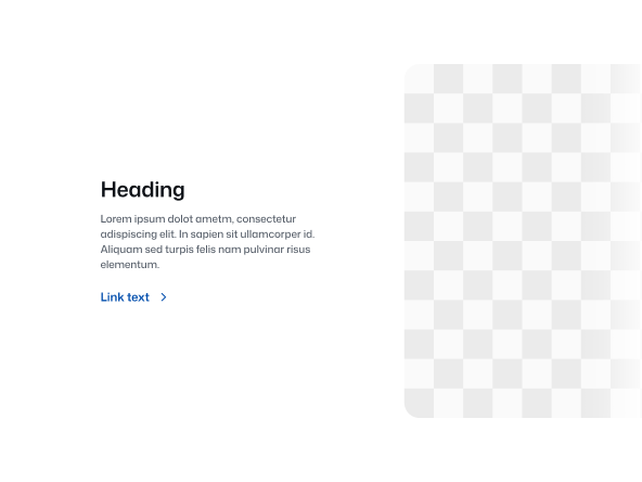
Section intro
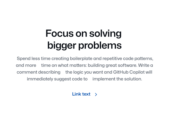
Use the section intro component to provide a title, optional description and link to a new section in the page.
Section intro stacked
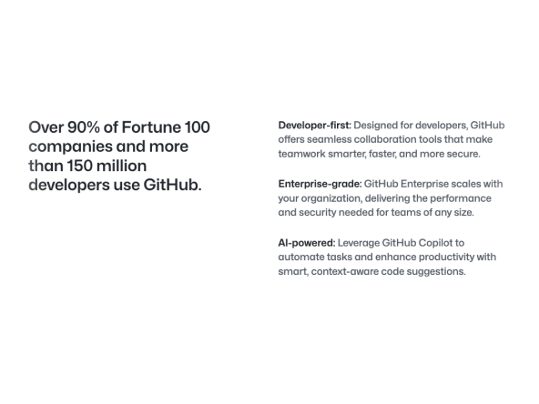
Use this section intro component to provide a heading, link and itemized content in a stacked layout.
Sub nav
A sub nav is a secondary navigation element, typically positioned beneath a primary navigation.
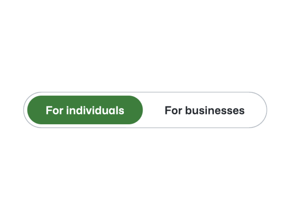
Subdomain nav bar
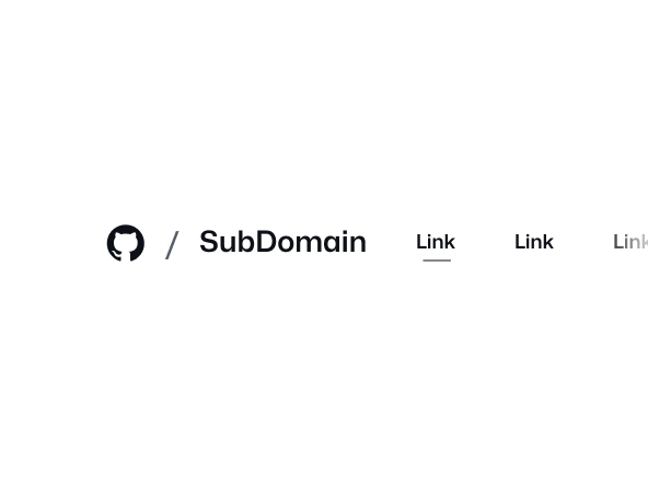
Use the subdomain nav bar component for top level navigation for subdomain sites.


Timeline
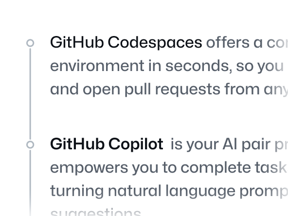
Use the timeline component to display a list of connected items as a vertical timeline.
Tooltip
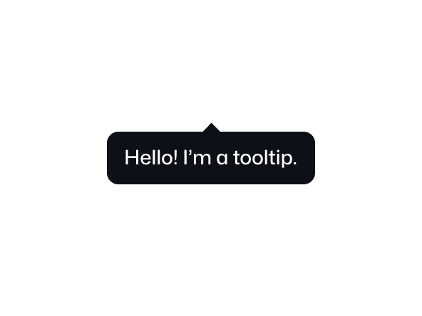
Use the tooltip component to display a short message when a user hovers or focuses an interactive element.
Unordered list
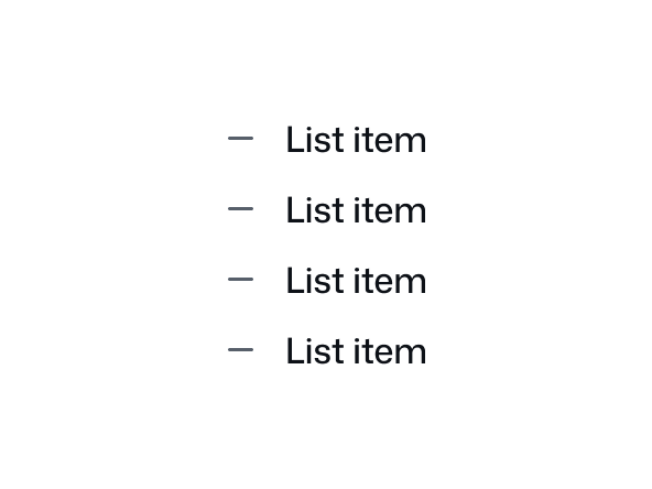
Use the unordered list component to present a collection of items without specific ordering.