Usage
Use rivers to showcase features and introduce topics. Rivers are composed of images or videos paired alongside text content like headings, paragraphs, and links.
A river’s content should be short and concise, no longer than 160 characters, and contained in a single paragraph when possible.
Stacked
Two or more rivers can be stacked to guide the user through a set of features. Keep rivers in a stack consistently aligned to create a predictable reading flow. For gridline rivers, always use start alignment. Don’t use zig-zag layouts.
Prefer the default 50:50 image-to-text ratio where possible. Use 60:40 only when the visual needs more space or emphasis.
Note that too many rivers can make the design feel repetitive. In that situation, consider introducing a breakout section or break the content with a different component, such as pillar or card to provide a better visual hierarchy and experience. For example, use the river for the top features you want to highlight and then use pillars to showcase the rest.
Don’t stack numerous rivers without breaking the content to avoid repetitive a layout that can make the design feel repetitive.
Sections with rivers
A single river component acts as a section and it should not include any child sections within in. Multiple rivers can be used to conform a section. In that case, the section should include a section intro that introduces the main topic or features.
River breakout
A river breakout component has an image that fills the width of the container while providing more space for content such as text and lists.
This is useful when you want to create a highlight which can be used to create more emphasis or simply break a monotonous vertical flow of left/right rivers. It can also be helpful on smaller viewports to avoid stacking two images or two chunks of text from adjacent river components.
As its name suggest, a river breakout should not be the first in the stack, it should be positioned in-between two standard rivers.
Some examples of when to use a river breakout:
- Expand on more complex feature that require more room for content
- Give designer a tool to emphasize the feature story
- Use a branded wallpaper in a more cinematic way than the standard 50/50 or 60/40 text-to-image column ratios
Don’t stack river breakouts on top of other river breakout components or center-aligned river components. These both show a full-width image. This diminishes the visual impact the river breakout is intended to provide.
The leading content in a river breakout component must always be present, but the trailing content is optional.
Limit trailing content to a maximum of 500 characters (or two timeline items) to avoid overwhelming the user and disrupting the layout’s balance.
River story scroll
A river story scroll component is used to compose rivers and create a dynamic, scroll-driven presentation. It’s a great way to showcase a set of features or topics in an interactive and visually engaging way.
Composition
River story scroll functions as a self-contained unit and is often paired with a a section intro. To effectively leverage this pattern, use between three and six rivers. For other configurations, simply stack rivers in a standard layout.
This component should be used sparingly, at most twice per page, and alternated with other content types rather than placed consecutively. This approach enhances user engagement and keeps the spotlight on key information while preventing user fatigue.
Content alignment and visuals
Content across the different rivers in a story scroll must share the same alignment; either start or end. This ensures that the content flows smoothly with predictable placement and transitions. Additionally, all visuals in a story should share the same aspect ratio to achieve a consistent effect.
 Ensure all visuals maintain a consistent aspect ratio.
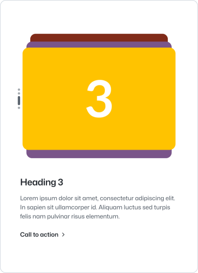 Avoid using visuals with varying aspect ratios.
Anatomy
Content
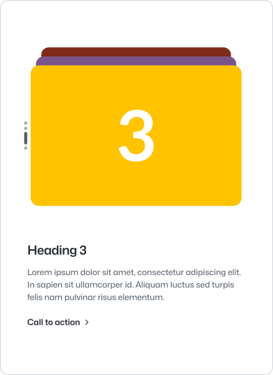
River provides a heading as the main title and a body text as the main content that describes the adjacent visual. The heading should be short and concise and the body should describe the feature or topic in a short paragraph.
Visual
A river can include either an image or video to illustrate the feature or topic. The media should be relevant to the content and should not be used as a decorative element.
Always use high quality images and videos. Avoid using images with text or single logos. Ensure the image fills the provided container.
The image is automatically styled to fit the width of the parent container. If you have bespoke styling requirements, you can disable the provided default styles and style the image manually.
Additional guidance
- We recommend using a river left as the first river of the flow to start with a visual and avoid stacking text with above section on mobile
- River components stacks create a unit, the set should be considered to be the main parent section. The parent section should be spaced as a regular section with the largest spacing while internal elements should use smaller spacing
- For a standalone river, choose its alignment based on whether the visual or text needs emphasis. Keep every river in a stack consistently aligned.
Link
River can include an optional call to action to link to more detailed content about the feature or topic. Avoid using buttons to do so, instead use the regular link built into the component.
 Use the provided link component.
 Avoid using buttons.