Usage
Buttons allow users to initiate an action or command when clicked. The button’s label or text description indicates the purpose of the action to the user. Most of the time, we use the “Default” button type, but other types of buttons may be used to indicate something special about the button’s hierarchy or functionality.
Anatomy
Options
Variants
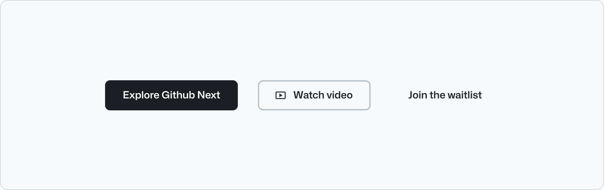
Primary
Primary buttons have top priority in visual hierarchy, and using too many of them on a single view dilutes their effectiveness. We recommend to limit the primary button to one button per view, and place it in the visible section, whenever possible, to indicate its emphasis relative to other actions. Use multiple primary buttons only when the action is repeated in multiple places of the same page. E,g a “Log in” button in the header and in the footer area.
Secondary
Secondary buttons are the default button type. Use them for the main actions on a page or form. Secondary buttons are the most common button type and should be used in most cases. They can be paired with a primary button to perform a secondary action, or used on their own.
Subtle
Subtle buttons have a transparent background with translucent hover and active states, making them useful for compound components like Button Group when paired with secondary or primary variants.
Block
Turning on the block option for button allows the button to span the full width of its container. This feature can be particularly useful when you want the button to occupy more space. Block button can continue to pair with secondary or primary variants.
Trailing and leading icons
You can place an icon inside the button in either the leading or the trailing position to enhance the visual context. It is recommended to use an use an Octicon here.
Use a trailing visual if the button action involves selecting items (dropdown, select, filter, etc), and a leading visual to provide visual context to the adjacent label. E.g. Use a search icon for a search field submit action.
Don’t use a trailing icons to add a visual cue to the label. Use the leading icon for better scanability.
Size
Button default to a medium size. Medium is suitable for most interfaces and is considered the preferred size.
Large buttons increase the significance of an action and should be used sparingly. Use the large option when you need to emphasize the button on a big sized heading, for example in a Hero component.
Small buttons are meant to be used sparingly. Some use cases can be:
- Contained inside other components like dropdowns or small popups.
- Areas where very low priority information might display a CTA.
- Brand presence inside products where information is compact. For example for in-product banner.
Accessibility
Descriptive buttons
Labeling buttons properly lets users know what will happen when they activate the control, lessens errors, and increases confidence.
Read more about descriptive buttons.
Related components
- ButtonGroup: To display a group of related buttons.
- Link: To display a link that navigates to another page.
- Hero: To display a large heading and a description with a ButtonGroup.