Usage
Use cards to summarize the central idea behind some content and provide a link to its corresponding detailed resource. It is important to present the information in a concise manner, avoiding lengthy and complex descriptions.
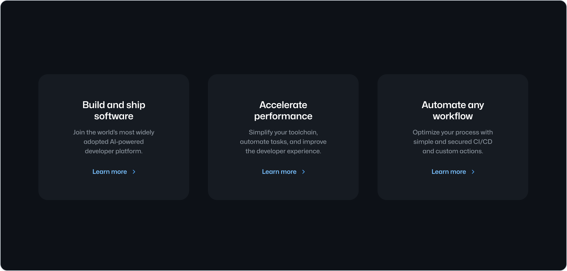
Cards should always be used in groups of two or more related concepts.
Stacked
Cards should be stacked to display a list of items that are related to each other. When displaying a visual asset, ensure it is consistent across all cards to create a visually balanced layout. The visual asset should be the same type for each card, either an icon or an image.
For a better visual experience, we recommend using similar length size for the heading and description in all stacked cards.
When using an image as the visual asset, we recommend using the same aspect ratio for all images. This will create a more balanced visual experience.
Cards typically appear in groups of three or four in desktop viewports. For smaller viewports, or when more than four cards are needed, we recommend stacking the cards vertically. You can use the Grid or the Stack component to achieve this.
Use center alignment when stacking multiple cards up to a maximum of three. For four (or more) use start alignment.
Use center alignment when presenting up to three cards in single row.
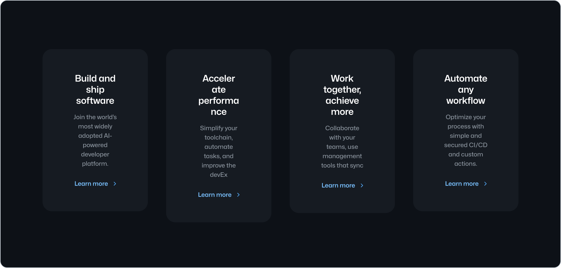
Don’t use center alignment when presenting more than three cards.
Anatomy
Visual asset
The visual asset is optional and can be an image or an icon. It can be used to provide a visual cue to the user about the content of the card. To avoid visual noise, we recommend using only one icon or image, but not both in the same card.
Label
The label can be used to indicate the type of content or its status. For example, use it to indicate that the content is new or that it is a beta feature. The label is optional and can be used along with a visual asset.
Heading
The heading is the main title of the card. It should be short and concise.
Description
The description is an optional short text that extends the information provided by the heading.
Call to action
The call to action label indicates the action or resource the card links to. It defaults to “Learn more”.
Options
Border
Card offers a variation with a border. Border is disabled by default.
Related components
- Pillar: To display related content with less visual emphasis.
- River: To display a list of content items with a visual asset.
- CTABanner: To display a single block of content to draw attention or create urgency around a user action.
- UnorderedList or the OrderedList: to display a list of plain content items.