Use breakout banners to promote important information and actions in-between blocks of content. Whereas the CTA banner is intended to redirect users to their respective conversion outlets, links in the breakout banner should only cross-link to supporting content.
Anatomy

Usage
Breakout banners should be used in the middle of a page to break up long blocks of content. Avoid using the breakout banner at the beginning or towards the end of a page.
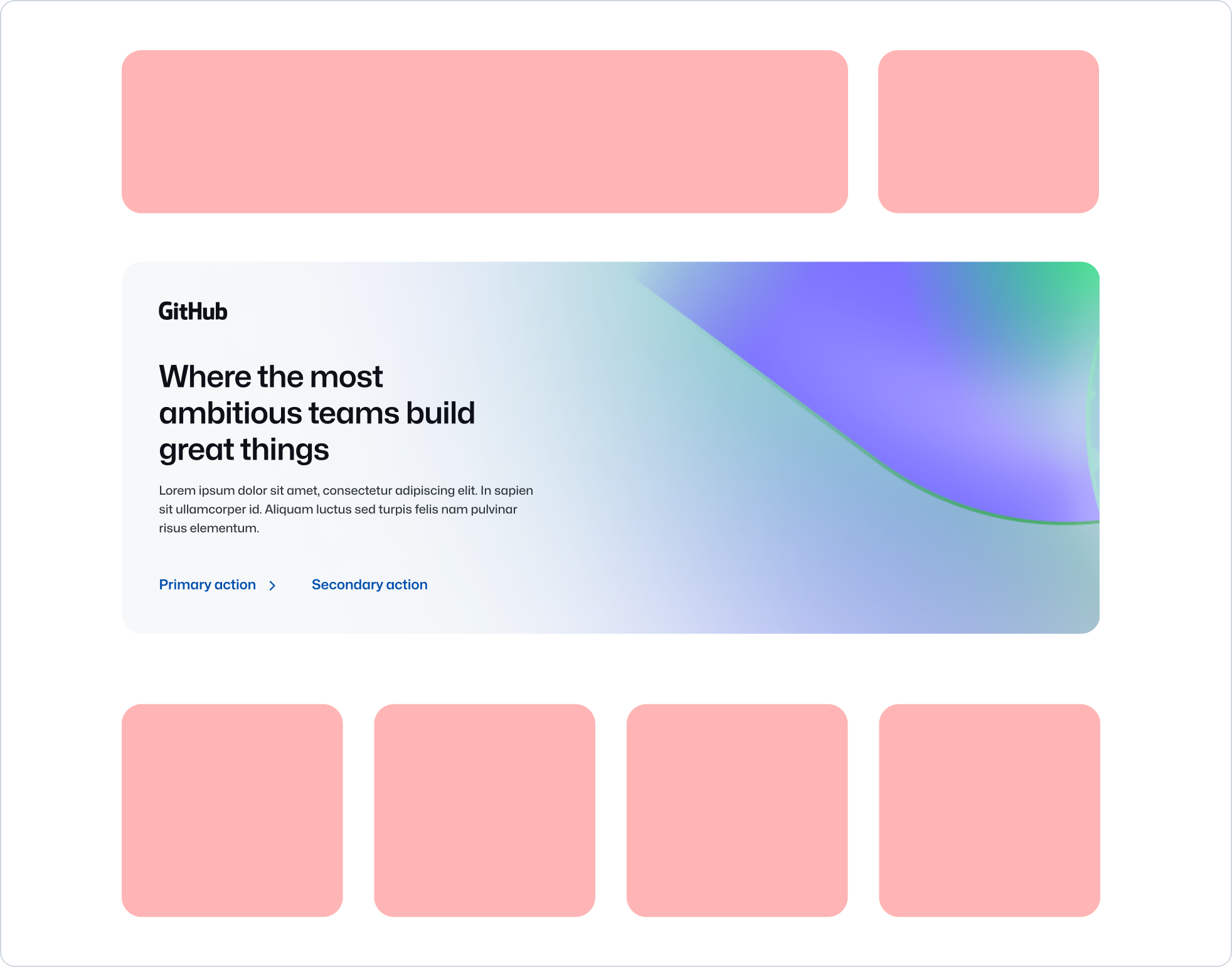 Use breakout banners to break up longer pages.
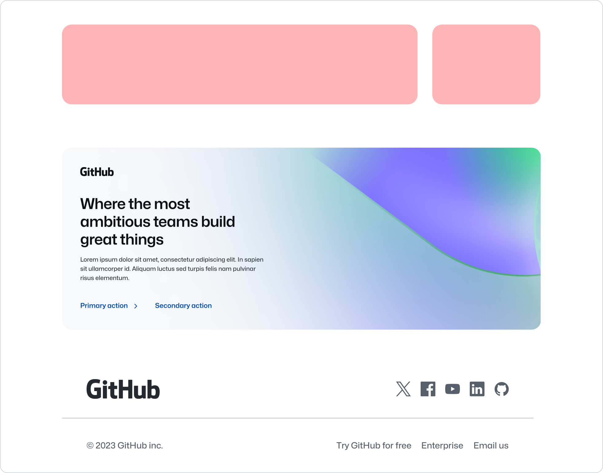
Don’t use the breakout banner too early or late in the page (E.g. near the footer). Prefer CTA banner in case of the latter. Also avoid placing the breakout banner too close to related components like the CTA banner.
Alignment
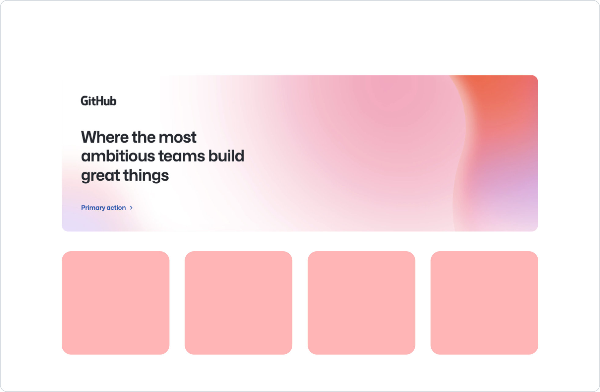
The breakout banner content can be aligned to the start or center of the parent element, with the former being the default. Use the center alignment if context calls for it. E.g. Use center alignment if the breakout banner is placed between two sections that are also centered aligned to avoid breaking the visual flow.
 Use start alignment when possible.
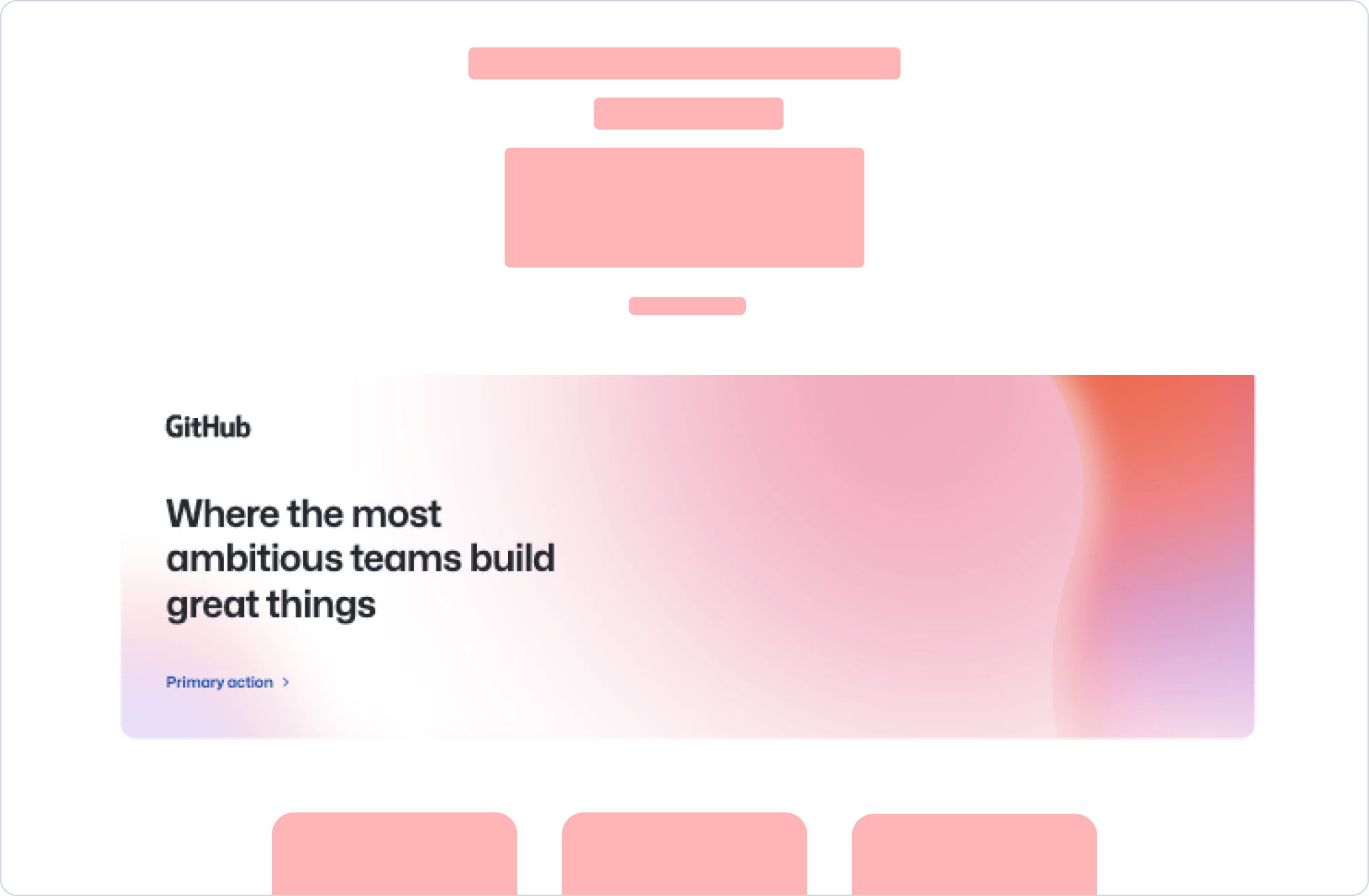 Don’t use start alignment when adjacent content is center aligned.
Use sparingly
Breakout banners should be used sparingly, at most once per page. This is to avoid diluting the impact of the spotlighted content or links in the context of the wider page.
 Use breakout banner sparingly.
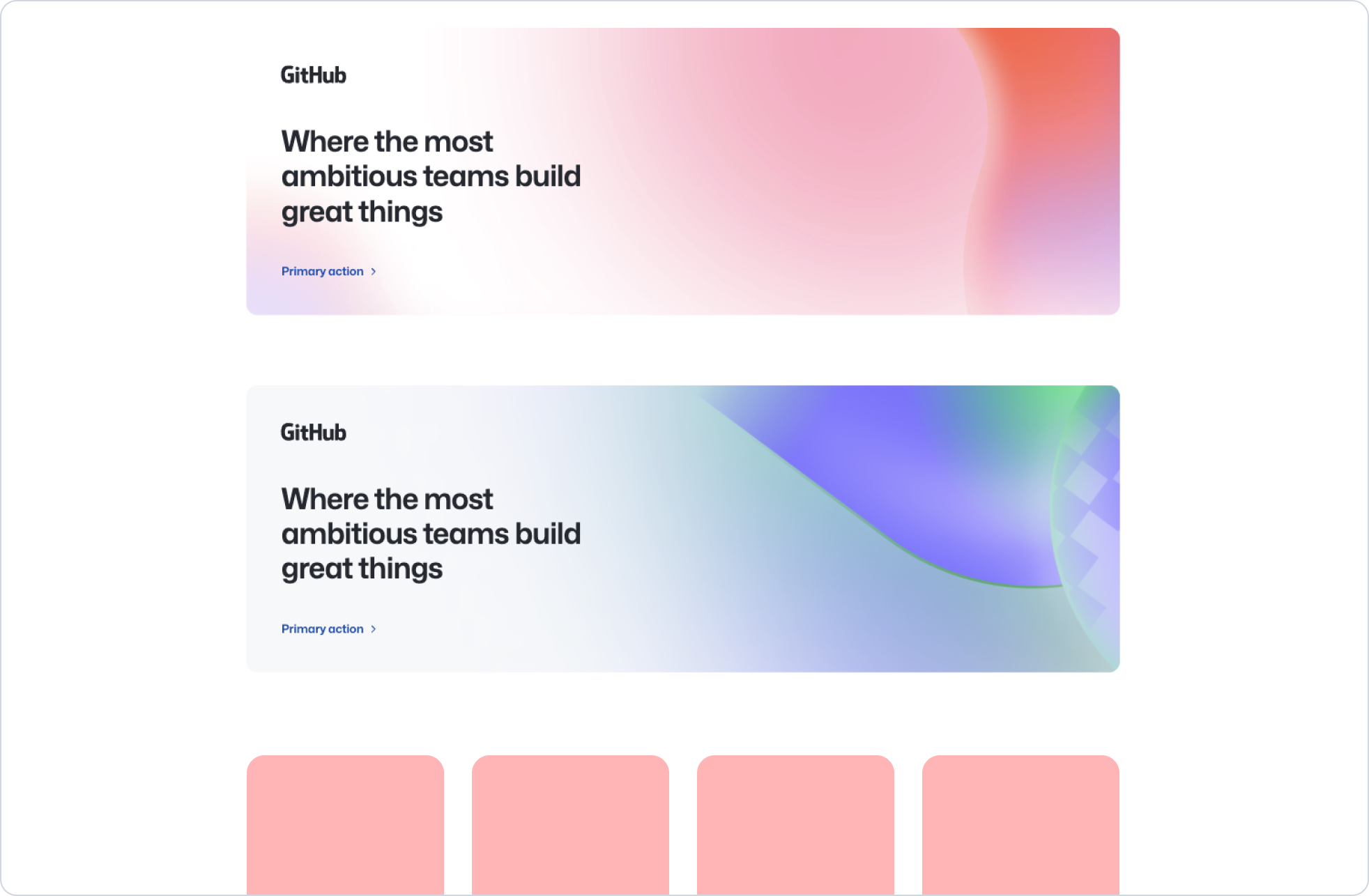 Don’t stack multiple breakout banners, prefer Bento instead.
Use concise headings
Both heading and optional descriptions in the breakout banner should be short and focussed. Heading should be not be longer than 3 lines, and description should be no longer than 3-4 lines.
 Use concise, but impactful heading and description text.
Don’t use longer form content in the heading or description. Consider using Bento as an alternative.
Background visuals
Background images should be abstract and low fidelity to not compete with the foreground text.
 Use approved wallpapers that provide space and contrast with the foreground text.
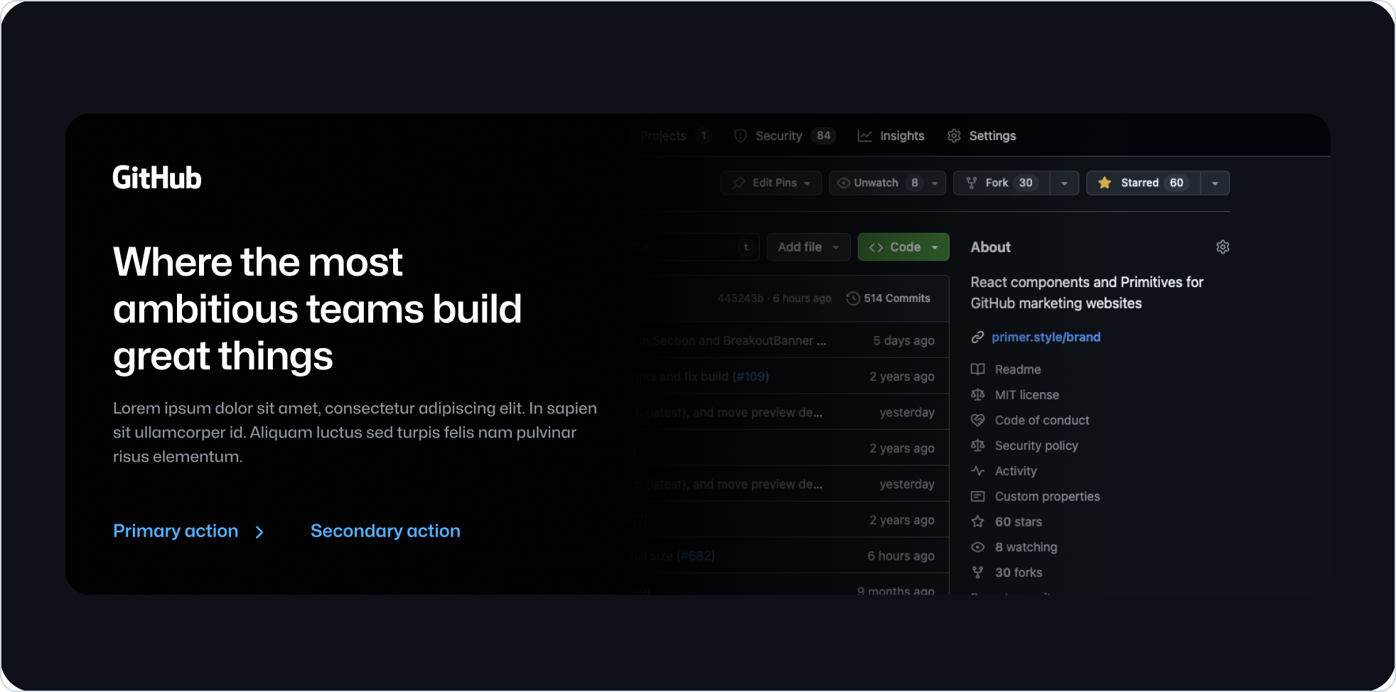 Don’t use images of people’s faces, real objects, etc.
Leading visuals
 Use logos or icons that are related to the adjacent banner content.
 Don’t use decorative imagery as a leading visual. Use the background image to apply decoration.
 Use monochrome colors, which correspond to the text color of the current, active color mode.
 Don’t use full color visuals.
Accessibility
- Ensure proper color contrast between text and background
- Make sure leading visuals include proper aria labels
- Use semantic heading elements with appropriate heading levels
- Ensure links have descriptive text that makes sense out of context