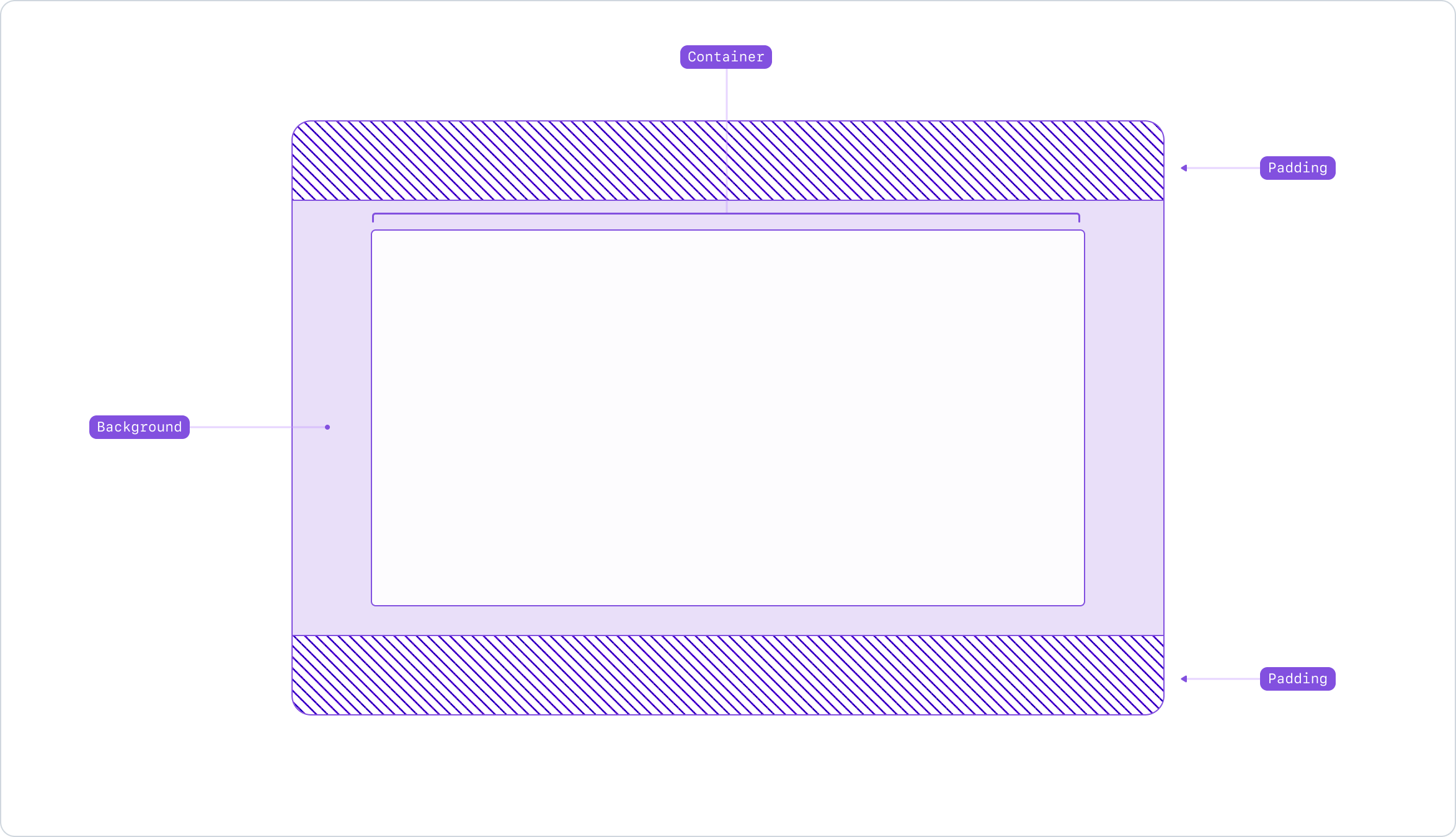
Anatomy

- Container: Wraps the content to ensure proper alignment and responsiveness across different viewports.
- Padding: Customizable padding at the top and bottom of the section to suit different content needs.
- Background: Options to customize the background with colors or images.
Usage
The Section component is a versatile layout tool. It serves as a container that can be customized to fit various design needs.
Use the Section component to create distinct blocks of related content within a page, enhancing both the structure and the layout. Use it to break up long pages into more digestible segments, making the content more approachable for users.
Content Grouping
Use the Section component to group related elements together, such as one or more subsections containing text, images, links and other compositions that share a common theme.
Semantics and headings
The Section component is a semantic element used to create a new section within a page. It should include a heading to title the section. You may use the section intro component or rely top-level components like Hero that already provide the required heading. Ensure that the heading level is appropriate for the content hierarchy.
Visual Separation
Use different backgrounds and paddings to visually differentiate different sections within a page, aiding in content hierarchy and navigation.
Grids and responsive design
The container maintains content margins and allows the use of the Grid to consistently align elements across different viewport sizes.
Related components
- SectionIntro: to add a heading and optional description to the section.
- Stack: to enable layout of its immediate children along the vertical or horizontal axis.
- Grid: to create flexible and responsive grid-based layouts.
- Box: to applying one-off styles to an element.