Layout
GitHub is a diverse and complex platform. These layout guidelines aim to provide a set of standards that enables consistent, accessible, and responsive experiences.
Overview
Humans process visual information by breaking down shapes and colors. The visual processing system parses colors and textures in parallel, while parsing shapes and forms one at a time.
Layouts are composed of shapes, and therefore parsed linearly. As a consequence, a layout should be organized aiming to create the least amount of friction for users.
People rely on their natural reading order (top-to-bottom, left-to-right in Latin script), and their acquired mental models from previous interactions to discover what they are looking for.
Strive for a focused experience
A page should enable the person to focus on the content. We should respect the user’s attention, and provide an experience that is clean, calm, and uncluttered.
Design fully-functional responsive experiences
Pages should adapt to smaller screens, without loss of functionality. Multi-column page layouts need to be designed for scenarios where not all columns fit the viewport at once. Break down layout into multiple views for mobile-friendly experiences.
Consider consistency inside and outside GitHub
Leverage existing mental models people have from using GitHub, the web, and other computer software. Use familiar patterns and conventions to create an experience that can be rationally understood.
Responsive foundations
Primer provides two levels of abstraction for handling responsive designs:
- Viewport ranges, for defining the layout and navigation affordance of a page at a high level.
- Breakpoints, for fine-tuning custom experiences.
Viewport ranges
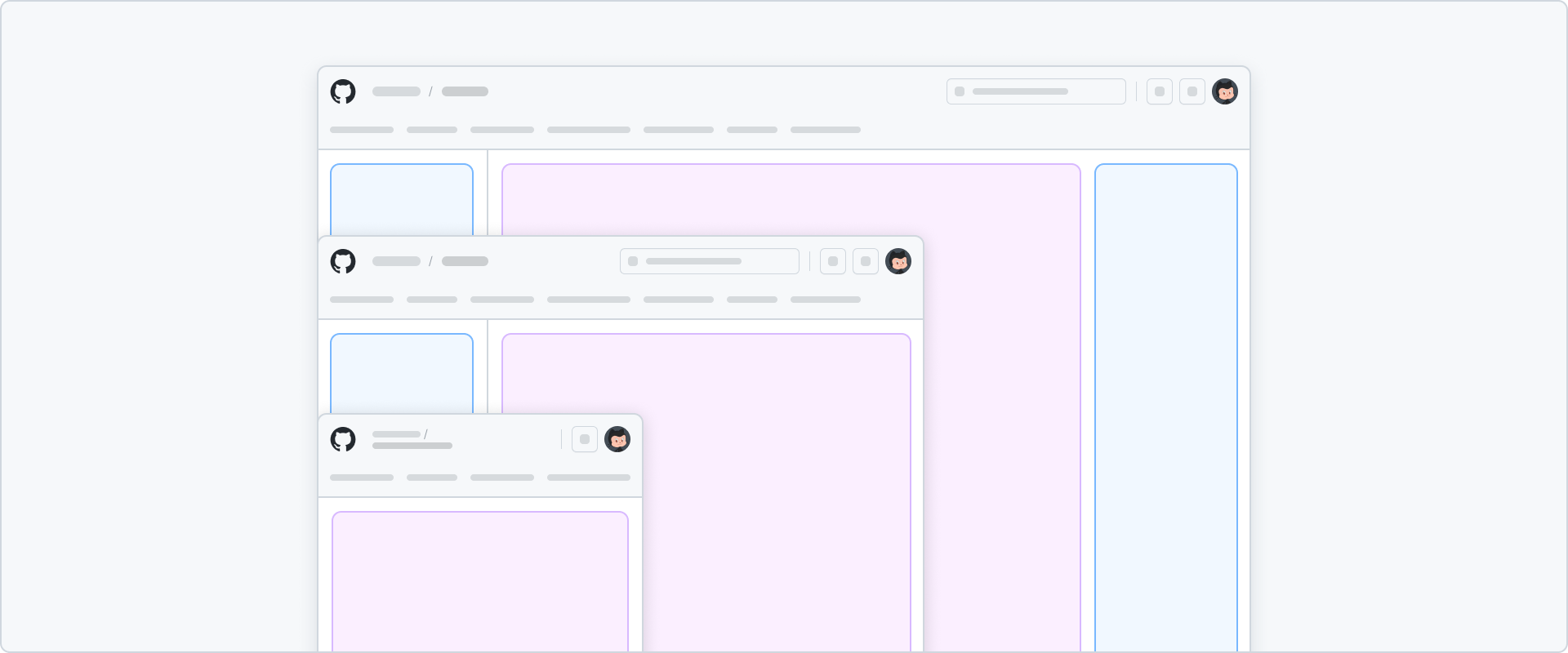
Viewport ranges target common scenarios when designing responsive layouts. They are based on the viewport width, and are opinionated about the number of layout columns that can fit in a given range.
Viewport ranges enable designs to break down complex multi-column experiences into simpler layouts according to the the available space.
Because they provide a clear separation between mobile and desktop patterns, viewport ranges allow pages to remain powerful on desktop-friendly scenarios, while allowing a targetted streamlined experience in small devices.
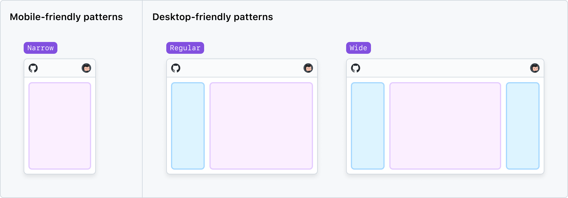
| Viewport range | Width range | Columns | Description |
|---|---|---|---|
narrow | <768px | 1 | Supports a single-column layout. Also known as “mobile”. |
regular | >= 768px | Up to 2 | All desktop-friendly patterns start at this range. |
wide | >= 1400px | Up to 3 | Optional range when a 3rd layout column is needed. |
Breakpoints
Breakpoints enable designers to fine-tune their responsive experiences, adjusting any specific responsive scenarios that are not addressed by viewport ranges.
Historically, Primer has utilized breakpoints as the base of mobile-first responsive CSS utilities. While these utilities values remain available, breakpoints are no longer tied to a min-width mobile-first media query approach.
Breakpoint sizes should be simply seen as a unit in a ruler. The numbers are not opinionated into how they should be used when applied to a media query. That is, they don't refer to ranges that go upwards or downwards.
While viewport ranges should be used for distinguishing responsive layout adaptations, custom media queries built with these breakpoints values can be used internally for adjusting any specific responsive scenarios that require a fine-tune level of control.
| Breakpoint | Size |
|---|---|
xsmall | 320px |
small | 544px |
medium | 768px |
large | 1012px |
xlarge | 1280px |
xxlarge | 1400px |
For more information about viewport ranges and breakpoints, check the Responsive API design guidelines ADR (currently only available for hubbers).
Padding
To provide more space for content on smaller screens, the padding should be adjusted according to the different breakpoints.
| Breakpoint | Content | Pane |
|---|---|---|
xsmall | 16px | 16px |
small | 16px | 16px |
medium | 16px | 16px |
large | 16px | 16px |
xlarge | 24px | 16px |
xxlarge | 24px | 16px |
The padding is applied directly to the content or pane area, not to its parent container.
For example, the content area on an xlarge breakpoint will have a max-width of 1280px. The 1280px includes the 24px padding, which means that visually, the max-width of the content area on an xlarge breakpoint will only be 1232px.
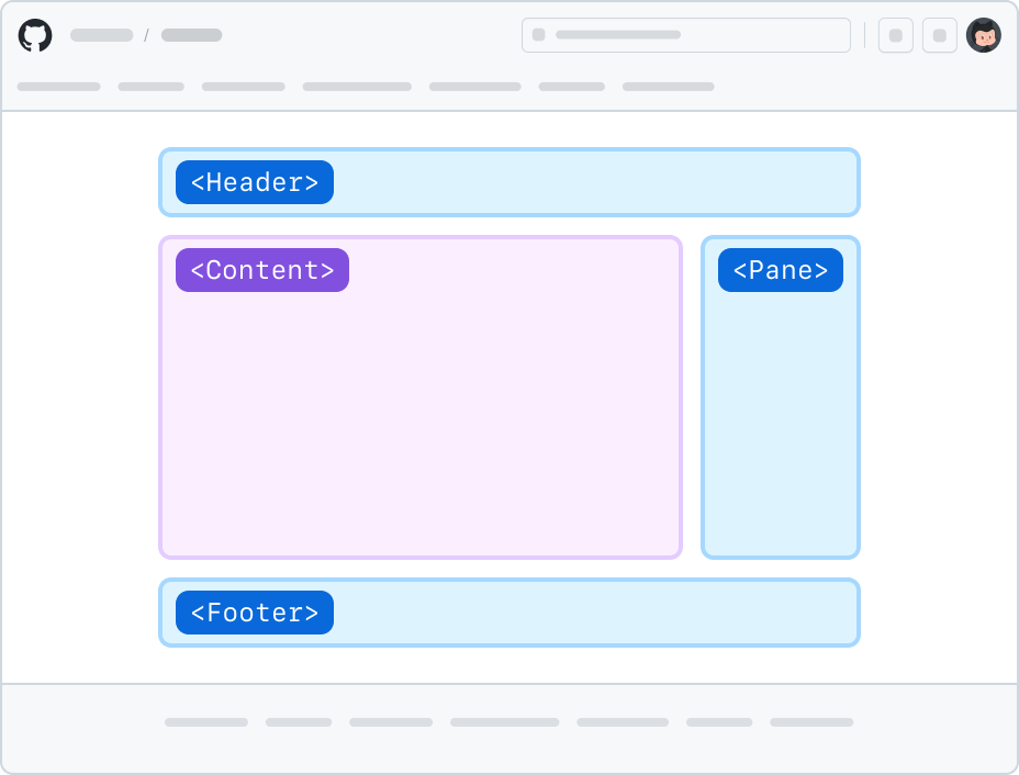
Anatomy of a page
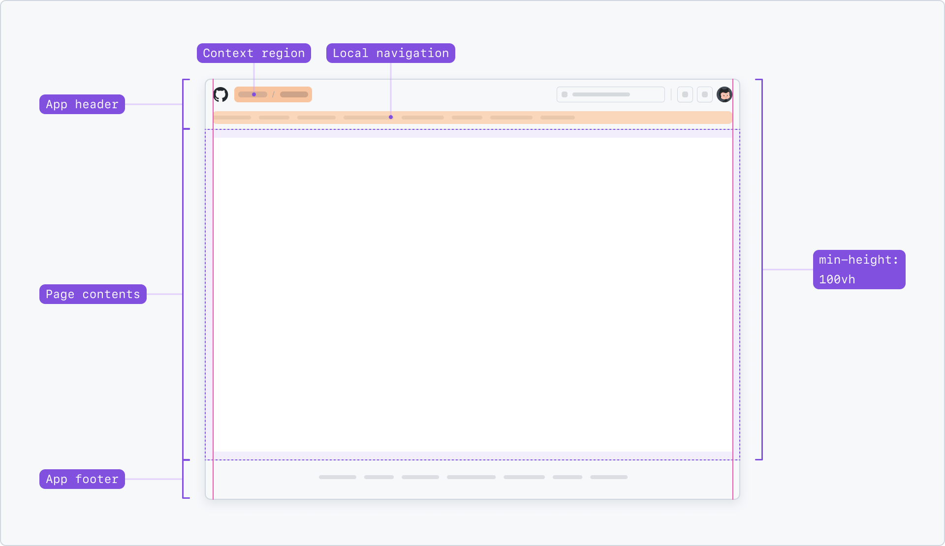
App header
App header is GitHub’s topmost bar. This header contains global navigation and actions, but also contextual navigation elements such as Context region and Local navigation.
It may also contain other system-level elements, such as notification banners.
App header is never fixed to the top of the viewport. It scrolls with the rest of the page.
Context region
Context region informs the current section where the person is located. For example, in any page that belongs to a repository, it shows :owner / :repository.
Context region is not a full-path breadcrumb. Instead, it works alongside elements such as Local navigation and other in-page navigation components to give the user a full mental model of where they are located.
Don’t include custom interactive elements such as dropdown selectors or other buttons in the Context region.
Repository context
:owner / :repositoryDo represent repositories as direct sub-items of an organization or user in the Context region.
:owner / :repository / IssuesDon’t use a Context region to show the full page’s path. A selected “Issues” item in the local navigation should provide enough complementary context.
Owner context (organization or users)
:ownerDo represent top-level sections with a single Context region item.
:owner / ProjectsDon’t use a Context region to show the full page’s path. A selected “Projects” item in the local navigation should provide enough complementary context.
Other owned categories
:owner / Projects / :projectDo represent objects other than repositories as sub-items of a category.
:owner / Projects / :project / InsightsDon’t display the full page’s path. The page should use local or in-page navigation elements to provide such context.
App footer
App footer contains useful links and legal information about GitHub. It remains “after the fold” in smaller pages to keep the focus on the main content.
The App footer should be present in all core pages. Experiences that require rich interactions, such as when manipulating large amounts of data, may opt-out of the App footer.
Page types
Page layouts can have many different forms and needs. The list below contain common page types that can be used as a starting point for designing new experiences.
Full pages
This is the classic type of a page design of GitHub, where both content and pane regions appear horizontally centered to the viewport.
Page layouts generally limit their maximum width to xlarge (1280px) so the content region doesn’t render paragraphs with too many words per line.
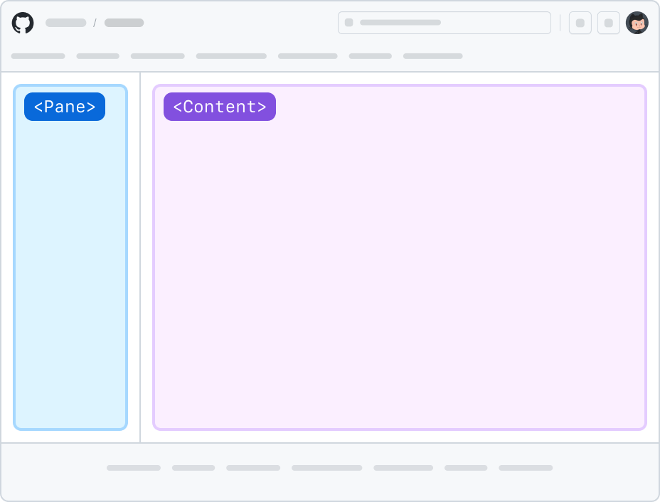
Split pages
Split page layouts are a good options for pages that have side navigation, filtering, or any type of list-detail pattern.
Split pages separate the viewport in two, allowing the pane to have an independent scrollable area. This is useful when the pane has a long list of items, and the user needs to scroll through the list without losing the context of the selected item.
The pane region of a split page layout is always flushed to the left. Don’t use right-aligned flushed panes as their scrollbar may conflict with the page scrollbar.
The content region of a split page layout may have a maximum width. In those scenarios, the content region tries to remain centered horizontally to the viewport if there's space.
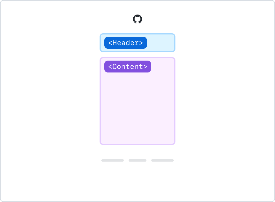
Interstitial pages
Used for signing-in experiences, password verification, loading states, or other long operations.
Interstitial pages usually have an xsmall (320px) maximum width.
Layout regions
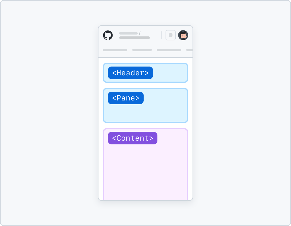
Layout regions are the main structural building blocks of a page layout. They are the areas where content and components are placed, and group elements that share a common purpose.
Layout regions make it easy to adapt the page to different viewport ranges. For more information about responsive behavior, see Responsive behavior below.
Header region
Headers appear at the top of the page, and include a page title, alongside optional actions, summary, local navigation, and metadata.
Content region
The content region is used for displaying the main subject of the page. Other regions support the content with additional information, either about, or related to it.
Left pane region
Display navigation, filtering, or an overview for entities such as users, bots, apps, etc.
Right pane region
Display item metadata, details, and other auxiliary information.
Footer region
Use it to display less important information, such as references, or links to other pages.
Responsive behavior
Narrow viewports support a single column when displaying page layouts. The list below contain common responsive adaptations to make sure experiences can remain usable on smaller screens.
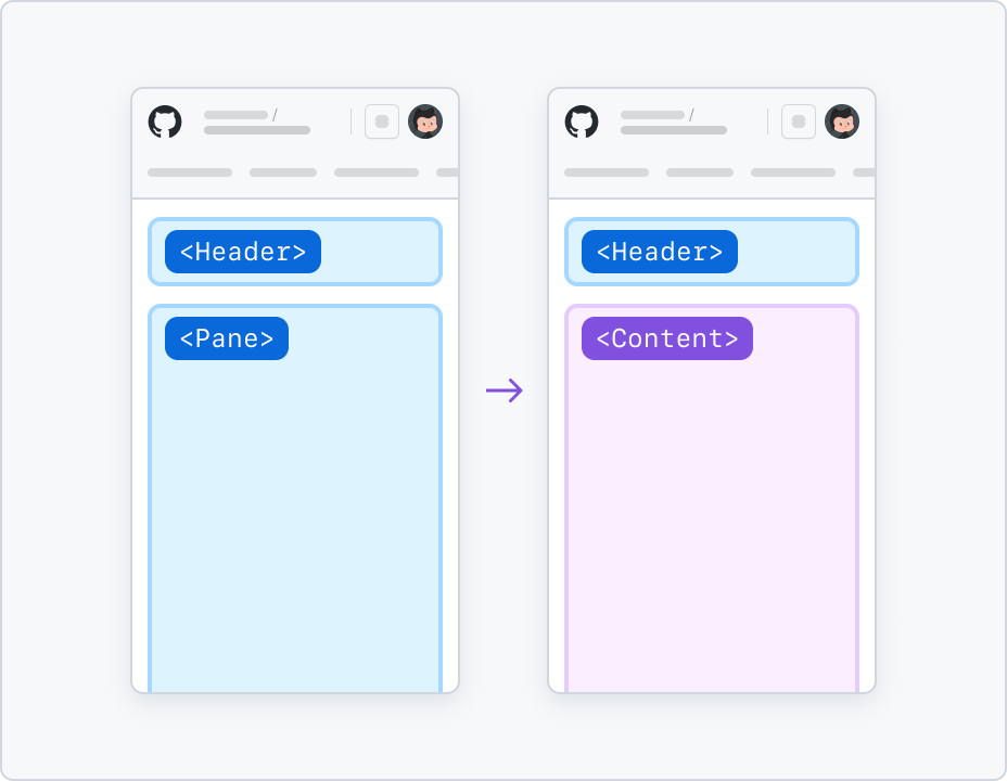
Split into different pages
List-detail patterns, such as settings pages, can be split into different pages when the viewport is narrow.
In this behavior, only one of pane or content regions is shown. The user can switch between the two by selecting an item from the list to drill-in into its details, or navigate back using a parent link in the page header.
See the responsive sidebar navigation patterns section of our navigation guidelines for more information.
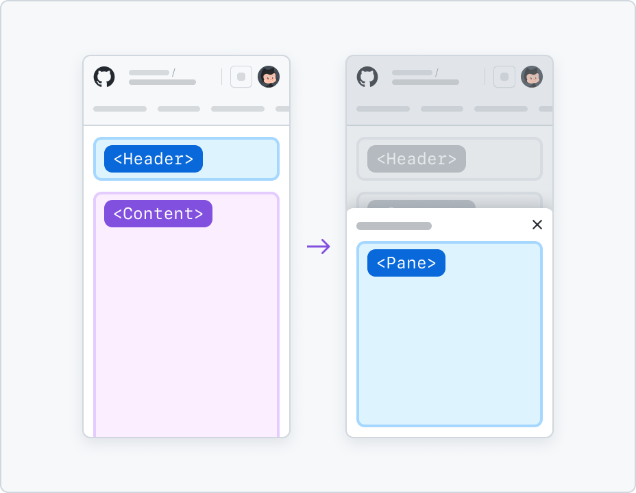
Show pane as bottom sheet
Panes can be displayed as bottom sheets when they’re used to display auxiliary information, such as metadata, details or actions. Use narrow viewport-specific button triggers to open the pane as a bottom sheet.
If you're using a pane as a sidebar for navigating or filtering, see the responsive sidebar navigation patterns section of our navigation guidelines for more information.
Stack vertically
In scenarios where the pane is used to display an overview of the content, it can be stacked vertically on top of the content region. Metadata and auxiliary information can appear stacked below the content region.
Avoid stacking a pane on top of the main content area if the pane has a lot of links. It will push the main content down and force the user to scroll to get to the content. For alternative patterns, see the responsive sidebar navigation patterns section of our navigation guidelines.
Additionally, a small pane summary may appear above the content, with a trigger used to display the full details as a bottom sheet.