Responsive
Supporting responsive experiences is an essential part of developing for the Web. Every page and feature at GitHub needs to adapt to the user’s device and their preferences.
Definition
Responsive web design is the practice of building a website suitable to work on every device and every screen size, no matter how large or small, mobile or desktop. Responsive web design is an accessibility requirement, focused around providing an intuitive and gratifying experience for everyone.
At GitHub, being Responsive means our experiences are inherently adaptive. Interfaces should not only adjust layout and spacing when resizing a page, but work efficiently to provide an experience that is tailored to match the paradigms and affordances of the person’s device:
- Responsive to the form factor: adapt to viewport size, pointing device support, and to the device metaphors, power, and affordances.
- Responsive to the user preferences: respect browser’s default font size, reduced motion, color scheme, contrast preferences, etc.
Responsive to the device’s form factor
Designing for the web means that people can open your page from virtually any type of device. When designing for GitHub, picture our users using desktops, tablets, and smartphones, but also custom-built tiny cyberdecks and VR headsets.
Device power
GitHub cannot discriminate against devices and connection speeds. Experiences need to be fast and performant, even on low-powered devices and slow connections. It’s not fully shipped until it’s fast.
Viewport size
To guarantee maximum compatibility, pages should adapt to the browser’s viewport size, without loss of information or functionality, starting at the following dimensions:
- Minimum viewport width: 320px
- Minimum viewport height: 256px
Providing support at these smaller sizes enable people with low vision to use GitHub with a browser zoom enabled, up to 400% on a 1280px wide screen. Read more about this accessibility requirement.
To understand how to break down a page to work on smaller viewports, check out Responsive foundations and Responsive behavior sections in the Layout page.
Pointing device
Consider multimodal input capabilities when designing interfaces. Many devices possess the ability to respond to cursor, touch, keyboard, voice, and other forms of input simultaneously. Additionally, many devices have the ability to have their input augmented in ways you may not initially expect. For example, many smartphones can support mouse and keyboard-based input, although their browsers may not be able to detect the presence of this augumentation.
Because of this, pointing device media queries such as coarse or fine are unreliable. Avoid relying on this type of query to conditionally modify parts of an interface.
Minimum target
When creating interactive targets in your design, ensure that they are large enough to easily tap or click on. The AA accessibility standard GitHub strives for requires a minimum target size of 24px.
However, it is recommended to aim for the AAA standard when possible. For more information on Target Size at the AAA level, refer to the W3C documentation.
A common example of a hit target that may not meet the AAA standard on mobile is our medium size button, which is visually only 32px in height. Consider utilizing the large button size for circumstances like this, instead of attempting to adjust the button's touch target area to meet the AAA size requirement.
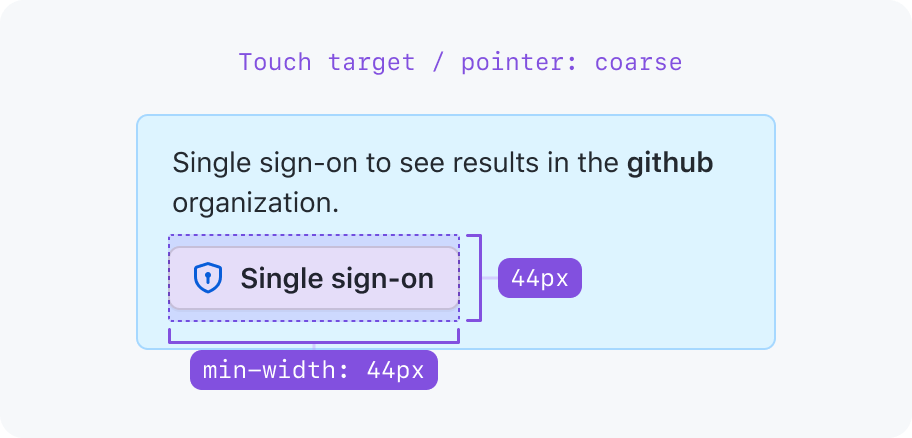
While acceptable for AA try to increase the touch target to 44px on mobile to reach AAA
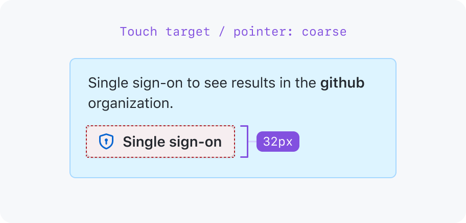
Keep the 32px hit target for mobile touch targets.
Hover support
Browsers report if the primary input mechanism can hover over elements with the hover media feature.
Devices that don’t support hovering such as smartphones and tablets may need adapted experiences so that the user can interact with the page without hovering over elements.
Features that rely on hover such as tooltips or hovercards may not be available on these devices. Make sure the information presented is still accessible through other means, such as a direct link to a page with the information.
Responsive to the user preferences
People may set system preferences to change the way they prefer to interact with their devices. By default, GitHub must respect these preferences. Providing a way to override these options within the User settings is also recommended.
On the web, these user preference media features include:
Browser default font size
Users may set their operating system or browsers to use larger or smaller fonts. GitHub should respect these preferences, as it enables people with low vision to increase the size of the text on the page.
Primer design tokens are designed to support rem units, which are relative to the browser’s default font size. Use Primer-provided design tokens to ensure consistency across the system.
To test this, change the size in the browser:
- In Chrome: Go to
chrome://settings. Under Appearance, change the font size. - In Firefox: In the menu button, select Settings. Under ”Language and Appearance” you can set different size. Default is
16.