Empty states
Empty states are used to fill spaces when no content has been added yet, or is temporarily empty due to the nature of the feature.
These guidelines demonstrate best practices for using the Blankslate component and designing empty states. If you're looking for guidelines on implementation, please refer to the Blankslate component.
The Blankslate component
The Blankslate is made up of several elements that work together to inform the user about a feature and how to proceed forward. Below are the different elements of the component and how to modify them.
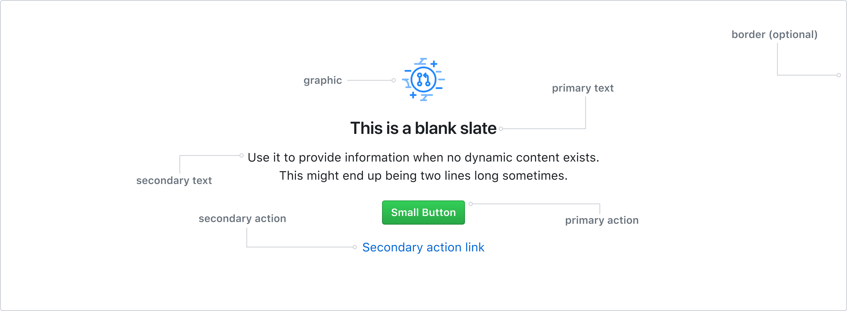
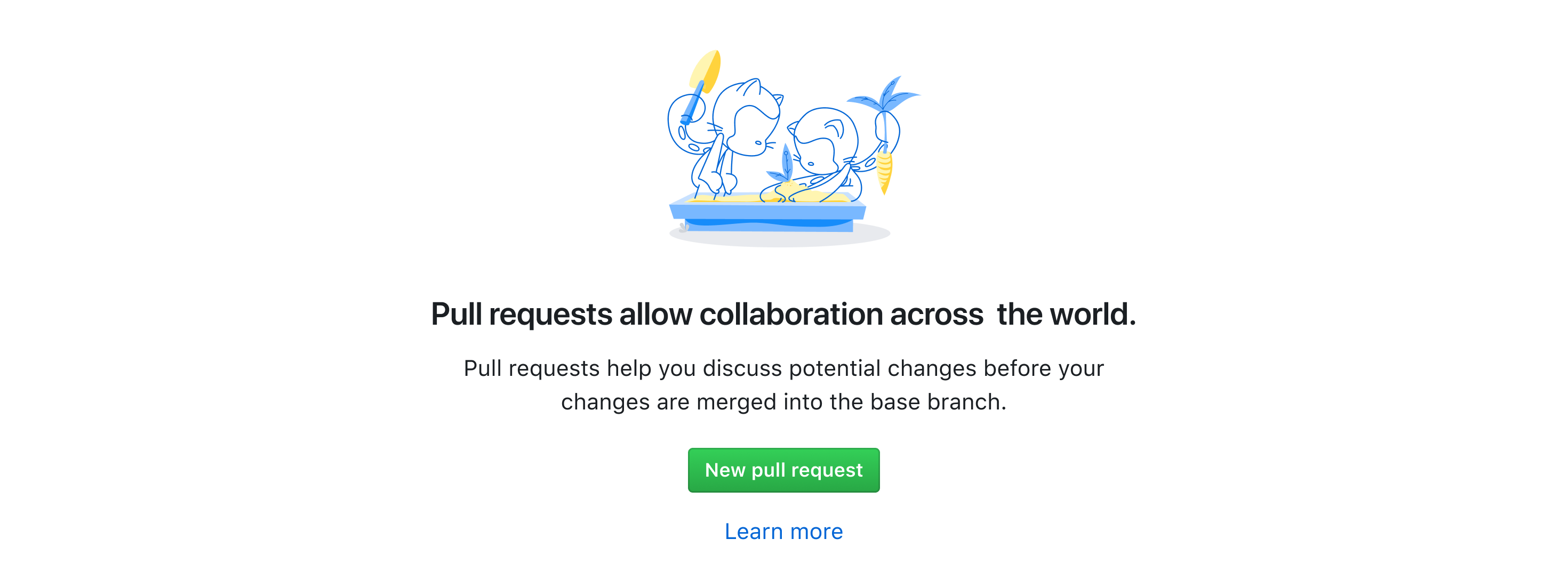
Graphic
The graphic can bring delight, preview an interface element, or represent the goal of the feature. Graphics should be placed intentionally and with thought about the intention of the content. Graphics also differ in meaning and appeal to the user, which is why the Blankslate component has multiple variations. These variations are outlined later on this page.
If a Blankslate is being used to convey an error state, the graphic should not attempt to bring delight or be playful. Instead, the graphic should reinforce that something went wrong. Default to using the alert icon.
Primary Text
Primary text acts as a title for the empty space. Use primary text to explain the purpose of the empty state, help users feel comfortable to engage with the content, begin a feature flow, or concisely summarize an error state.
If the space is empty because this the feature hasn't been used yet, convey the intention of the feature in a way that sounds welcoming and human. For example, if a user is trying to view a list of their repositories but hasn't created any yet.
If the space is empty because the feature is temporarily empty, convey that the feature is empty because of the nature of the feature. For example, if a user is trying to view notifications but has no notifications yet.
If the space is empty because something went wrong, concisely summarize the problem. For example, "Repositories could not be loaded due to a system error" would be a sufficient summary if a user cannot view a list of their repositorie due to a database outage.
Secondary text
This optional text is used to inform the user about the feature or error in more detail. Secondary text should be brief and non-redundant if possible. From the text, users should be able to understand what steps they might take next.
If the space is empty because this the feature hasn't been used yet, the general purpose of the feature and how it may help them accomplish a goal.
If the space is empty because something went wrong, explain what they can do to fix the problem. If there is nothing the user can do to fix the problem, secondary text can provide additional revelevant context or explain what they can do to get help.
Primary action
Blankslates can and are encouraged to use one primary link or action. The action copy should be kept brief and descriptive. If it requires further specification, consider adding an Octicon before the copy.
If the space is empty because this the feature hasn't been used yet, the action should initiate a creation flow or link to a feature.
If the space is empty because something went wrong, the action should lead to a solution, a way to get more information, or a way to get help.
Secondary action
Secondary actions are optional and are represented by a text link located below the primary action button. A secondary action is used to direct a user to additional content about the feature. This might look like Learn more about X or "Check out the guide on X.
Error states are unlikely to ever have a secondary action.
Border
The border is invisible by default, but can be added to help define the structure of the Blankslate component when needed. This can be particularly helpful in page layouts where the Blankslate is not the only content on the screen.
Variations
Empty states have multiple variations that can be used in different contexts.
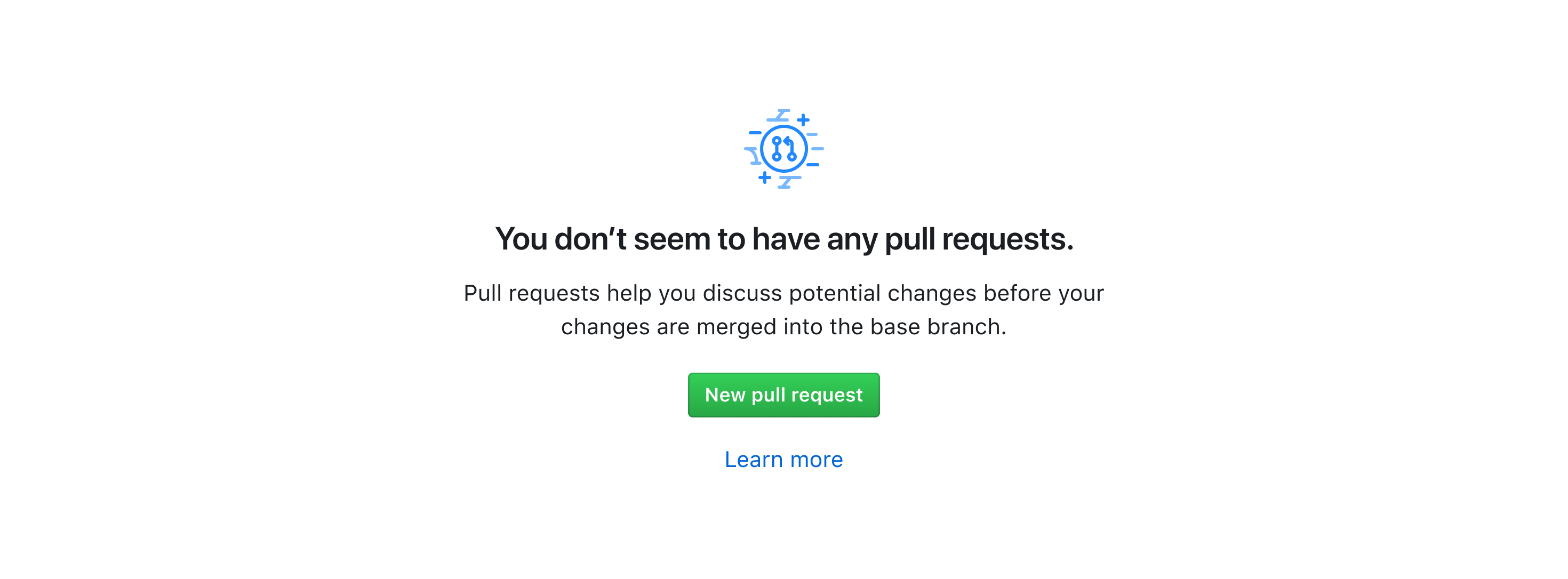
GitHub marketing icons
GitHub marketing icons can be used to represent the feature where the Blankslate is found. Blankslates should default to using a GitHub marketing icon for graphic elements.
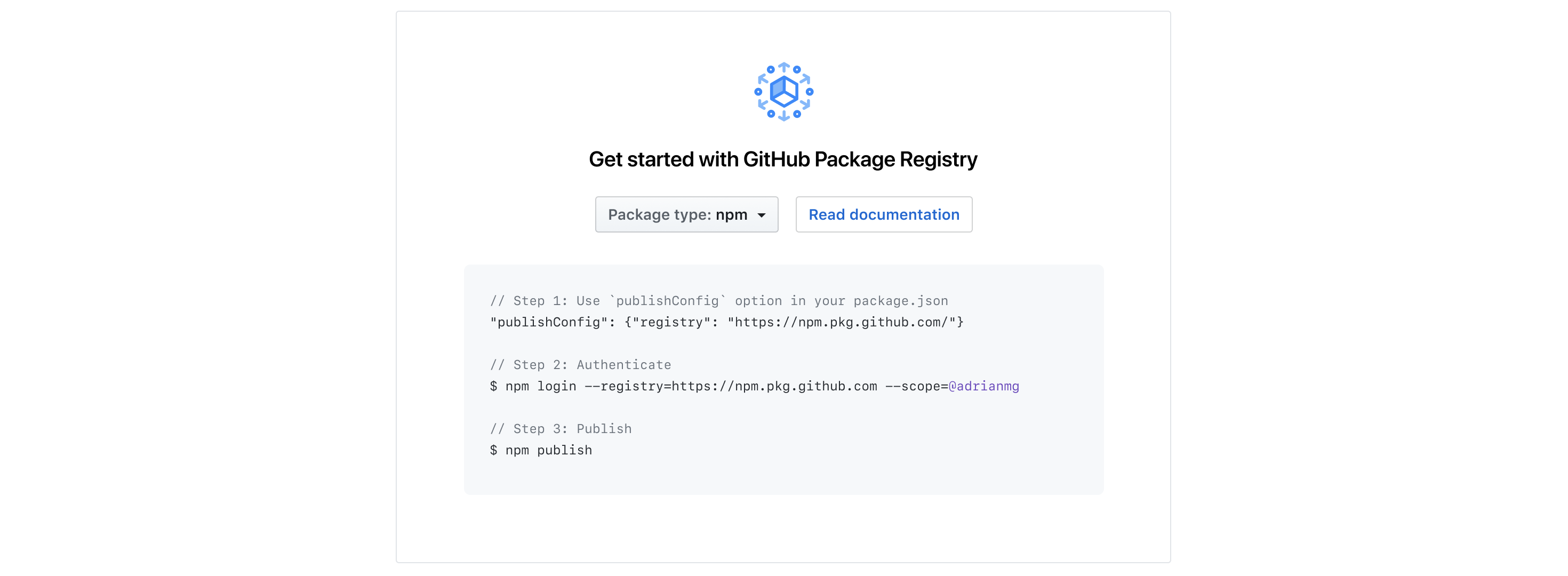
Code block
Blankslates that use a list of steps or offer instructions in the format of code to get started with a feature can insert a code block. This is the case for getting started with packages in GitHub:
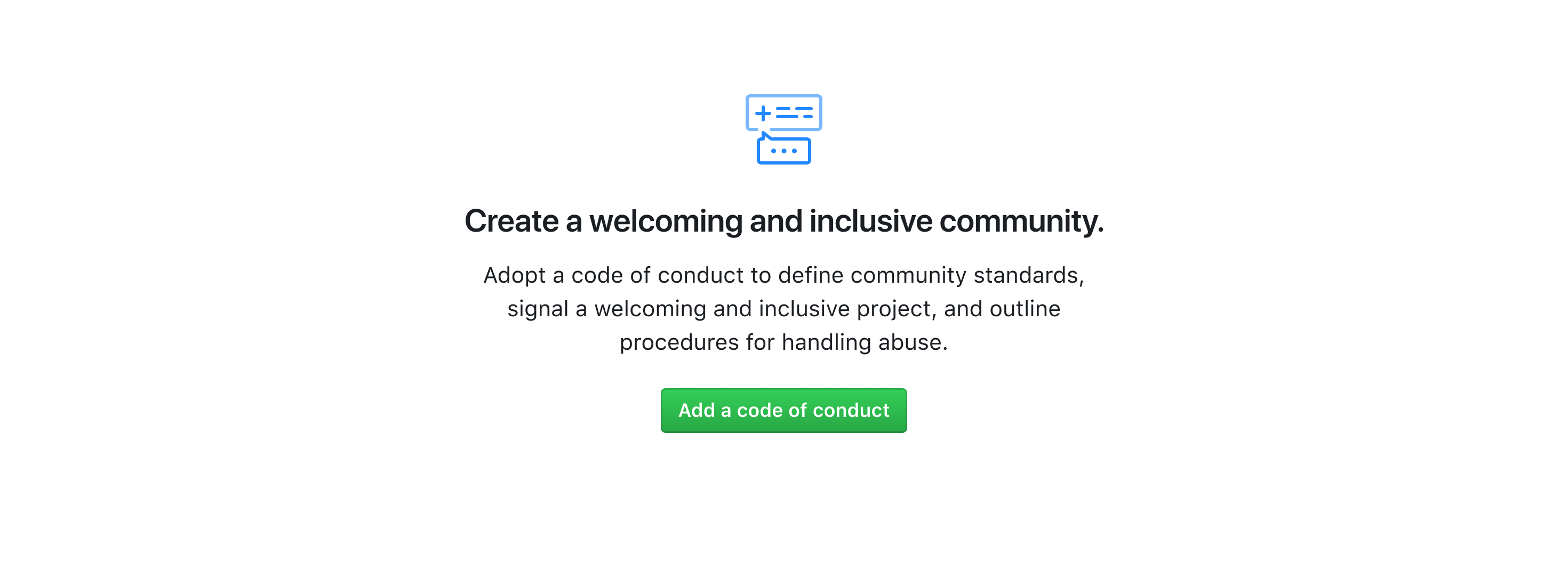
Content and copy
Empty states should explain features in addition to conveying intention. In the example below, the primary text is used to provide a welcome invitation to creating a positive community while the secondary text supports this intent by informing the user on how to do this by providing a code of conduct.
For errors
Avoid language that's overly technical. If an error code is shown (for example, HTTP 500), make sure it's for relevant for diagnostic purposes or necessary transparency. Avoid using obscure error codes altogether.
When possible, concisely describe what the problem is while being as specific as possible. For example, "Form could not be submitted. Some required fields were empty."
Vague messages like "There was a problem" can be frustrating. Overly specific/literal technical explanations like "The US East-2 database cluster responsible for PR and issue comment data is down" give the user an excessive amount of information and could make less technical users feel dumb. The way the user understands how GitHub works may be different from how it's literally built.
First time user experiences
For first time user experiences, use illustration Blankslates to playfully engage the user and introduce the Octocat as a symbol of GitHub. Primary text should welcome the user to the platform and feature. Secondary text should seek to educate the user, but at a simpler, less-technical level.
Error states
If it's possible for the user to recover from the error, explain what went wrong and nudge them towards a path to recover from the error.
Try to push the user forward via an alternative path until they truly hit a dead end for completing their task. Only offer an alternative path forward that can help the user complete their task, resolve the error, or get more context on the error. Don't try and push them in a different direction just to get them away from the error.
For more information about gracefully degrading experiences due to system errors, see the degraded experience guidelines.