Feature onboarding
Onboarding is a virtual unboxing experience that helps users get started with a feature. This is a guide for designing onboarding for the product and does not include what to do for marketing pages, email announcements, social media, etc.
When designing a feature onboarding flow, remember to:
- ✅ Think creatively utilizing different ways to onboard users, including patterns that are not explicitly mentioned in this document.
- ✅ Create a well-rounded feature release campaign that may leverage both on and off-product avenues.
- 🚫 Do not leave feature announcement campaigns running forever.
Usage guidelines
Proximity and proportion
- Onboarding elements should be close to where the feature will live in perpetuity.
- Consider the primary task on a page before disrupting the user with a feature callout.
- Keep in mind the context, placement, and dominance of an onboarding element.
- Onboarding UI choices should be proportional to the functional hierarchy of the feature on the page.
Do not derail or trap the user
- Make it clear to the user how they may dismiss the message and return to their original task quickly.
- Maintain context if a call-to-action links to a new page, i.e. open the link in a new tab or window to avoid losing a user's work.
Set clear campaign limits
Create a new feature release timeline with clear parameters and an appropriate ramp down plan:
- Define why
- System triggers, e.g. a new feature released, a user should not need to dismiss the same announcement each time they visit a different repository.
- User triggers, e.g. a user visits a specific repository for the first time, if recurring, a user should feel added value each time they see the message.
- Consider how triggers may be tallied for users who belong to multiple repositories and organizations.
- Define when
- Timebox to a maximum number of days a coordinated campaign will run across all targeted users.
- Specify a maximum number of impressions a user should see an in-product message. Respect when a user dismisses a message.
Avoid traffic collisions
- Avoid showing too many alerts at once. There should be no more than 2 alerts at a time.
- Consider what other alerts, teaching bubbles, or banners may be active on the page.
Create efficient sequences
Sequence tasks in a logical way to increase onboarding success. Clearly define when a user starts and successfully completes an onboarding flow.
Treat feature onboarding as a story or a journey with a beginning, middle, and end.
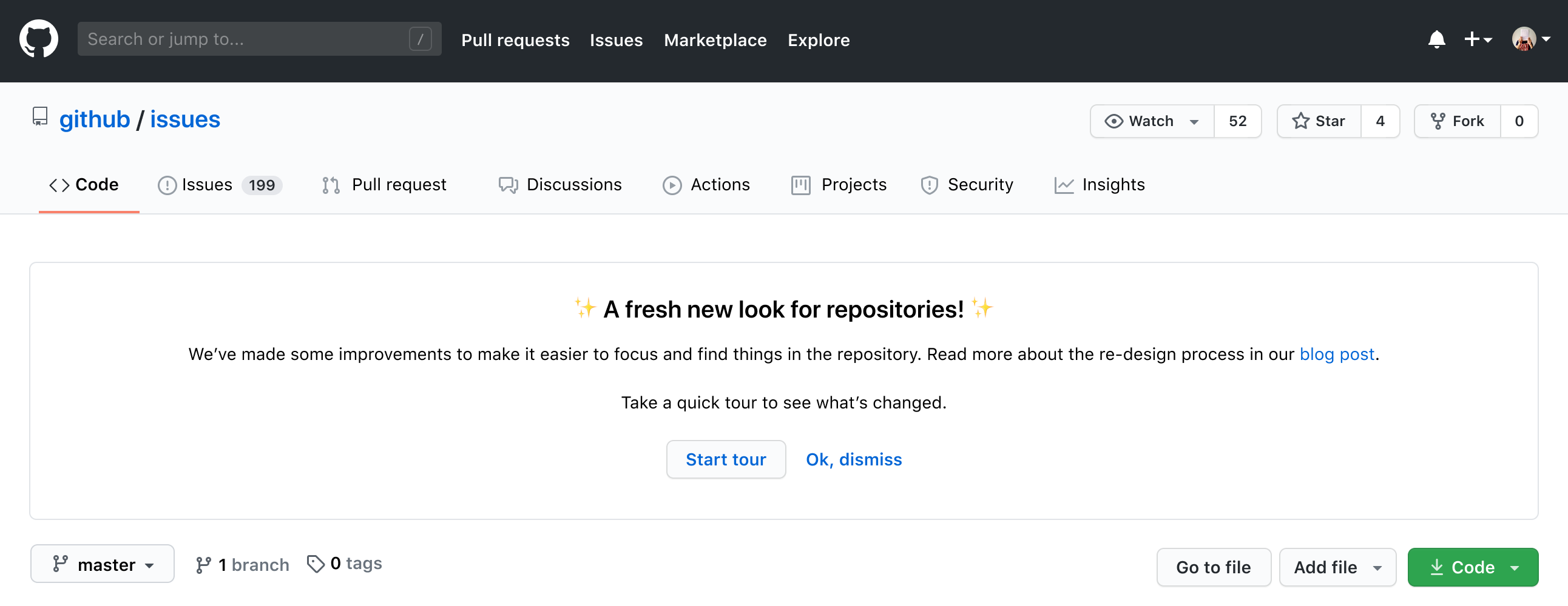
Beginning: Draw attention to the feature
- Invite the user to engage with an onboarding journey.
- Use teaching bubbles, alert banners, the feature preview tray or announcement modals to draw attention to the feature.
Use empty states or alert banners to call attention to a feature if users may discover the feature when starting a task.
Use teaching bubbles or other easily dismissable elements if users will discover the feature when they are completing another task.
Middle: Guide users through their task
- Use form, checklist, or other components to help users complete their task.
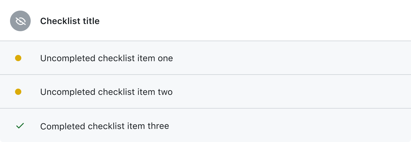
Example of a checklist.
End: Celebrate the finish
- Clearly define when a user starts and successfully completes an onboarding flow.
- Use a concise banner, or other message to confirm the user has completed their task.
Teaching bubble
A teaching bubble is a Popover that calls attention to a feature in a specific part of the page. Generally, teaching bubbles should be used to educate the user and enrich the task at hand.
Usage guidelines for teaching bubble
Teaching bubble Figma sticker sheet.
- Highlight a new feature or important feature that extends or improves the user's experience on the page.
- Show one teaching bubble at a time.
- Include a headline that states the purpose of the message.
- Keep messages short and concise, around 160 characters.
- Make it clear how to easily dismiss the Popover.
- Include supplementary information when applicable. Consider a "Learn more about…" link in the message body that opens a new window or tab without destroying a user's work or context.
- Don't point to hidden elements.
- Don't use a teaching bubble if the user cannot immediately interact or benefit from the highlighted feature.
- Don't derail users; call-to-actions should not remove the user from their current context.
Variations
| Example | Notes | |
|---|---|---|
| Default |  | Generally, use a descriptive dismiss button over a close icon. "OK, got it" is the default dismissal button copy. |
| Condensed |  | Use a close icon for condensed messages. Remember to apply the correct tab order for screen readers to easily dismiss the teaching bubble at the end of the message. |
| Multiple buttons |  | Invite the user to engage with the value proposition promised. Include dismiss as a secondary button as "OK, dismiss". Additional links that takes the user to a new page should be linked from the text and must open in a new tab or window to prevent losing the user’s context. |
| Emoji |  | Use emojis to inject personality into the message. |
| Pictograms |   | Use pictograms to represent the feature. |
| Illustrations and gifs |  | Visually communicate or demonstrate a complex feature with illustrations and gifs to supplement a message. |
Inline feature discovery
Inline feature discovery is a way to highlight features without obscuring other parts of the page while a user may be performing an existing task.
Page banner
Use page banners for announcements that are relevant to the core task on the current page. Remember to consider using other feature announcement patterns or marketing strategies instead of disturbing the user with multiple announcements.
Include a clear way for users to dismiss a page banner and clear campaign parameters.
Call out a major feature or change in a page with an invitation to engage and a clear way to dismiss.
Inline banner
Use inline banners in a page with multiple steps or actions.
| Example | Notes | |
|---|---|---|
| Inline feature banner |  A short introduction to the Wiki feature while configuring repository settings. | Organization, repository, or user settings, where a feature is managed and customized, inline alert banners can highlight relevant features that may help better accomplish a user’s task. |
| Hidden revealed |  Discovering the Profile Readme when creating a new repository. |
Empty states
Use empty states as an integrated way to onboard users to new features. Read more about empty states.
In-product marketing empty state
For special occasions, a first time experience may be more unique than the typical blank state. Take a more branded approach to engage and guide the user through complex experiences. Be aware of how the experience will change once the first-time UI is no longer there.
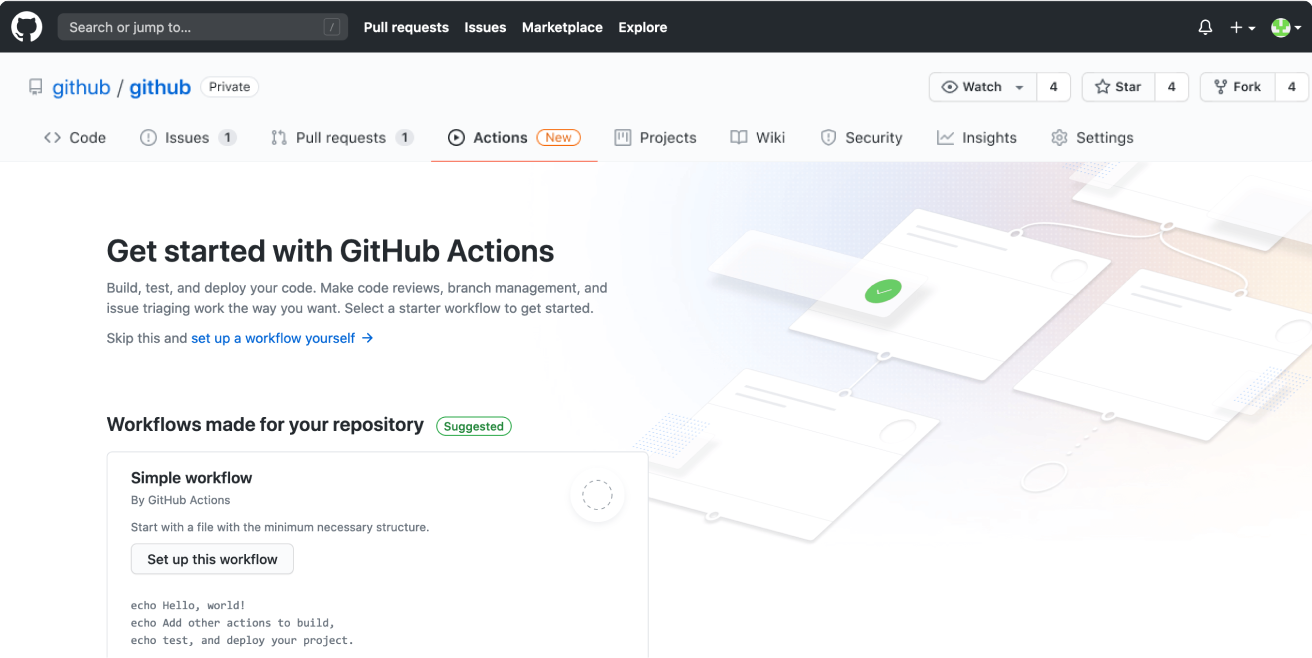
GitHub Actions branded first-time user experience
Designated feature discovery areas
The designated feature discovery areas are generally detached from where the feature actually lives and have a clear click-through for the user to try out the feature or to learn more.
Dashboard feature bulletin
The top of the right sidebar in a user’s dashboard (logged-in home) is a designated area for feature discovery. They take the user directly to the feature in the product or the relevant marketing page.
When using a dashboard feature bulletin:
- Limit messages to around 160 characters.
- If there is a click-through, include a descriptive button; avoid hidden links.
- Use color, with discretion, to spotlight and bring brand feature personality to the announcement.
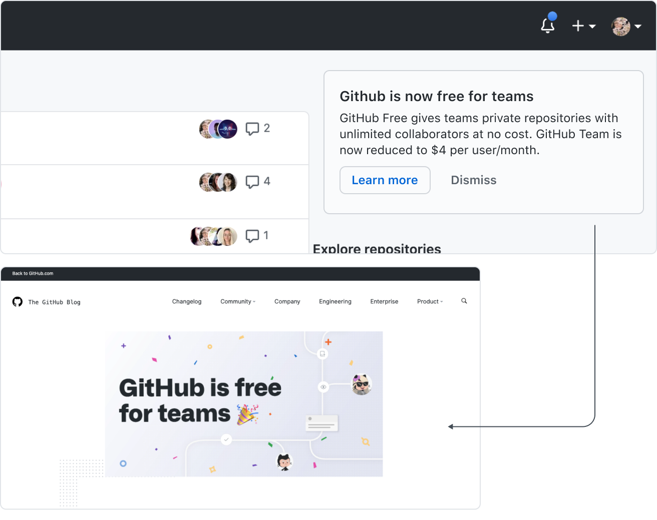
An announcement about GitHub Teams in the feature preview bulletin leads to an off-platform marketing page.
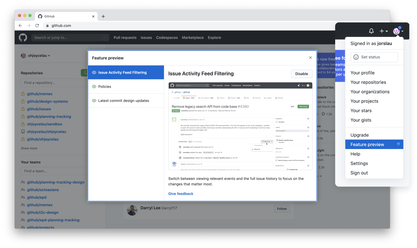
Feature preview dialog
Feature previews allow teams to test features in production with users who opt in. A feature under private or public preview will be added to the Feature Preview dialog, accessible through the user dropdown.
Note: Features in preview should have a comprehensive release and redaction plan. No feature should remain in preview for longer than 2 months unmonitored.
Lifecycles (labels)
Labels are a softer way to accentuate new features without derailing the user from their primary task.
Consider using standalone labels for features that appear in a user’s current view but may navigate away from their current page to fully engage with the feature.
If the label is not part of a navigational item then it's important to include a Give feedback link to collect info on how the changes are perceived by the user.
Lifecycles
Depending on the size and impact of your ship you might only release to a fraction of users.
There are currently 4 main lifecycles: Private preview, Public preview, General availability (GA) and Closing down.
The Private preview lifecycle is often referred to as a Staff ship within GitHub.
Note: The Technical preview label may sometimes be used by the Next team for experiments and research projects.
| Appearance | Stage | Details |
|---|---|---|
 | Private Preview (formerly Alpha, Private Beta, Staff) | - Not publicly announced - Support handled by the product and engineering team (no SLAs) |
 | Public Preview (formerly Limited Public Beta, Public Beta) | - Publicly announced - Customers should not yet take production dependencies on the service (no SLAs) - Support handled by the product and engineering teams. With VP Support approval, exceptions allow the Support team to handle tickets. |
| General Availability | - Available to ALL GHEC Customers - SLAs apply (where applicable, some products do not have SLAs) - Support provided |
We recommend gathering feedback through a discussion to enable seamless follow-up with the user. This discussion should specify the changes made, providing clarity to the user about what's new. In case of deprecating a feature, it's crucial to provide additional information through our documentation. Note that features that were never promoted beyond the Private preview lifecycle do not need to go through a deprecation lifecycle.
Color and terminology
It's important to stick to the correct terminology and label color when referring to a lifecycle. We no longer use the terms Alpha or Beta to identify stages and instead preview Private preview and Preview in the UI.


Label usage and guidelines
For more information on how to properly use labels in the product, please refer to the design guidelines.