Forms
Primer's form design guidelines aim to minimize the effort and cognitive load required to complete a task that requires data input from the user. For example, creating a new repo configuring settings, and logging in.
FormControl anatomy

Label (required)
Labels should be descriptive and concise: aim for no more than 3 words. Write labels in sentence case. Examples: "Repository name", "Payment method".
If you're having trouble keeping label text short, consider using a caption to provide more context.
Placeholder text is never an acceptable substitute for a label because:
- The placeholder text disappears as soon as the input has a value
- Placeholder text colors are typically too light to meet the minimum color contrast ratio required for accessibility
- Screen readers do not read placeholder text as a label
Required field indicator
When a field is required to have a value, it should be visibly marked as required.
This guidance applies to situations where all fields are required. The exception to this are common interaction patterns such as login forms, where there is the expectation that:
- All items are required, and that
- Input validation will help communicate the input being required if left out on submission.
Fields visually marked as required should also be set as required in code. This creates a parity in experience for all users.
An individual checkbox or radio button cannot be marked as required.
Input (required)
The input is what the user interacts with to set the value of the form control. You may pre-fill inputs with smart default values, but be careful about making too many assumptions about what a user wants or needs.
Caption
A caption may be used to provide additional context about the field to help users fill in the correct data or explain how the data will be used. Caption text should be as short as possible.
Caption text may be displayed alongside a validation message, or it may be hidden if it only provides redundant information.
Caption text may be used to augment the label, but should not be redundant with the label or any other parts of the FormControl. If the caption feels redundant, try removing it.
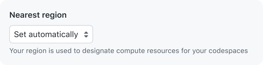
Use caption text that shows new information and provides helpful context

Don’t use caption text that is redundant
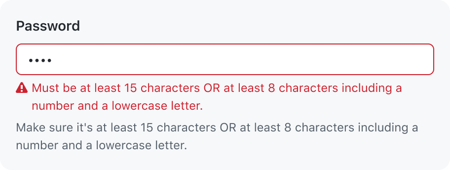
Validation message
A single validation message may be displayed to provide helpful information for a user to complete their task. For example: explain why a value is invalid so they can correct it and submit the form.
An individual checkbox or radio should not have its own validation message or style.
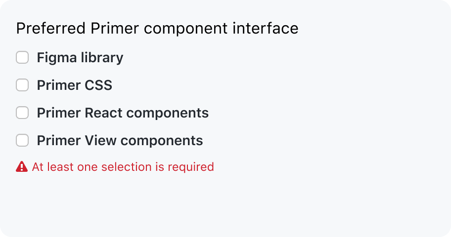
Show a validation message for the group of inputs
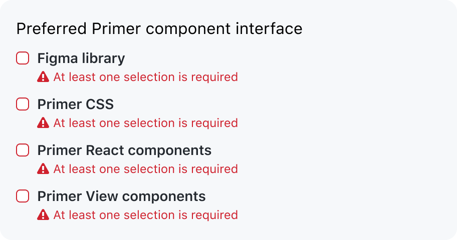
Don’t show a validation message for each input
Information from the caption should not be repeated in the error message. Show the validation message and remove the caption. A validation message makes the field easier to spot when a user is scanning for invalid fields.
Hide a caption that is redundant with the validation message
Don’t show a repetitive validation message
For more information about form validation, see the validation guidelines.
Input methods
Open-ended text

Use an open-ended text field when the field does not have a list of possible values. If the input is able to suggest values, use autocomplete to allow users to pick a value or enter their own.
A set of selectable options

Show a set of selectable options when there is a finite number of possible values.
Structure
Forms should have a structure that makes it easy for users to scan. Forms that flow vertically are easier for sighted users to scan visually.
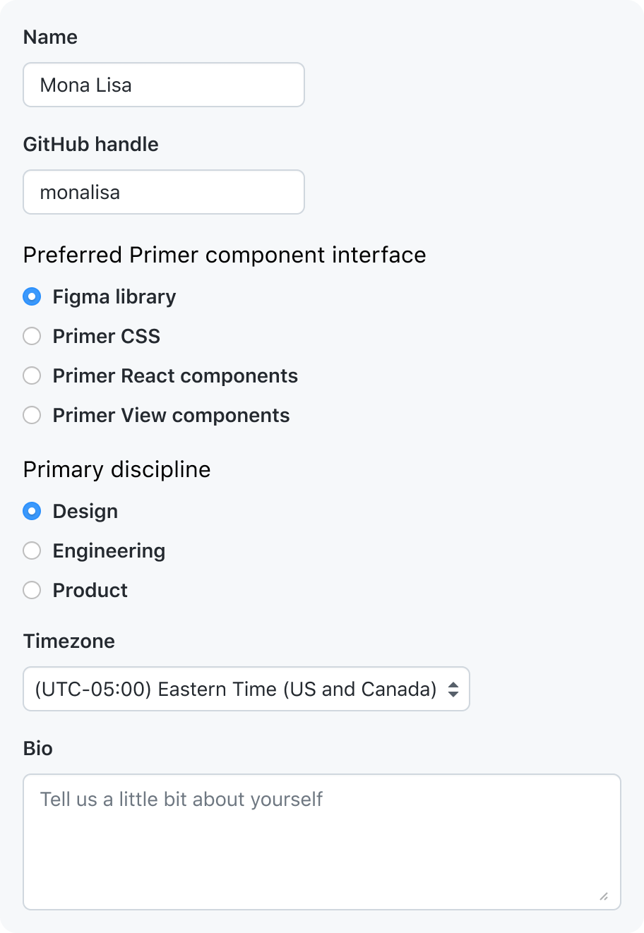
Default to vertically stacked FormControls
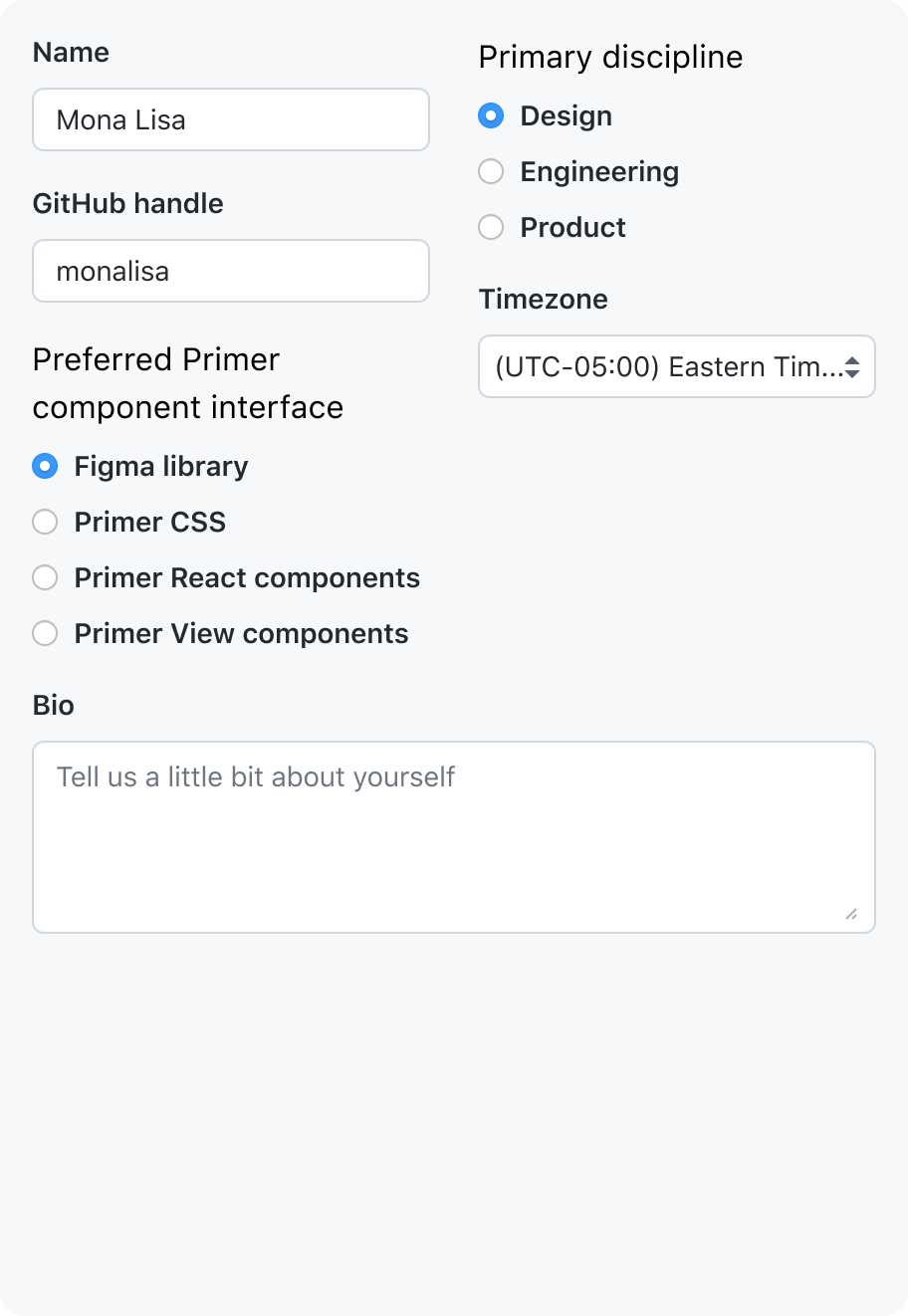
Don’t lay out forms that flow into columns just to reduce the vertical space used by the form
Order of form controls
Form fields should be in a predictable order that flows intuitively.
To achieve an intuitive flow:
- Order fields by their relative level of importance
- Keep related fields near each other
- When possible, keep inputs that require keyboard input near each other so that users who use a mouse don't have to switch back and forth between clicking and typing
Sizing form controls
Hint at the expected length of the value
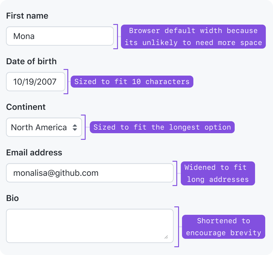
Form controls should be sized to fit their value. Start with the browser default width, and adjust as needed.
- Single-line text inputs get a default width set by the browser, but their width can be changed to fit the approximate length of their text.
- If the text length could fall into a wide range, then either keep the browser-default length, or fill the width of its parent.
- Multi-line text inputs like Textarea get a default width and height set by the browser, but its dimensions can be changed to fit longer blocks of text.
- Select dropdown widths are set by the browser to be as wide as the text of its longest option. We shouldn't override this width unless it's to make the dropdown fill the width of its parent.
- Checkbox and radio inputs have static dimensions
Maintain page hierarchy
Input components ship with size variants that adjust font size and padding to maintain consistent hierarchy with adjacent elements.
Grouping form controls
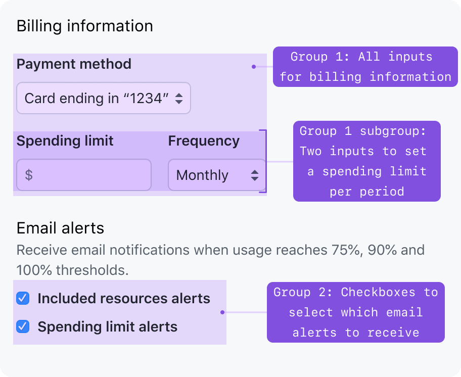
When there is a collection of closely related fields, they should be labeled and visually grouped together. For example: putting form controls closer together.
Progressively disclosed form controls
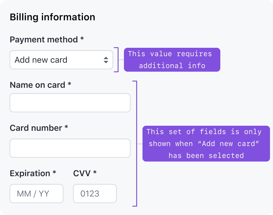
To keep forms concise, you may choose to hide or show form controls based on selections the user has made.
Nested form controls
Sometimes, progressively disclosed form controls can be visually nested under a parent form control. A common pattern is to use a checkbox or radio “checked” state to decide whether to show a related form control.
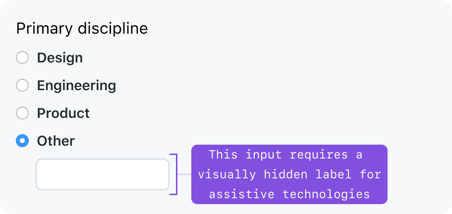
If the parent form control provides sufficient visual context, you may visually hide the label. However, you must specify text for a visually hidden label that is accessible to screen readers.
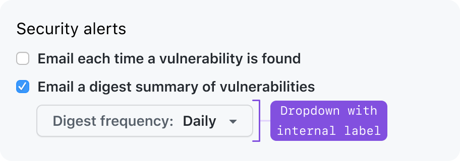
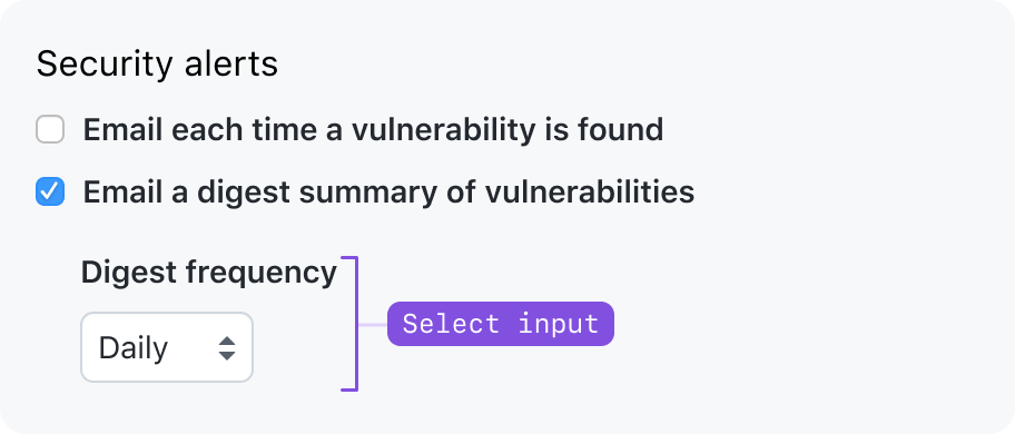
If the parent form control does not provide sufficient context, a visible label should be shown. Make sure the label of the nested form control doesn’t clash with the label of its parent form control.
See the progressive disclosure pattern for more information.
Validation
Use Primer instead of browser-native validation UI. Browser-native validation messages are not accessible to screen readers, and they visually clash with Primer styles.
Disabled buttons are discouraged, as they don't clearly communicate what actions a user should take to complete a form.
Instead, consider the following validation methods.
Validation statuses
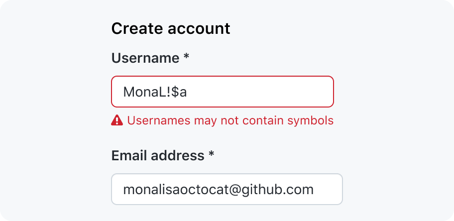
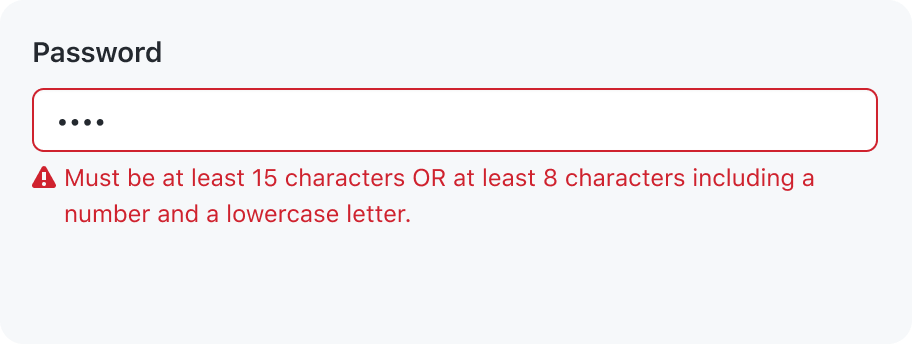
Error messages: An invalid field should always have a message explaining why the value does not pass validation. The message should explain why the value is invalid, and unblock users from completing their task by guiding them to a valid value.
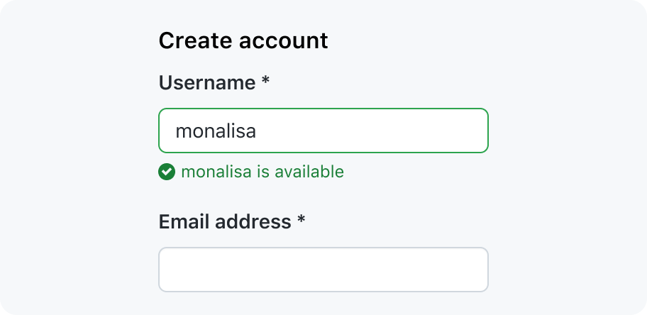
Success messages: A success message may be used when a user might need extra assurance that the field's value is valid. For example: when creating a repository name, it’s nice to be assured that the name is available and valid.
Validation on submit
The default behavior of the web is to perform validation when the user attempts to submit the form. This lets the user flow quickly through the form without interruption.
When the form fails validation, guide the user to the invalid inputs:
- If the form has 3 or more errors, you may show an interactive summary of errors
- If an interactive summary of errors is not shown, the first invalid input should be focused and scrolled into the viewport
- Each invalid
inputshould be marked asaria-invalid=true - The inline error message should be tied to each invalid input using
aria-describedby- If the inline error message is removed from the DOM, also remove the
aria-describedbyattribute from the form input.
- If the inline error message is removed from the DOM, also remove the
Live regions should not be used for form validation. Always use focus management (e.g. moving focus to the first link in the interactive summary, or the first invalid field), and appropriate markup to connect the error message to the field. If there are no focusable elements in the error summary Banner, you may focus on the heading in the Banner.
After a form has been submitted and failed validation, you may switch to inline validation to provide quicker feedback.
Interactive summary of errors
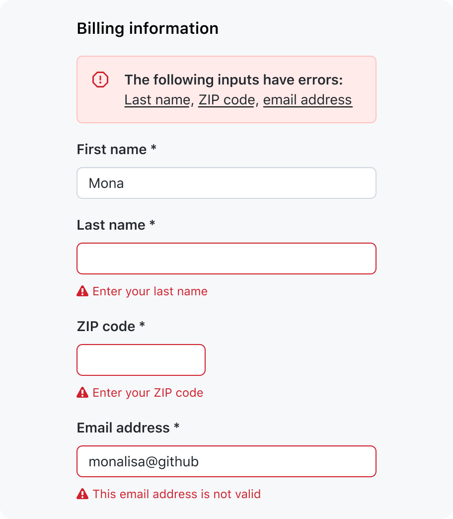
In a Banner at the top of the form, list the invalid inputs as anchor links. When the link is activated, place focus in its corresponding input.
When the Banner appears, it should be focused.
Inline validation
Inline validation offers immediate feedback, but be sure to consider the following drawbacks.
- There is a negative impact on perceived performance when validating server-side.
- When a screen reader user moves focus from the invalid input to the next form control, they will be interrupted by the validation message of the previous form control.
If the form control is in a valid state, validation should be performed until after the user has made a change to the input and has removed focus from the input.
Don't attempt to validate an input before the user is done with it. Validation may be performed as the user is typing or making their selection, but only after the first time the input has been validated and the input is in an invalid state. This gives the user early positive feedback by removing the error if the user makes a change that fixes it.
If the form control’s validation is likely to take more than 1 second, show a loading indicator.
Submission
Forms should follow consistent patterns for submitting and saving data.
Handling degraded forms
There may be cases where a critical system error prevents forms from being used as intended.
For more information, refer to the degraded experience guidelines for more information on designing a gracefully degraded experience.
Failed submission
If a form's data cannot be saved, don't remove or disable the form fields or the submit button. Instead, inform the user that the form is in a read-only state and cannot be saved. If they still try and submit the form, show a dialog explaining that the form cannot be saved.
No form data is available
If none of the form data can be read, remove the form entirely and replace it with a message explaining why the form is unavailable.
Form data is partially available
If only some of the form field data cannot be read, disable the affected fields and show an error message below those fields explaining that the data is unavailable. Disabling the fields adds another hint that something is wrong, and the field data is not actually empty.
Form components
- Autocomplete: An autocomplete input renders a text input that allows a user to quickly filter through a list of options to pick one or more values.
- CheckboxGroup: A set of checkboxes to let users make one or more selections from a short list of options.
- RadioGroup: A set of radio inputs to let users make a single selection from a short list of options.
- Select dropdown: A select input may be used when a user needs to select one option from a long list.
- Textarea: A text area is used to put multiple lines of text in an input
- TextInput: A text input is used to set a value that is a single line of text.