Saving
Save patterns help users store and update their content and configuration throughout GitHub. These changes should be represented in the UI accurately, quickly, and obviously. Their behavior should inspire confidence and trust.
Explicit saving
When designing a form, start with an explicit saving pattern. Avoid mixing explicit and automatic save patterns on a single page with multiple forms, and never mix save patterns in a single form. For example: if I upload a profile photo in the "Public profile" form, that change should not be saved until I explicitly submit the whole form.
Explicitly saved forms can be saved by clicking a submit button or by pressing Enter while focused on an input.
If there is an error saving the data, the user's data should be preserved in the form and they should be given feedback about the failure.
Separate auto-saving controls from an explicitly saved form
Don't mix auto-saving controls and explicitly saved controls in the same form
Unsaved changes
If a user tries to navigate away from a page with a form that has unsaved changes, you have the option to warn them that their changes will be lost using the beforeunload event. Modern browsers prevent developers from customizing the alert message, so we're limited to a generic message like "Do you want to leave this site? Changes you made may not be saved."
Declarative controls
To ensure your forms are accessible, you should use explicit saving (and not automatic saving) in declarative controls. These are:
- Text inputs
- Checkbox groups
- Radio button groups
- Browser-native
<select>dropdown menus - Multi-select dropdown menus
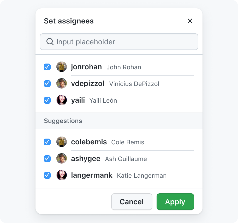
Use save and cancel buttons in dropdowns that allow multiple selections
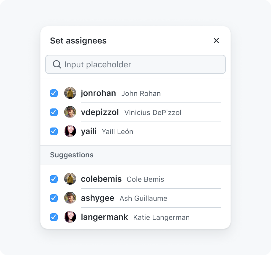
Don't automatically save selections once the dropdown is closed
There are a few issues to bear in mind with autosaving declarative controls.
- Text inputs: Users expect to set a value and then submit. Sensitive information could be unintentionally submitted, such as a change password input.
- Checkbox groups: It could be unclear whether or not the selection has been saved. Users may accidentally submit a selection clicked by accident.
- Radio button groups: Screenreader users can't read the options without selecting them, which could accidentally apply a selection the user didn't want.
- Browser-native
<select>dropdowns: Similarly to radio button groups, options could be selected when a user focuses the select and uses the arrow keys to read through each option.
Calls to action
When data is not automatically saved after the user makes changes, buttons are used to submit or cancel the changes.
Text
All configuration flows should have calls to action that include an obvious active verb such as "Create", "Save", "Delete", or "Update" (for example, "Create" a new repository, "Add" an SSH key to your profile, "Save" security preferences, "Update" a repository's description, "Delete" an old email address).
When defining these calls to actions, make sure to:
- Keep the text as succinct and clear as possible
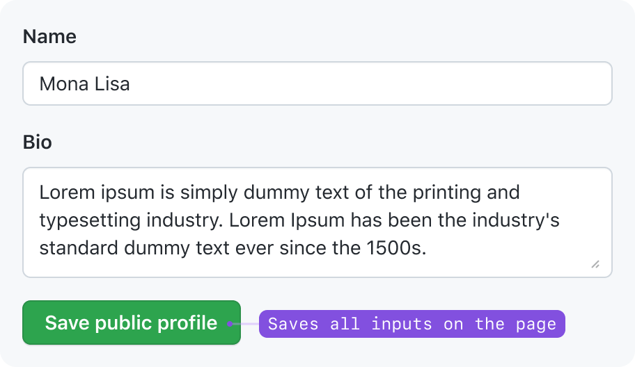
- Add the item’s name to the button text in cases where it may be unclear to the user what is being changed
Use descriptive text with an active verb
Don't use vague text
Appearance
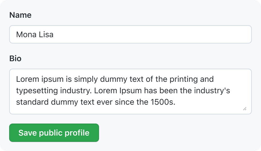
- If the save button is used to save every input on the page, use the primary button appearance.
- If the save button refers to a segment of controls on the page, use the secondary button appearance.
- If the save button has a corresponding cancel button, use the primary button appearance for the save button, and secondary for the cancel button.
For more guidance on button usage, see the button documentation.
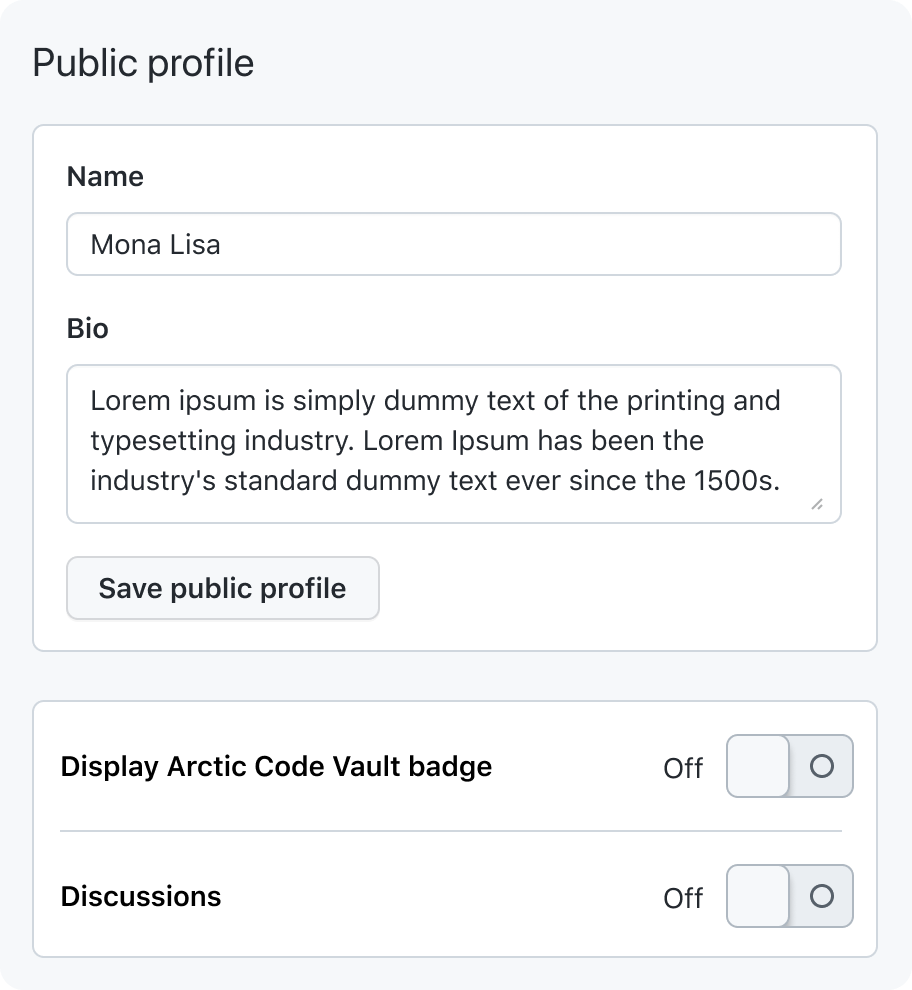
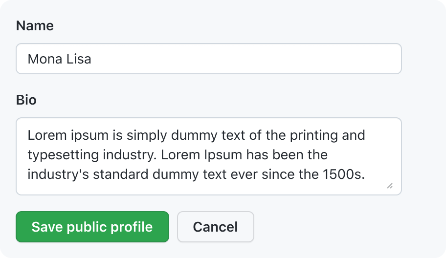
Controls all belong to one form
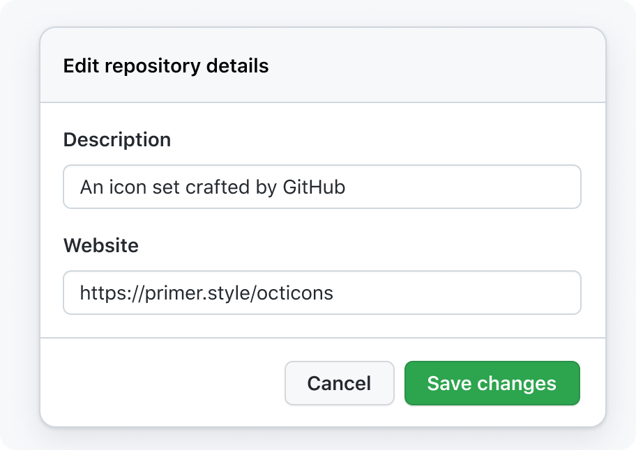
A form with a button to save and a button to cancel
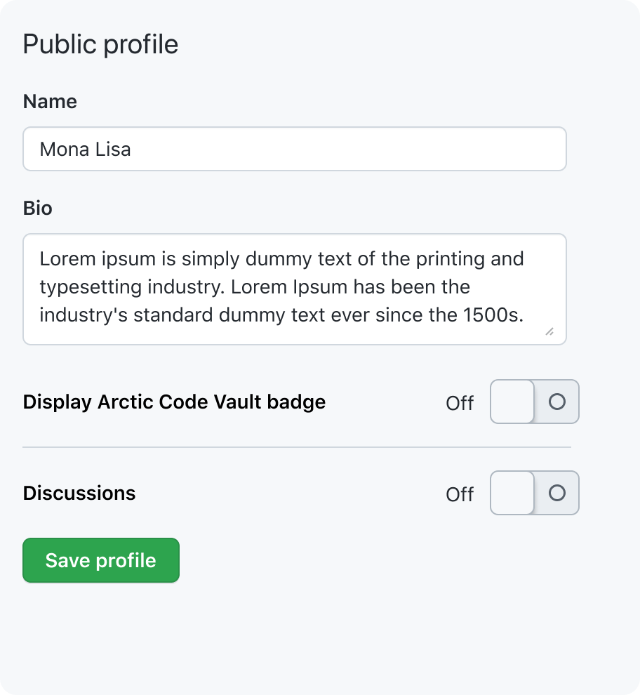
Controls divided into multiple sections
State
Do not disable or hide a form's save button even if the form is invalid or has not been changed. Disabled buttons cannot be focused using the Tab key, and disabled button styles are typically low-contrast and difficult to read.
Always keep the save button enabled
Don't disable the save button if the form is invalid or unchanged
Placement
Place save buttons somewhere intuitive and easily accessible.
- There should only be one save button on a page.
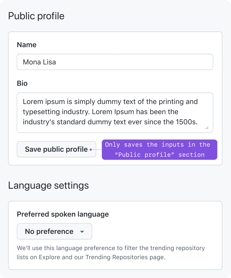
- Place save buttons somewhere intuitive and easily accessible. If all of the fields save automatically, do not include a save button. This makes it unclear when data is being saved. See the guidelines on explicit saving and automatic saving for more information.
- Allow only one edit mode activated at a time if you're designing a page with content that can be edited separately (such as an issue title). Pages that contain multiple save buttons can cause confusion about which save button saves which group. Multiple save buttons with the same label can cause confusion for people who use assistive technologies like screen readers and voice recognition software.
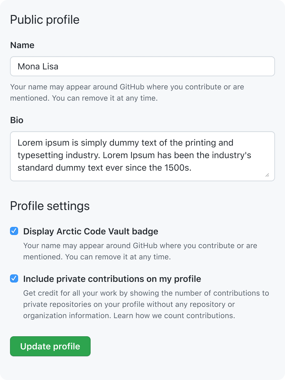
Have one save button per form
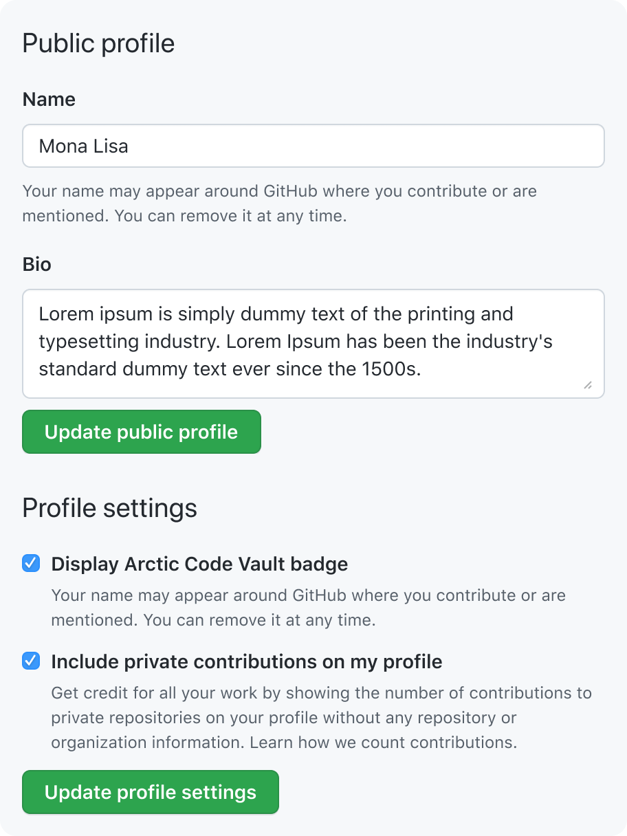
Don't have one save button per section of a form
Bottom-left (default)
If there is a button to submit and a button to cancel, the cancel button should go to the right of the submit button.
Default to placing the submit button at the bottom left of the form. Labels and inputs are left-aligned and run from top-to-bottom, so users would naturally move their eyes down and to the left.
Bottom-right (dialogs and comments)
If there is a button to submit and a button to cancel, the button to cancel should go to the left of the submit button.
If the save button is used in a dialog, place the button at the bottom right of the dialog. Right-aligned dialog buttons feel familiar because it's a common pattern across various platforms such as Windows, macOS, and Android.
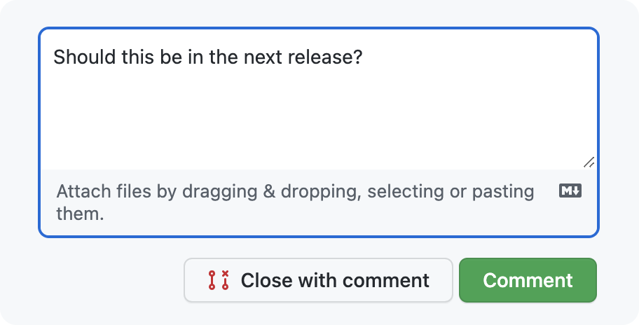
If the button is used to send a message such as a comment on an issue, right-align the button below the text area. This is where GitHub has traditionally placed the Submit button for issues and pull requests, and it's common practice in other apps to place a Send button to the right.
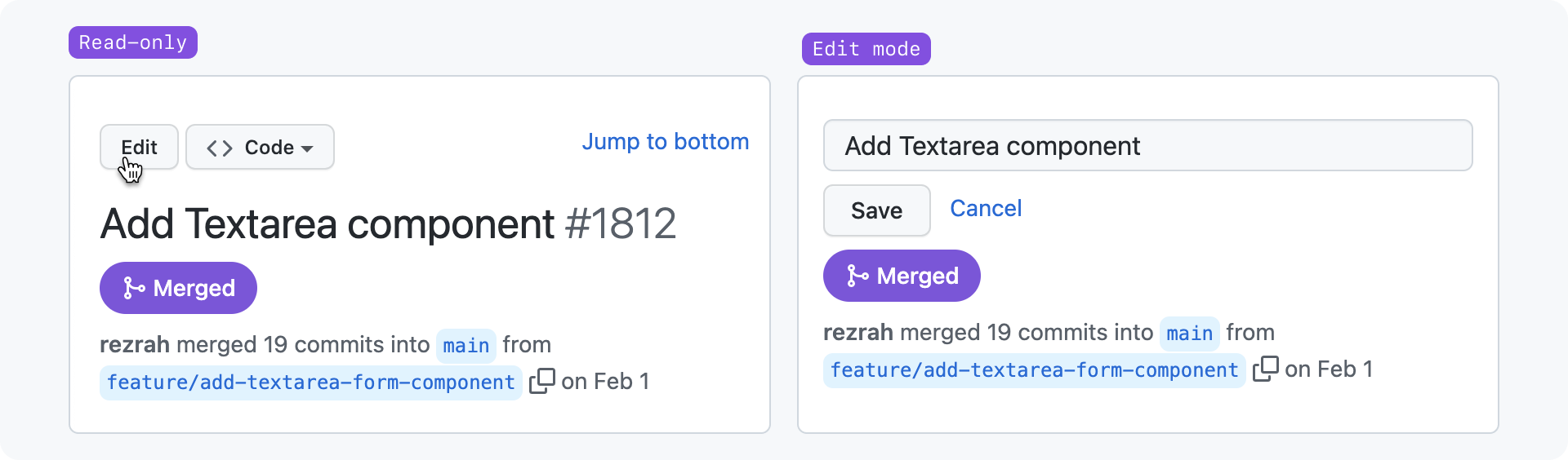
Adjacent to inline editing input
To simplify the interface, some content may be edited inline without taking the user to a separate flow.
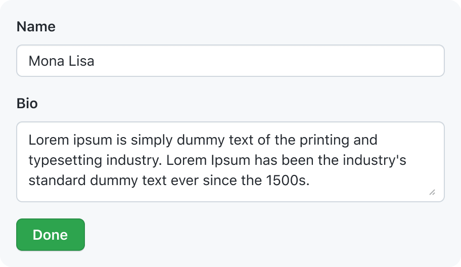
An input used for inline editing should have a save button placed very close to visually connect the input with the button.
Other
If you believe your submit button will not be intuitive or easily accessible using any of the placement options listed here, you may consider alternatives and optionally propose a new Primer pattern.
Automatic saving
Automatic saving applies changes as they are made. Automatic saving should be used when the user expects instant feedback from the change they made.
Imperative controls
To reduce UI and give instant feedback, you should use automatic saving (and not explicit saving) for imperative controls. These are:
- ToggleSwitches. The ToggleSwitch behaves like a light switch: the light just switches on and off without you having to confirm each time you flip the switch.
- SegmentedControls. The SegmentedControl behaves like tabs: the tab changes as soon as you select it, and you can only select one at a time.
- Single-select dropdowns that are not native
<select>dropdowns or part of an explicitly saved form. Single-select dropdowns behave like a radio dial: the station starts playing as soon as you select it.
Dropdown menu accessibility
Semantic menus should only have a list of options to select from and should not have a save button in their dropdown. As soon as additional features (search inputs, filters, tabs, etc) are added, the component should be treated like a dialog with a button to submit and a button to cancel.
Feedback
If the change is not obvious within the user's viewport, provide feedback to let the user know that the change occurred successfully.
- If the change occurred without a redirect or page refresh, you can use the InlineMessage component.
- If the change occurred and the page refreshes or redirects, you can use a Banner component.
If your design is being implemented in github.com, avoid using a toast for now. The toast components used on github.com have accessibility issues that need to be fixed.
Error forgiveness
Before submitting a form with potentially destructive consequences (for example, delete a repository), ask the user to confirm they want to submit the form.
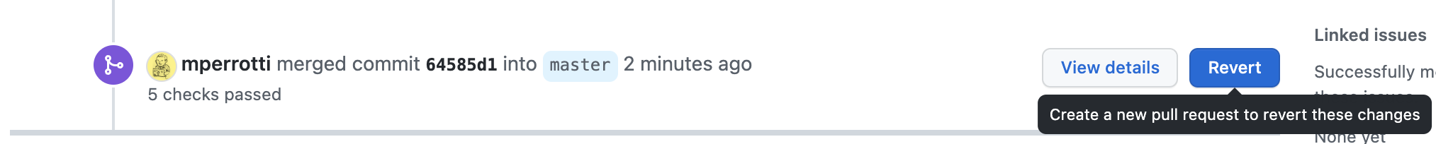
For risky changes, provide a way to undo those changes after saving.
Redirecting
When creating new content like issues, discussions, or even larger entities such as repositories or organizations, you may redirect the user to the entity they just created at the end of the flow.
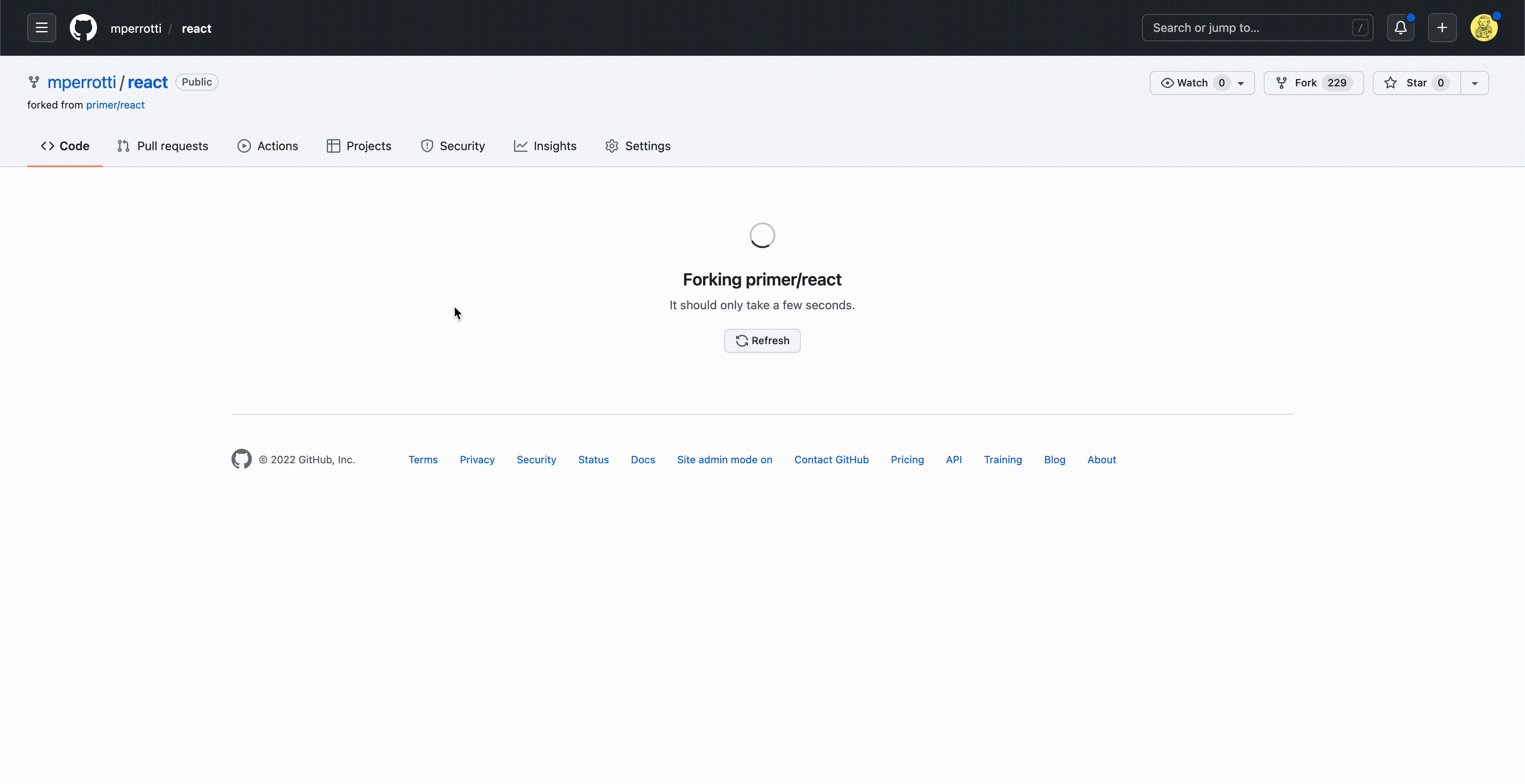
In some cases, such as forking or using a template, you may need to hold the user at a waiting page while the entity is generated. In these cases, make the user feel confident that something is happening and that their configuration details will not be lost.