Contributing to Figma
We love contributions and are happy to support you.
Currently only GitHub employees can contribute to Primer Web, due to how Figma handles open source files.
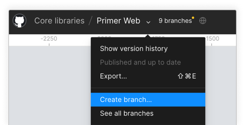
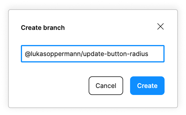
To make changes you first need to create a branch from Primer Web and name it @username/changes-being-made.
For example: @lukasoppermann/update-button-radius.
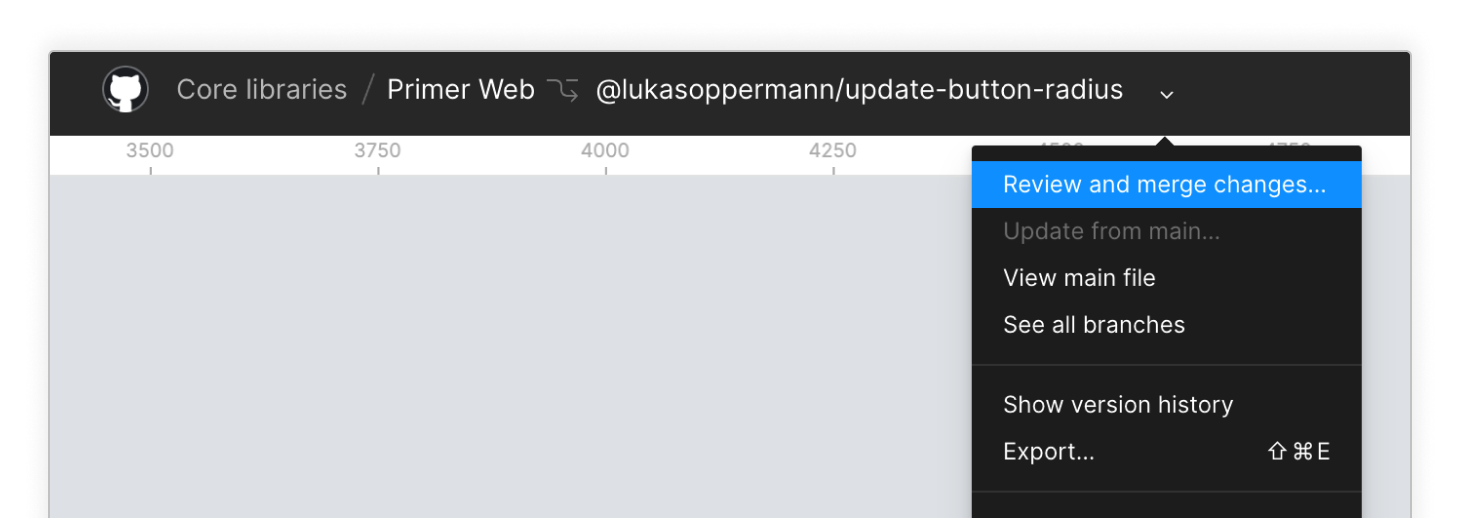
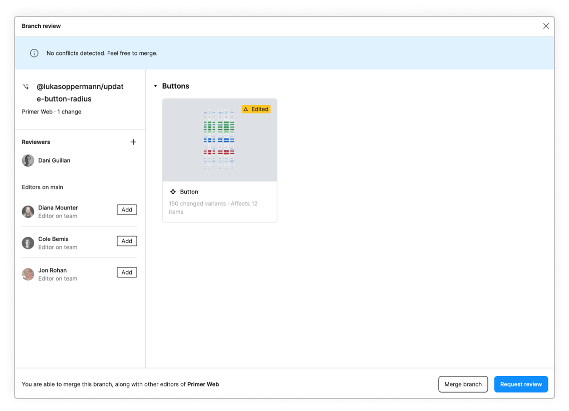
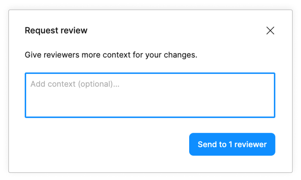
When you are satisfied with the changes you made, request a review from the direct responsible individual (DRI) of the file. If you are not sure who that is, reach out in the #primer-figma slack channel.
Once your branch is approved, a maintainer will take care of merging and publishing the changes to the library.
We use this process to make sure no accidental changes get added to the library. It also allows us to better track changes added by a branch. Think of it as a repo that does not allow direct pushes to the main branch.
Authoring components in Figma
Naming
The name of a component and it's properties should reflected what is present in code whenever possible.
For example, the button component would be named Button instead of btn which is neither a utility or component name but a prior reference from CSS.
Component names use PascalCase. For example, the ActionList component is named ActionList. Refer to the "Spelling of component names" ADR for more context.
Layer structure
Every component that is added should have its layers named to reflect what is rendered on that layer. When describing component layer structure, Primer uses a left-to-right direction to reflect start-to-end positioning.
When updating existing components, be careful with adding or removing layers that have children as this will create a breaking change for consumners.
Groups of layers
For groups of items within a component, be explicit to what is contained within a group.
| ✅ Do | ❌ Don't |
|---|---|
 |
Text
Layer names should typically represent the type of textual information it contains. Text layers that will retain overrides when swapping to another instance or variant should be named the same.

Layer name examples: ButtonText, Message, Text
Actions
Layers that contain actions should have their name describe the action.
Variants
In Primer, variants and component properties are used to quickly select different states and/or visual options of a component.
Variant properties
When creating a new component, apply variant properties that follow existing parameters as seen in other framework implementations such as Primer React. If a parameter exists but cannot be expressed in Figma (e.g. alt or href) it is not necessary to include it. Variant properties will always appear above component properties in the properties panel and can only be reordered with other variant properties.

Component properties
Certain visual options can be controlled with Figma's component properties. Apply component properties when controlling the visibility of a layer, swapping between specific instance options, or controlling the content of a text layer. Below is a list of common properties and the types of items they control.
As a reminder, variant properties will always appear above component properties in the properties panel.
| Name | Description | Component property type |
|---|---|---|
| leadingVisual? | Show/hide the leading visual which is a the start of the component (left-side) | Boolean |
| title | Text content for "Title" layer | Text |
| leadingAction | Swap between different interactive options (such as checkbox, checkmark, bullet) | Instance swap |
Writing properties
- When writing properties, either variant or component, write them as they are seen or would be written in code. For example, the prop for an icon or avatar in the ActionList component is written as
leadingVisual. - When writing variants, keep the property name as its written in code with lower or camelCase and the values in lowercase.
- When indicating a boolean property add a "?". For example, the property to show/hide the title of a component is written as "title?"
Examples
| Property name | Values |
|---|---|
| label? | true false |
| state | rest focus hover |
| visual | octicon avatar |
Properties table
The following table includes a list of common properties used within the Figma components in Primer Web. Please note that not all components will contain all properties contained within this list. Use your best judgement as to which properties should be implemented.
| Category | Description | Included values |
|---|---|---|
type | A variation of the component or a specific part | text, single select, multi-select, danger, header, item, footer |
state | The state of the component's interactivity | default (rest), hover, selected, disabled |
size | Size variations of the component | small, medium, large OR pixel values |
leading[Accessory] | The leading visual accessory of a component placed to the left of a text label or description | icon, avatar |
trailing[Accessory] | The trailing visual accessory of a component placed to the right of a text label or description | icon, avatar, label, counter |
description | Descriptive text within a component; can be a toggle (boolean) set of values or a dropdown selection | on/off [boolean], short/long, inline/block |
selected | Mark the component as selected; toggle (boolean) the selection marker, typically a check mark | on/off |
Multiple components vs Multiple variants
Some components may feel connected enough to turn them into a component set in Figma. Within Primer, our main distinction between using variants or adding additional related components is to ask, "Will this change only visual styling or will this also change function/purpose of the component?". Another question to consider is how this will effect maintainence of the component.
Examples of when to use multiple components
- Alerts: Banners
- Avatars: Avatar and AvatarStack
- Form select items
Examples of when to use variants
Slots

The _Slot component is a local component to the Primer Web library and is added as a placeholder for any customizeable content where the designers have more flexibility.

Areas where using this slot workflow is recommended include headers, main content, footers. Slots should be used within a container that has autolayout in order to dynamically fit its parent container. Due to certain bugs in Figma, if a _Slot is replaced and does not flex, the auto layout properties will need to be manually updated.
When using a component that contains slots within your own design file, create a local component that has the specific contents needed and replace the _Slot with an instance of the local component.

Contribution checklist for component
Only when adding new components
DRIs
| Internal Figma library | External Figma library | DRI |
|---|---|---|
| Primer Web (Internal) | Primer Web (External) | @lukasoppermann |
| Primer Brand (Internal) | @danielguillan |