Moving Away From Experimental SelectPanel
This guide will show you how to upgrade from the now deprecated
experimental SelectPanel to the latest SelectPanel
component.
Coded examples
Please reference the SelectPanel stories for the most up-to-date examples.
Prop changes
The following table lists the prop changes between the experimental and stable
SelectPanel components.
From Experimental SelectPanel | To Stable SelectPanel | Notes |
|---|---|---|
onSubmit | onOpenChange | There is no explicit "save" button in the stable SelectPanel (except for modals and narrow screens). Instead, the panel is closed on click outside or escape, and the onOpenChange callback function is called. |
selectionVariant | variant, selected | The stable SelectPanel infers the selection type (single, multi) based on the type of the selected prop supplied (array, object). a variant of type "modal" or "anchored" is supported |
children | N/A | The stable SelectPanel doesn't accept children. Instead, various props are supplied through the API as a substitute. See Subcomponent Changes. |
The remaining arguments for SelectPanel can be found in the documentation for
that component.
Please see the following for complete descriptions and examples.
Subcomponent changes
The following table lists the subcomponent to prop mappings between the experimental and stable
SelectPanel components.
Subcomponent in Experimental SelectPanel | Prop in Stable SelectPanel | Notes |
|---|---|---|
SelectPanel.Header | onOpenChange | There is no explicit "save" button in the stable SelectPanel (except for modals and narrow screens). Instead, the panel is closed on click outside or escape, and the onOpenChange callback function is called. |
SelectPanel.SearchInput | variant, selected | The stable SelectPanel infers the selection type (single, multi) based on the type of the selected prop supplied (array, object). a variant of type "modal" or "anchored" is supported |
ActionList, ActionList.Item, or similar | items | See Items. |
| Custom error, warning or empty states` | message | See Messages |
| notice | See Notices. |
SelectPanel.Footer | secondaryAction, onCancel | See Footer. |
SelectPanel.SecondaryAction | secondaryAction, onCancel | See Footer. |
Items
In the experimental SelectPanel, it is common for developers to iterate over an array of items and render them inside a component such as an ActionList.
For the stable SelectPanel, you’ll want to provide an array of items instead, the component will handle the rendering for you. The items prop must conform with the ItemInput interface.
If you need a reference back to the original item, you may do so by putting it inside the item property within each item.
Before
  import {SelectPanel} from '@primer/react/experimental'
  ...
  <SelectPanel>
  ...
  <ActionList>
      {filteredModels.map(m => (
        <ActionList.Item
          key={m.id}
          onSelect={() => {
            if (m.id === model?.id) {
              setShowPanel(false)
              return
            }

            onSelect(m)
          }}
          ref={m.id === model?.id ? selectedModelElement : null}
          selected={m.id === model?.id}
        >
          <ActionList.LeadingVisual>
            <PublisherAvatar
              logoUrl={m.logo_url}
              darkModeIcon={m.dark_mode_icon}
              publisher={m.publisher}
              size={20}
            />
          </ActionList.LeadingVisual>
          {m.friendly_name}
        </ActionList.Item>
      ))}
    </ActionList>
  ...
  </SelectPanel>
After
  import {SelectPanel} from '@primer/react'
  ...
  useEffect(() => {
      setItems(
        models.map(m => {
          const item = {
            text: m.friendly_name,
            leadingVisual: () => (
              <PublisherAvatar logoUrl={m.logo_url} darkModeIcon={m.dark_mode_icon} publisher={m.publisher} size={20} />
            ),
            item: m,
            id: m.id,
            selected: m.id === model?.id,
            ref: m.id === model?.id ? selectedModelElement : null,
          }
          if (item.selected) {
            setSelected(item)
          }
          return item
        }),
      )
    }, [models, model])
  ...
  <SelectPanel items={items} ... />
Variants
In the experimental SelectPanel, you may be supplying a selectionVariant prop. For the stable SelectPanel, this is not necessary as the component will infer the selection type given the supplied selected object:
Single Selection
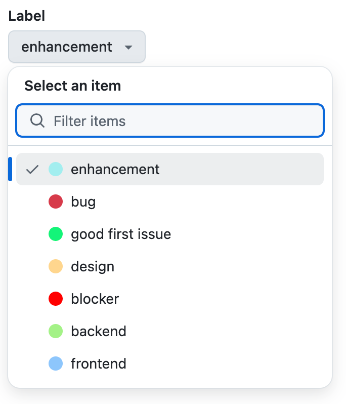
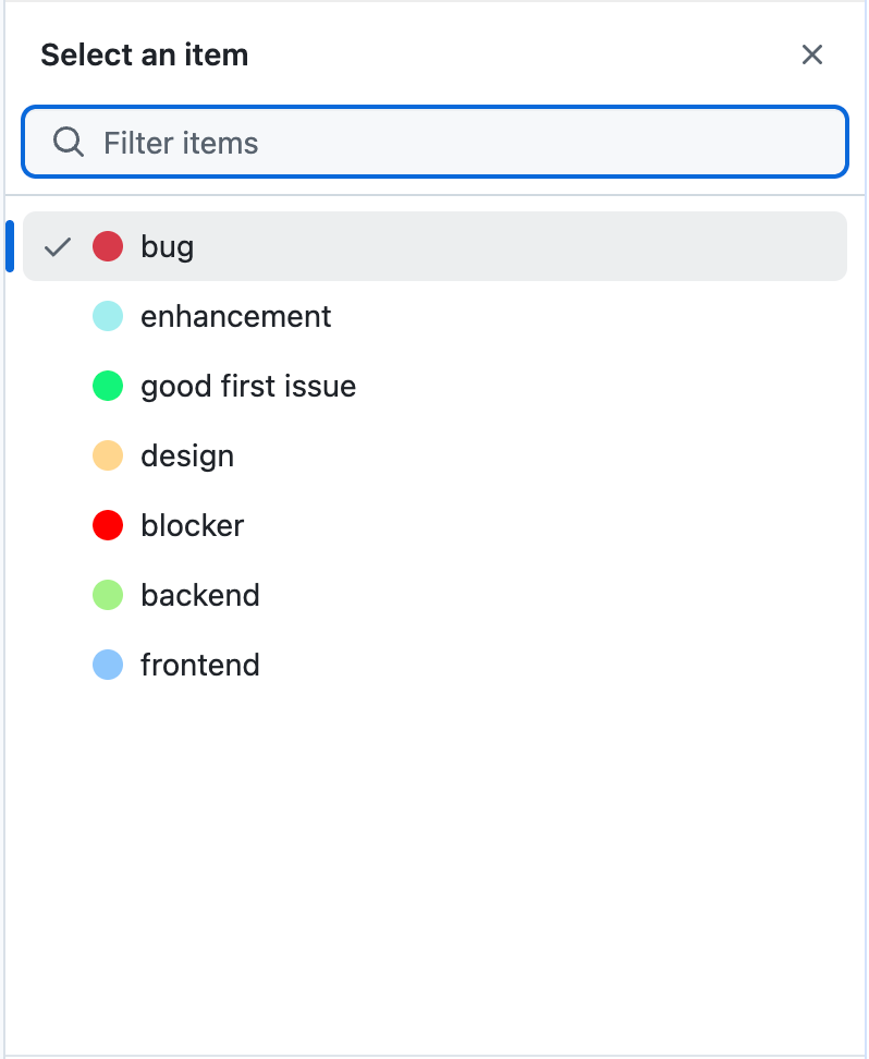
The SelectPanel will infer that the selection type is single if the selected prop supplied is a single object.
Note that all “single” variants are considered instant in the stable SelectPanel, since it always saves on selection.
Before
import {SelectPanel} from '@primer/react/experimental'
...
<SelectPanel selectionVariant="instant">...</SelectPanel>
import {SelectPanel} from '@primer/react/experimental'
...
<SelectPanel selectionVariant="single">...</SelectPanel>After
import {SelectPanel} from '@primer/react'
...
<SelectPanel selected={selectedItem} ... />
Multiple Selection
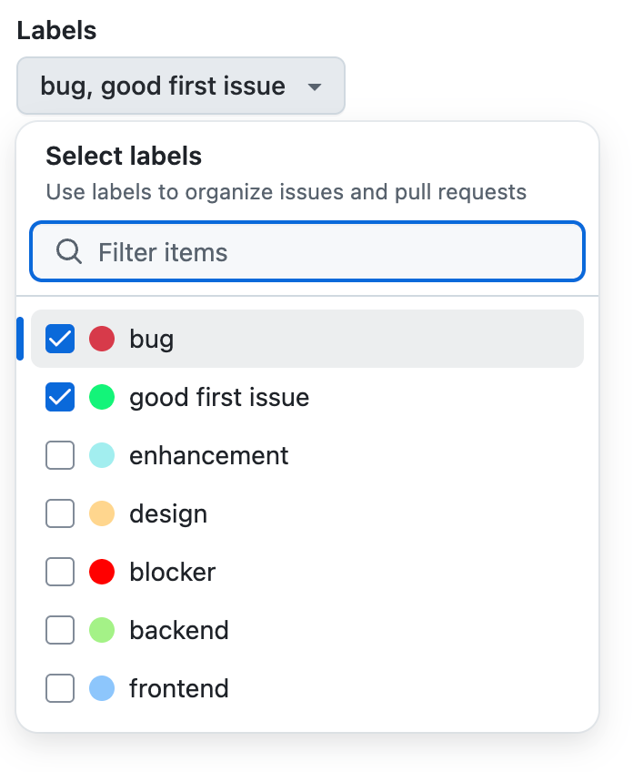
The SelectPanel will infer that the selection type is multiple if the selected prop supplied is an array of items.
Before
import {SelectPanel} from '@primer/react/experimental'
...
<SelectPanel selectionVariant="multiple">...</SelectPanel>
After
import {SelectPanel} from '@primer/react'
...
<SelectPanel selected={[...selectedItems]} ... />
Modals
Similar to the experimental SelectPanel, the stable SelectPanel supports a variant=”modal” that will render the SelectPanel inside a modal.
onSubmitbecomesonOpenChangeonCancelstays asonCancelPlease note that the onCancel prop is required for modal variants.
Before
import {SelectPanel} from '@primer/react/experimental'
...
<SelectPanel variant="modal" onSubmit={onSubmitFunction} onCancel={onCancelFunction}>
	...
</SelectPanel>
After
import {SelectPanel} from '@primer/react'
...
<SelectPanel variant="modal" onOpenChange={onSubmitFunction} onCancel={onCancelFunction} ... />
Panels without input
THe stable SelectPanel does not support panels without input. If you are using the experimental SelectPanel in a way that does not require an input, you may want to consider using the SimpleSelect component instead (accessible to GitHub staff only).
Loading states
In the experimental SelectPanel, loading states were managed manually, rendering conditionally either a loading state or the ActionList depending on the externally managed loading status.
In the stable SelectPanel, you may pass in a loading prop as a boolean indicating whether the SelectPanel should display a loading state or render the items.
If no loading prop is supplied, the SelectPanel component will do its best to infer the loading state based on the contents of the items list passed in. skeleton and spinner variants are supported.
Before
import {SelectPanel} from '@primer/react/experimental'
...
<SelectPanel>
  ... {isLoading ? <LoadingComponent /> :
  <ActionList>
    ...
  </ActionList>}
</SelectPanel>
After
import {SelectPanel} from '@primer/react'
...
// defaults to spinner
<SelectPanel loading={isLoading} ... />
import {SelectPanel} from '@primer/react'
...
<SelectPanel loading={isLoading} initialLoadingType="skeleton" ... />import {SelectPanel} from '@primer/react'
...
<SelectPanel loading={isLoading} initialLoadingType="spinner" ... />Messages (empty, error and warning state)
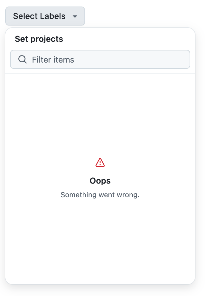
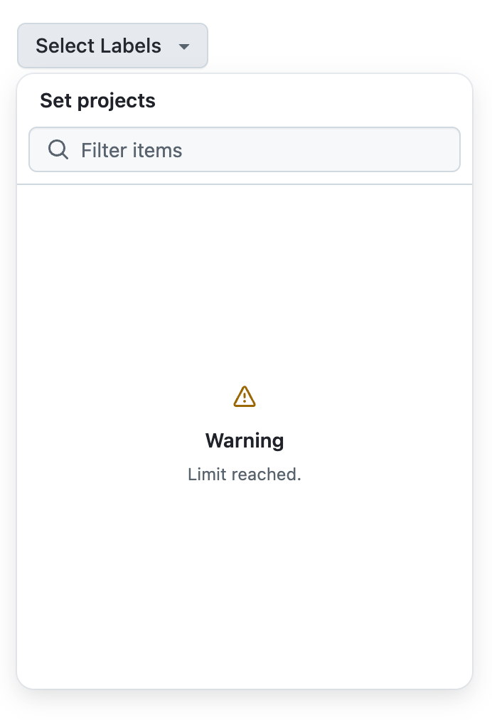
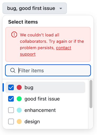
In the experimental SelectPanel, empty states as well as errors and warning messages were managed manually, rendering conditionally either the desired message or the ActionList depending on the externally managed status.
In the stable SelectPanel, you may pass in a message prop that conforms with the SelectPanel message prop API. If this prop is supplied, the SelectPanel will choose to render this message in lieu of the items list. If no empty state message is supplied, a default message will be used.
Please note that the stable SelectPanel can only receive one message at a time. It is up to the consumer to device the logic that supplies the correct message to the component given the external state (empty, warning, error)
Empty message
Before
import {SelectPanel} from '@primer/react/experimental'
...
<SelectPanel>
  ... {items.length == 0 ? <EmptyStateComponent /> :
  <ActionList>
    ...
  </ActionList>}
</SelectPanel>
After
import {SelectPanel} from '@primer/react'
...
<SelectPanel message={
  items.length === 0
    ? {
        title: "No matching items",
        variant: "empty",
        body: "Please use a different query",
      }
    : undefined
  } ...
/>
Error message
Before
import {SelectPanel} from '@primer/react/experimental'
...
<SelectPanel>
  ... {isError ? <ErrorComponent /> :
  <ActionList>
    ...
  </ActionList>}
</SelectPanel>
After
import {SelectPanel, Link} from '@primer/react'
...
<SelectPanel message={
    {
    title:"An error has occured",
    variant:"error",
    body: <Link href="...">See more details</Link>
    }
  } ...
 />
Warning message
Before
import {SelectPanel} from '@primer/react/experimental'
...
<SelectPanel>
  ... {hasWarning ? <WarningMessage /> :
  <ActionList>
    ...
  </ActionList>}
</SelectPanel>
After
import {SelectPanel, Link} from '@primer/react'
...
<SelectPanel message={
{
title:"You have entered an invalid query",
variant:"warning",
body: <Link href="...">See more details</Link>
}
} ...
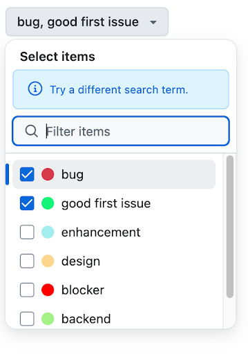
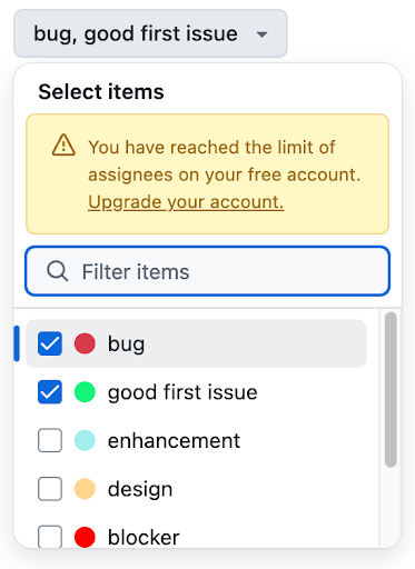
/>Notices (inline messages)
In the experimental SelectPanel, inline messages were managed manually, generally by rendering a subcomponent on top of the ActionList. In the stable SelectPanel, you may pass in a notice prop that conforms with the SelectPanel notice prop API.
If this prop is supplied, the SelectPanel will choose to render this message on top of the SelectPanel input. Info, Warning and Error states are supported.
Please note that the stable SelectPanel can only receive one notice at a time. It is up to the consumer to devise the logic that supplies the correct message to the component given the desired state.
Info notices
Before
import {SelectPanel} from '@primer/react/experimental'
...
<SelectPanel>
  <SelectPanel.Header>
    <Banner hideTitle variant="info">
      Info Message Here
    </Banner>
    ...
  </SelectPanel.Header>
    ...
  <ActionList>
    ...
  </ActionList>
</SelectPanel>
After
import {SelectPanel, Link} from '@primer/react'
...
<SelectPanel message={
    {
    title:"You have entered an invalid query",
    variant:"warning",
    body: <Link href="...">See more details</Link>
    }
  } ...
/>
Warning notice
Before
import {SelectPanel} from '@primer/react/experimental'
...
<SelectPanel>
  <SelectPanel.Header>
      <Banner hideTitle variant="warning">
        Warning Message Here
      </Banner>
        ...
  </SelectPanel.Header>
    ...
  <ActionList>
    ...
  </ActionList>
</SelectPanel>
After
import {SelectPanel} from '@primer/react'
...
<SelectPanel notice={
    {
    text:"Warning Message Here",
    variant:"warning",
    }
  } ...
/>
Error notice
Before
import {SelectPanel} from '@primer/react/experimental'
...
<SelectPanel>
  <SelectPanel.Header>
    <Banner hideTitle variant="critical">
      Error Message Here
    </Banner>
    ...
  </SelectPanel.Header>
    ...
  <ActionList>
    ...
  </ActionList>
</SelectPanel>
After
import {SelectPanel} from '@primer/react'
...
<SelectPanel notice={
    {
    text:"Error Message Here",
    variant:"error",
    }
  } ...
/>
Footer
The experimental SelectPanel had a SelectPanel.Footer subcomponent that was used to render a footer inside the SelectPanel. In the stable SelectPanel, this is no longer necessary as the component will infer whether primary actions are needed based on the variant (modal, narrow screen, etc). A secondary action may optionally be passed in as a prop.
Primary buttons
The stable SelectPanel operates on instant selection and save on close. In that sense, primary “save” and “cancel” buttons are not baked into the component by default.
This aims to standardize the experience across the entirety of dotcom. However, when the SelectPanel is rendered in a narrow or mobile screen, it is rendered as a full-screen component, the save and cancel buttons become available at this point. The same is true for the modal variant.
Because every SelectPanel has the potential to become a full-screen component, it is recommended that you always supply the onCancel prop to handle such scenarios.
NOTE: You may resize the screen to a smaller size to view the full-screen SelectPanel in action.
Secondary actions
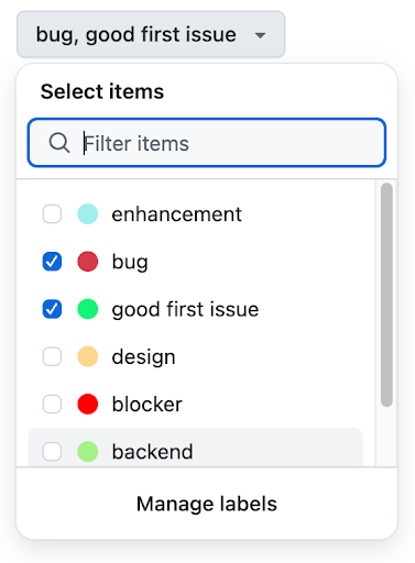
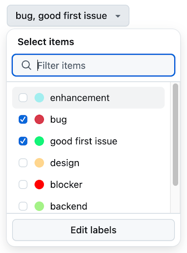
All variants of the SelectPanel (modal, single, multi, full screen) support a Secondary Action. In the experimental SelectPanel, secondary actions were managed manually, generally by rendering a SelectPanel.SecondaryAction subcomponent inside of the SelectPanel. In the stable SelectPanel, you may pass in a secondaryAction prop that conforms with the SelectPanel secondaryAction prop API.
Please note that the stable SelectPanel can only receive one secondaryAction at a time.
Before
import {SelectPanel} from '@primer/react/experimental'
...
<SelectPanel>
  ...
  <ActionList>
    ...
  </ActionList>
  ...
  <SelectPanel.Footer>
      <SelectPanel.SecondaryAction variant="link" href="#href">
        SecondaryAction Link Callout
      </SelectPanel.SecondaryAction>
  </SelectPanel.Footer>
</SelectPanel>
import {SelectPanel} from '@primer/react/experimental'
...
<SelectPanel>
...
<ActionList>
...
</ActionList>
...
<SelectPanel.Footer>
<SelectPanel.SecondaryAction variant="button" onClick={() => {}}>
SecondaryAction Button Callout
</SelectPanel.SecondaryAction>
</SelectPanel.Footer>
</SelectPanel>After
import {SelectPanel} from '@primer/react'
...
<SelectPanel secondaryAction={
    {
    text:"SecondaryAction Link Callout",
    variant:"link",
    href: "#href"
    }
  } ...
/>
import {SelectPanel} from '@primer/react'
...
<SelectPanel secondaryAction={
{
text:"SecondaryAction Button Callout",
variant:"button",
onClick: () => {}
}
} ...
/>Narrow screens (mobile)
All SelectPanel variants (including single, multi select and modal) become a full screen SelectPanel on narrow screens, such as mobile. This is due to accessibility considerations and cannot be opted out.
Because of this, plan to always supply the onCancel prop to SelectPanel usages as they’re needed in narrow screens to dismiss the panel.
In multi-selection panels, calling the onCancel prop should dismiss all the selections made while the panel was open without saving.
Sample migrations (GitHub staff only)
You may reference the following PRs (accessible to GitHub staff only) for examples of how to migrate from the experimental SelectPanel to the stable SelectPanel.
- Single Selection
- Multiple Selection
- As Modal
- To new SimpleSelect