Components
Primer Components are reusable, interactive building blocks for designing consistent user interfaces. They include elements for actions, containment, communication, navigation, selection, and text input, ensuring a cohesive and accessible design across applications. Each component is designed to be flexible and can be seamlessly integrated into various projects to enhance functionality and user experience.
ActionBar
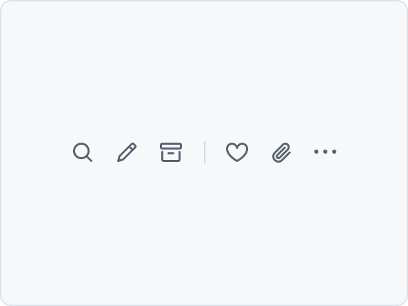
A collection of horizontally aligned IconButtons. The IconButtons can be split into groups by adding a divider. When there is not enough space, IconButtons that don't fit will be added to an overflow menu.
ActionList
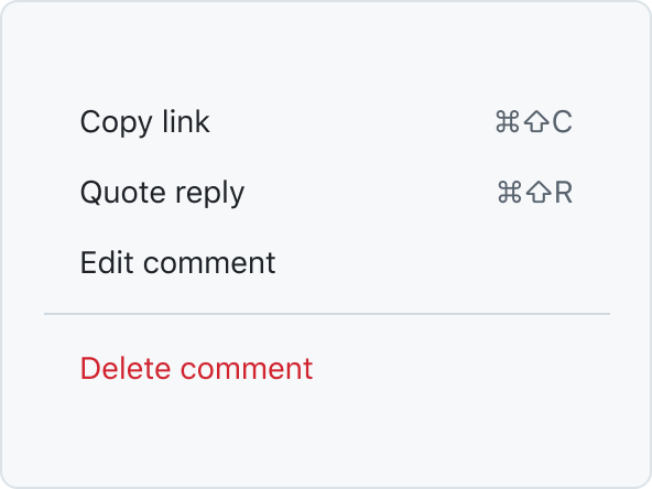
ActionList is a vertical list of interactive actions or options. It's composed of items presented in a consistent, single-column format, with room for icons, descriptions, side information, and other rich visuals.
ActionMenu
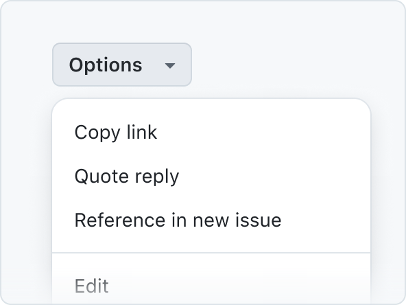
ActionMenu is composed of ActionList and Overlay patterns used for quick actions and selections.
Autocomplete
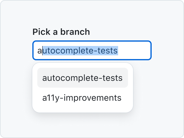
Autocomplete allows users to quickly filter through a list of options and pick one or more values for a field.
BranchName
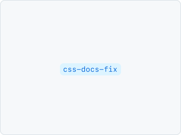
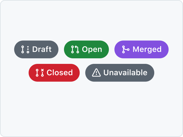
BranchName is a label-type component rendered as an <a> tag by default that displays the name of a branch.
Breadcrumbs
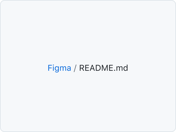
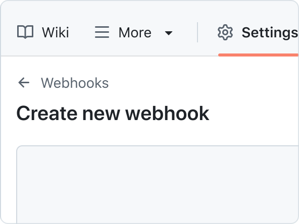
Breadcrumbs display the current page or context within the site, allowing them to navigate different levels of the hierarchy.
CircleBadge
CircleBadge visually connects logos of third-party services, eg. in the marketplace.
ConfirmationDialog

ConfirmationDialog is a specialized dialog component used to confirm user actions. It provides a simple way to ask users to confirm or cancel potentially destructive or important actions.
DataTable
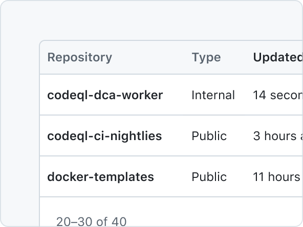
DataTable is a 2-dimensional data structure where each row is an item, and each column is a data point about the item.
Details
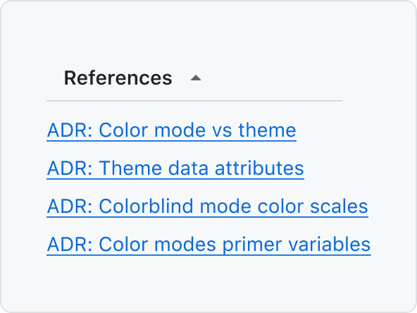
Details is a styled component to enhance the native behaviors of the <details> element.
Dialog

Dialog is a floating surface used to display transient content such as confirmation actions, selection options, and more.
FormControl
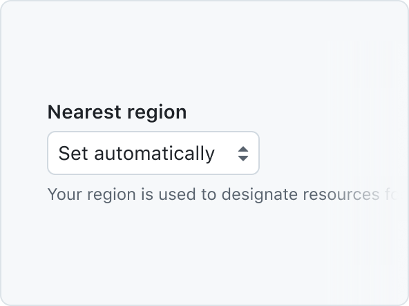
FormControl displays a labelled input and, optionally, associated validation text and/or hint text.
Heading
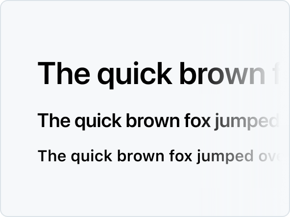
Heading defines the hierarchical structure and importance of the content they contain.
InlineMessage
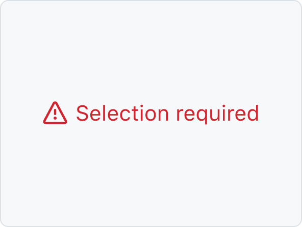
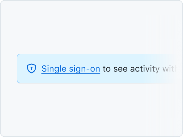
InlineMessage is used to inform the user about the result of an action within the content.
LabelGroup
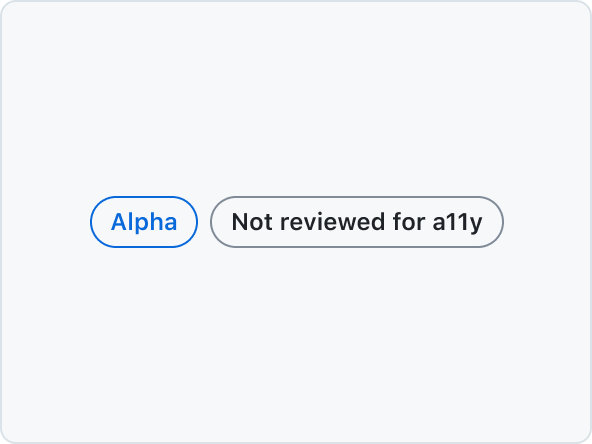
Use LabelGroup to add commonly used margins and other layout constraints to groups of Labels
Overlay
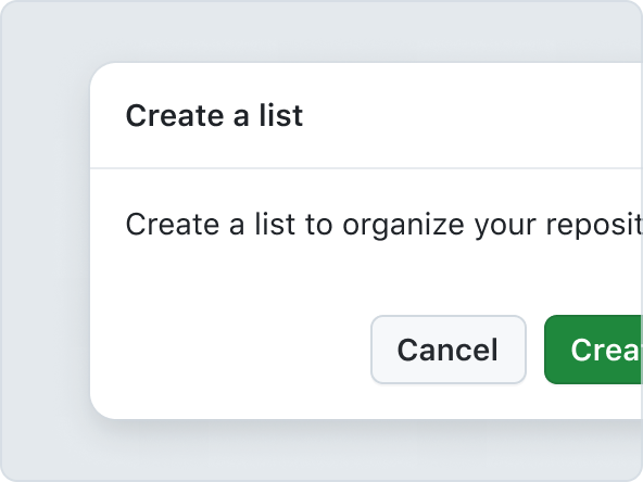
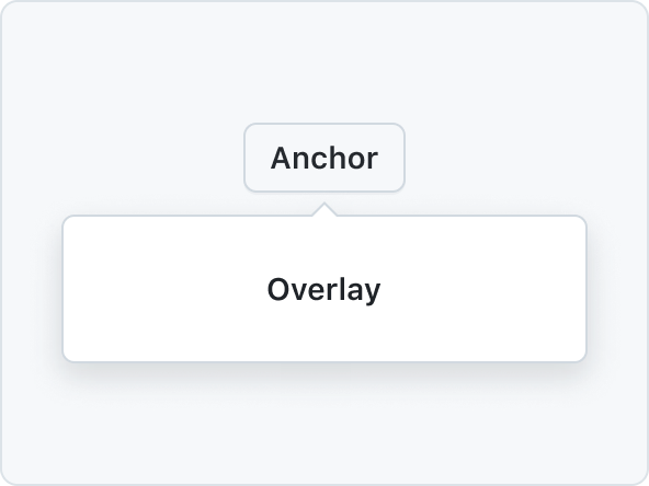
Overlay components codify design patterns related to floating surfaces such as Dialogs and menus.
ProgressBar
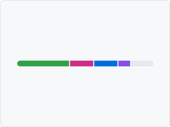
A ProgressBar is a simple chart that can be used to show how complete something is, or visualize parts that make up a whole.
Radio
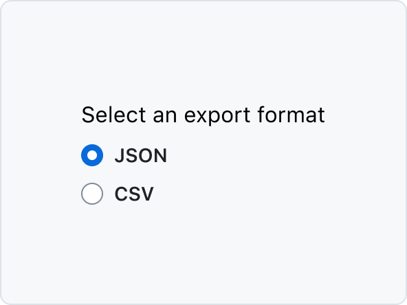
Radio button is a form control for making a single selection from a short list of options.
SegmentedControl
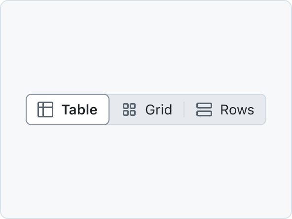
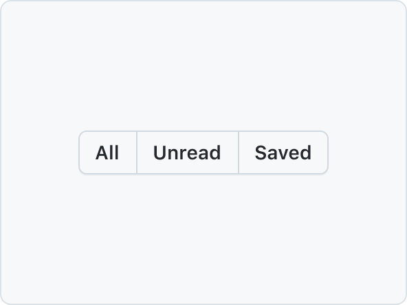
SegmentedControl is used to pick one choice from a linear set of closely related choices, and immediately apply that selection.
SelectPanel
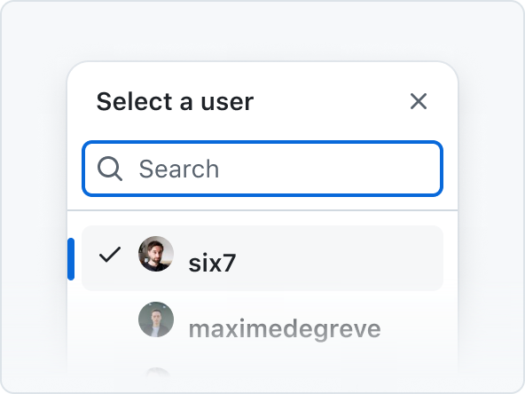
The SelectPanel is an anchored dialog that allows users to quickly navigate and select one or multiple items from a list. It includes a text input for filtering, supports item grouping, and offers a footer for additional actions. Changes are applied upon closing the panel.
SkeletonAvatar

SkeletonAvatars are placeholders for loading Avatars. They support the same variants as the Avatar component.
SkeletonBox

A SkeletonBox provides a placeholder for non-text, non-Avatar elements (e.g., hero images) that are still loading.
SkeletonText

SkeletonText shows a placeholder for loading text to improve perceived performance.
Spinner
A Spinner is an indeterminate loading indicator, ideal for processes with unknown or variable durations.
SplitPageLayout

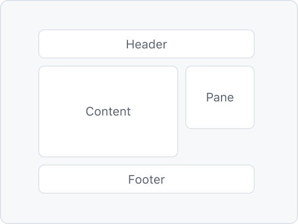
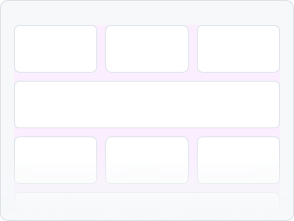
SplitPageLayout is a layout component that allows you to create a two-column layout with a main content area and a sidebar.
Timeline
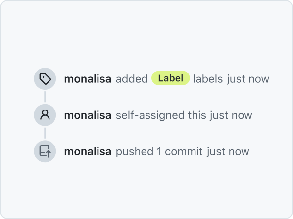
The Timeline component is used to display items on a vertical Timeline, connected by Timeline elements.
Token
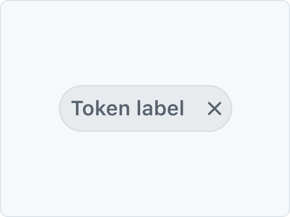
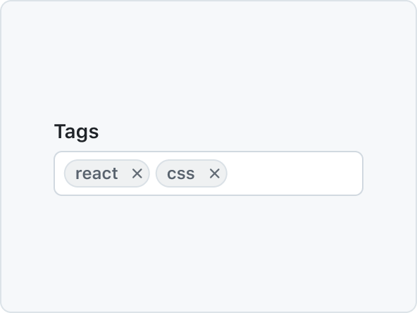
Token is a compact representation of an object, and is typically used to show a collection of related metadata.
Tooltip
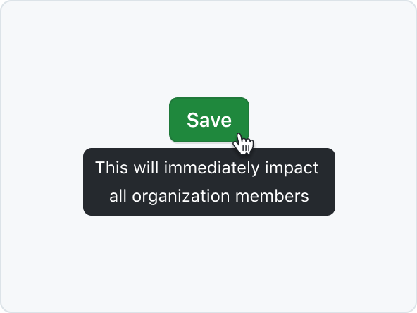
Tooltips add additional context to interactive UI elements and appear on mouse hover or keyboard focus.
TreeView
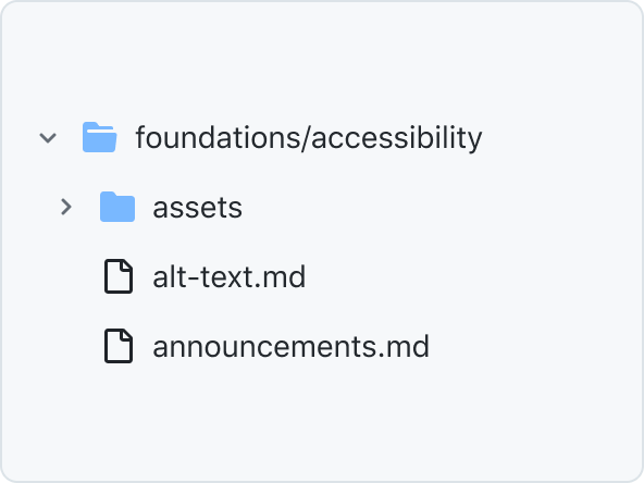
TreeView is a hierarchical list of items that may have a parent-child relationship where children can be toggled into view by expanding or collapsing their parent item.
