Moving Away From Flash
This guide will show you how to migrate from the now deprecated Flash component to its supported replacement,
Banner.
Migrating to Banner
Banner is not a drop-in replacement for Flash. It has a structured layout, a required heading, an icon for each
variant, and a named landmark for assistive technologies. Review each Flash usage for necessary changes to its content,
props, layout, and accessibility behavior.
Basic migration
Use the Banner title prop for the main topic of the Flash message. Move any supporting content to the Banner
description prop or children.
Before

import {Flash} from '@primer/react'

<Flash variant="danger">Changes could not be saved. Please try again.</Flash>
After

import {Banner} from '@primer/react'

<Banner
  variant="critical"
  title="Changes could not be saved"
  description="Please try again."
/>
Variant changes
Flash variant | Banner variant | Notes |
|---|---|---|
default or omitted | info | Use for non-critical information. |
danger | critical | Use for critical errors or destructive actions. |
warning | warning | Use for flagging potential issues. |
success | success | Use for successful actions. |
| N/A | upsell | Use for highlighting features that require a plan upgrade. |
See Banner variant guidelines for more detailed information and examples.
Title
Unlike Flash, every Banner requires an accessible title. When migrating, identify a concise title for the existing
message and provide it with the title prop. Alternatively, the existing message can be split between the title and supporting content (as in the Basic migration example above).
For components that accept variable message content, provide a separate concise title rather than using the entire message as the title.
For a short message that does not need a visible title, use the hideTitle prop. The title should still be set to something concise and relevant, as it remains available to assistive technologies.
<Banner
  variant="success"
  title="Repository settings saved"
  hideTitle
  description="Your repository settings were saved."
/>
The title is an <h2> by default. If another heading level is appropriate for the page hierarchy, use
Banner.Title.
Full-width Flash
The full prop on Flash does not have a universal one-to-one replacement in Banner. Choose the replacement based
on where the existing Flash appears:
- For a page-level
<Flash full>, use a standardBannernear the relevant section or above the page heading. Do not carry the edge-to-edge treatment over withflush. - For
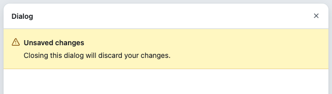
<Flash full>inside a confined container such as a dialog, table, card, or box, useBannerwithflush.
Before
<Flash full variant="warning">
  Unsaved changes. Closing this dialog will discard your changes.
</Flash>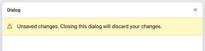
After
<Banner
  flush
  variant="warning"
  title="Unsaved changes"
  description="Closing this dialog will discard your changes."
/>
Reference: Banner flush guidelines
Actions and dismissal
Rather than requiring manual configuration of buttons, links, and dismiss controls, Banner provides dedicated props for these actions.
- Pass the main action to
primaryActionand an optional second action tosecondaryAction.Bannerpositions these actions and adjusts their layout at narrower widths. - If the existing
Flashhas a custom dismiss button, pass its handler toonDismiss.Bannerwill render the dismiss button. Preserve any existing focus-restoration behavior. If none exists, move focus to a useful place after dismissal.
Before
import {Button, Flash, IconButton} from '@primer/react'
import {InfoIcon, XIcon} from '@primer/octicons-react'

<Flash style={{display: 'flex', alignItems: 'center', gap: 'var(--base-size-8)'}}>
  <InfoIcon aria-label="Info" />
  <span style={{flex: 1}}>Repository settings need review.</span>
  <Button onClick={openSettings}>Review settings</Button>
  <IconButton variant="invisible" aria-label="Dismiss" icon={XIcon} onClick={dismissMessage} />
</Flash>
After
import {Banner} from '@primer/react'

<Banner
  title="Repository settings need review"
  primaryAction={<Banner.PrimaryAction onClick={openSettings}>Review settings</Banner.PrimaryAction>}
  onDismiss={dismissMessage}
/>
References: Banner action guidelines and Banner dismissal accessibility guidance
Icons
Banner automatically provides an icon for every variant, so explicitly rendered icons should be removed
when migrating from Flash. Custom visuals are supported with leadingVisual only for info and upsell banners.
Reference: Banner icon guidelines
Custom styling
Flash typically requires custom CSS to arrange its icon, message, actions, and dismiss control, whereas Banner handles its internal layout and responsive behavior automatically. Remove these Flash-specific layout styles, retaining only styles needed to position the entire component within the surrounding page.
Accessibility
Semantics
Unlike Flash, Banner always renders a <section> and cannot be rendered as another element using the as prop. When migrating a Flash that uses as, the prop should be removed; the rendered element will become <section>.
Dynamic announcements and focus
Banner is not automatically announced when dynamically added to the page. Preserve existing live-region or
focus-management behavior, then verify that it remains appropriate: move focus to essential content, or use a live
region to announce non-essential content when moving focus would be disruptive. If the existing implementation does
both, verify that both are necessary to avoid duplicate announcements.
See the Banner accessibility guidance for announcement and focus-management
requirements.
Migration checklist
- Map the
Flashvariant to the appropriateBannervariant. - Provide an accessible
title, or split the existing message into a concisetitleand supporting content. - For
<Flash full>, choose a standardBannerorBannerwithflushbased on its placement. - Move existing actions and dismissal controls to the corresponding
Bannerprops. - Remove explicitly rendered icons unless using
leadingVisualwith aninfoorupsellbanner. - Remove
Flash-specific internal layout styles. - Remove the
asprop and account forBannerrendering as a<section>. - For dynamically displayed messages, preserve or add appropriate live-region or focus-management behavior.